For any website, content is the most important part. So, naturally, you would want it to be as simple and straightforward as possible, in order not to worry about viewers trying to understand the cryptic messages hidden behind poor color choices and messy fonts.
This is why not only the general design and imagery but also the font choices and the overall consideration for typography are important for conveying the right message to the audience. By choosing appropriate font combinations and assigning the right hierarchy where needed, you can decrease the confusion and let the viewers stay and read your content.
In terms of appealing visual language, your text should have few characteristics, of which the most important are a readable font, the high contrast, and the hierarchy.
Even if there is a large library of fonts out there, many designers choose a sans serif fonts such as Helvetica, Verdana or Arial as their main font because they are familiar, very easy to read and adaptable to any design project. They also come standard, so by choosing fonts as these, they can be sure that the text will visually be the same not just for print, but also for web design.
Thankfully, the design world has advanced to the point where fonts are not nearly as limited as they once were. Starting with 2010 the Google Fonts were released, making the process of choosing and pairing fonts easier and quicker.
However, you should be aware that not every font combination in Google’s library is a recipe for typographical success. With the right font pairings and usage considerations, your brand will convey the right message to your audience, professionalism, and reader friendliness without the need for expensive customized fonts.
In this article, I’ll show you 15 great Google Font combinations that will help you to accomplish all this.
You will find below 15 spectacular Google Font combinations that together with images and graphics, will help you define your brand’s personality.
Open Sans Condensed + Open Sans

Open Sans Condensed / Open Sans
Here’s the easiest combination that works wonderfully for nearly any design project. Open Sans is one of—if not the—most versatile font in the entire collection of Google Fonts. It’s extremely easy to read in large blocks of text, at the same time being salient enough for headlines.
I can’t imagine any scenario where Open Sans would go wrong. Unless you’re looking specifically for a serif font, this one will serve perfectly almost any business, blog, landing page, or web app.
Simple. Elegant. Familiar.
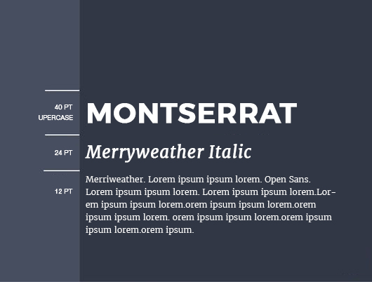
Montserrat + Merriweather
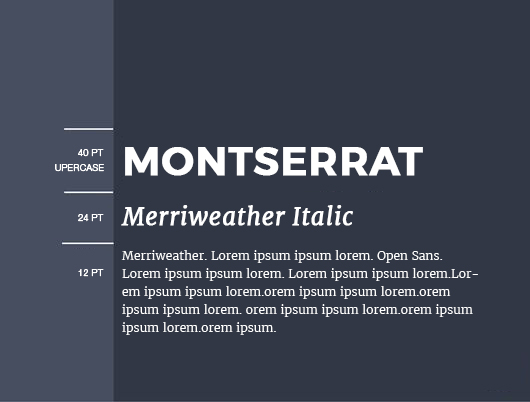
Montserrat is a very appreciated font among designers for its versatility and simplicity, and Merriweather pairs wonderfully with it because its contrasting style and easy readability. It doean’t matter if you interchange them as headlines or paragraph text—they both work great as either!
This particular combination is a nice balance of modern and classic design. Therefore, its variety of uses could support many types of businesses.
Raleway + Roboto Slab

Roboto Slab is a versatile font, yet a bit more classical in style. When paired with the distinctive and bold Raleway, we can see an amazing match of clean and refined typography.
Raleway is one of those fonts that defines sophistication. When used as an all-caps headline, it works beautifully for luxury items like jewelry, designer clothing, perfumes and so on. Roboto Slab supports it well with simple and approachable descriptive text.
Playfair Display + Source Sans Pro
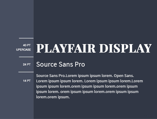
Playfair Display / Source Sans Pro
Playfair Display was inspired by the letterforms of the 18th century during the transition from quills to steel-tipped pens. So, it’s no surprise that this font expresses an old charm while having a modern twist.
This font adds a personal touch to something like a tagline or product description. If you use its currency symbols, you’ll immediately see why it’s the perfect choice for a product or service centered around luxury and appearances.
At the same time, Source Sans Pro keeps the text grounded in a modern and clean presentation, while pushes things a little further into the future and creates an intriguing combination.
Alegreya + Lato

Alegreya is a font without no pretense about its personality; what you see is what you get. On the other side, Lato could be champion of all-purpose fonts in Google’s library. Together they make for a combination that is fun, easy to read, and pragmatic.
This combination is great for small local businesses like cafes, or professionals who want to suggest a warm feeling to their clients’ design projects.
Fjalla One + Cantarell
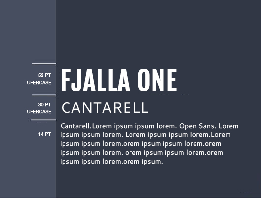
Maybe it’s not one of the most versatile fonts, but Fjalla One creates headlines that demand attention. Small or large, lowercase or all caps, those letters are hypnotic no matter what you do with them. Similarly, Cantarell has a charm that seems to attract the same attention that Fjalla One draws for headlines.
This pairing works extremely well for blogs, landing pages or anything else that includes long bodies of text that needs noticeable subheadings to break up content.
Roboto Condensed + Roboto

The Roboto font-family is extremely versatile, having many font weights, there’s practically no limitation to what the font could be used for. Modern and geometric, yet somehow friendly and dependable, Roboto is an exceed in terms of forms and functions.
Here’s another pairing that you could use. While Roboto works for just about anything, but it would work particularly for tech startups, modern small businesses, or any type of brand that looks into the future.
Amatic SC + Josefin Sans
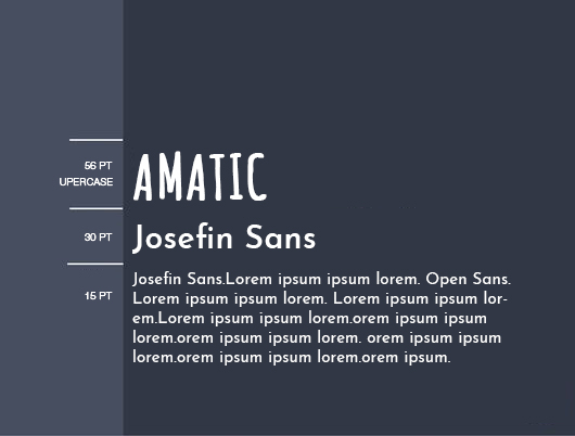
This is more for people with artistic inclinations. Obviously, the combination won’t work for everyone, but the bizarre nature of both Amatic SC and Josefin Sans create something that for sure will stand out, as long as you don’t overdo it.
If you’re a fun-spirited artist, musician or entertainer, you could use this pairing to capture your unique personality. Depending on the niche, tone, and topics, this combination could also work for a blog.
Oswald + Droid Serif
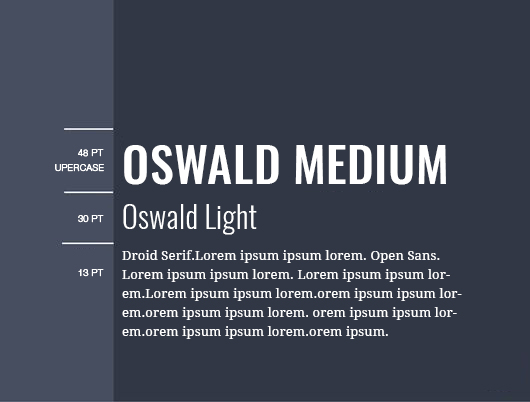
Regardless the font-weight or use of caps, Oswald is a great font for headlines. Its condensed nature helps it grab attention and pop, but it also makes for a pleasant text, if you use it as your main body’s font. On the other side, Droid Serif has a classic look, similar to Garamond. Used properly, this serif font can bring a nice elegance to your professional appearance.
The versatility of Oswald and the timelessness of Droid Serif make this combination great for professionals dealing with high-end clientele or for product descriptions where the text is important to emphasize a premium quality.
Unica One + Vollkorn

Unica One can be pretty funky on its own, but when used as all caps it becomes a headline that is all business. Vollkorn is a font reminiscent of classical literature. Contemporary and impactful, when they are used in this combination, somehow the two of them work amazingly together.
Archivo Black + Tenor Sans

Archivo Black was designed to meet the intensive needs of print and digital platforms. Originally created for headlines and highlights, this font is ideal for high-geared press work.
On the other hand, Tenor Sans has as purpose to aid page body text setting. Because of its legible characters, this font gives an elegant and relaxed feel and it can also be applied to headlines. Combining these two fonts, you will have a highly legible and well-crafted typography that’s a recipe for high-performance typesetting.
Pathway Gothic One + Cardo
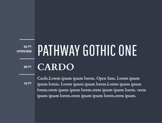
Cardo is a large font perfect for linguists, classicists, medieval specialists and biblical scholars. It is largely used for documentation and other extensive publications. It offers a variety of punctuation techniques, text figures, and ligatures.
Pathway Gothic One is a stylish font with an outlandish compressed design. It is an attractive choice among typesetting and typography experts. The result of combining these two fonts is nothing short of amazing.
Six Caps + Archivo Narrow

Six Caps is a highly condensed and tight display font. It is a stripped down and normalized version of classic grotesque display letterforms.
Archivo Narrow was designed to be used simultaneously in print and digital platforms and it was originally created for highlights and headlines. The technical and aesthetic characteristics of the font are both crafted for high-performance typography.
With a warm and modern feeling, the combination works perfectly for design projects related to the entertainment industry.
Oswald + Open Sans
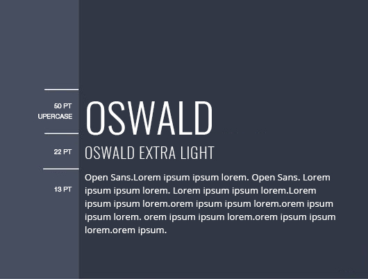
Here again Open Sans. This humanist sans serif typeface was designed with an upright stress, open forms and a neutral, yet friendly appearance. It was optimized for print, web, and mobile interfaces, and has excellent legibility characteristics in its letterforms.
Regardless the font-weight or use of caps, Oswald is great for headlines, so pairing them will bring you the timeless feeling of elegance and refinement.
Poppins + Sintony

Sintony is a modern sans serif typeface, drawn with a slightly square structure and smooth stroke modulation. It’s great for long passages of text, providing any text with a calm and clear feeling.
On the other side, Poppins is one of the newcomers to the long tradition of the geometric sans serif fonts. These typefaces have been a popular design tool ever since these actors took to the world’s stage.
The combination works perfectly and can serve almost any business, blog, landing page, or web app.



As fonts are very important element of any website, it should come with right colour, style and combination. Amatic SC + Josefin Sans is a pretty combination.