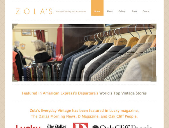
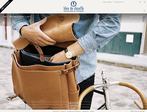
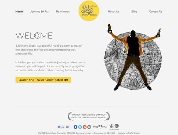
Navigation is certainly a very important element in web design, especially if we keep in mind that the navigation of a page is there to orient and guide the user. I believe we know that it’s extremely important that users understand navigation options to better explore a website and that is why today we are showcasing examples of navigation menus, to show how websites are presenting menus to their users. From the traditional header menu to side bar menus, footer menus and much more, you will see that there are a variety of ways to present your navigation options. So check it out and let us know which one you like most.
Inspiration  Gisele MullerFebruary 13, 201223 Comments05.6k
21 Examples of Excellent Navigation Menus in Web Design
Share
Gisele Muller
Gisele Muller loves communication, technology, web, design, movies, gastronomy and creativity. Web writer, portuguese/english translator and co founder of @refilmagem & @mentaway Twitter: @gismullr


Great, thank you for this article. Also a very interesting “sketchy” navigaton bar is on http://www.moredays.com
Thanks for sharing and help me with this post in this days! I build two site and I need to new different navigation, footers, menu…Thanks!
There’s completely nothing special about these menus and some of them are inaccessible.
All you basically do in these galleries is post the *21* most recent images from The Best Designs and CSS Awards… where’s the value in this? WDL needs less of these rehashed galleries, and more articles like this: https://webdesignledger.com/tips/keeping-yourself-motivated-throughout-the-workday or this https://webdesignledger.com/tips/usability-design-for-online-web-forms
I’ve been saying this for the past year or so. Couldn’t agree more and some of these sites from a usability standpoint are a joke. Maybe do some real digging instead of just copying and pasting from other awards sites and lists.
“Oh this screenshot looks nice!” *Cmd-C*
Wow, some beautiful work. Thanks, food for thought…
cool. thanks for share..
Some good examples of navigation + many “common” solutions and really bad examples that shouldn’t be posted here. Kevin is right – this is more like copy & paste than real selection of good content worth seeing. There is no value in that and this is not the first time.
I would be more interested in creative navigation menus with let’s say four or even more navigation levels, because that’s part of my my daily work. I think it’s not very outstanding to create beautiful menus with only one or two navigation levels.
Echoing the thoughts of others, I tend to feel this is a collection of ‘pretty’ navigation, rather than ‘good’ navigation. There doesn’t seem to be much here in the way of interesting usability or semiotics, instead, it seems to be more about notable graphic design skills, although I admit this is hard to capture with still images in short format.
Thanks for the share good looking navigation doesn’t always mean easy user experience!
I like the navigation of “Leading Art”, but other are quite common.
some of them are good but i don’t think these are “21 Excellent Examples of Navigation Menus in Web Design”
Navigation is an area of my design work I am always trying to improve on. I thought this was a great article and there are some really inspiring ideas in the collection you have put together. I really liked the Agence Crac site and how the navigation is at the bottom of the page. I also liked the roll over on the menu bar. I also really liked the Leading Art site and how the navigation is not just in a straight line. Great collection and I look forward to more from yourself.
So why are these excellent, again? Oh yeah, because they were featured in some CSS gallery site.
“Excellent Navigation menu”
Ooo..not at all… O_O
look at this excellent one-page website : http://www.bookdesanciens.fr
Thanks for the inspiration,,i like Leading Art
Some really good examples of navigation. In my opinion, the more simplistic the navigation the better. The leading art navigation is very creative and interesting, but may confuse visitors. Great list altogether.
Some great examples.
Once again, you’ve out done yourself with these examples. Amazing how quickly someone comes up with better design. I really like Nordic Ruby. I found some other ones on other sites as well (I think ngen was the best one in my search in terms of navigation design).
Thanks again for your great work!
great examples, thanks.
Navigation is the core of your website. Sophisticated nav bars scare your visitors away, while well-thougt-out, simple and creative navs are most loved.