Your color scheme is going to make or break your design.
And we want you to make it.
That’s why today we’re going to go over 5 color trends that you should be using in 2020.
2020 is the start of a new decade, and your colors are going to speak volumes, whether you go with neutrals, bolds, soft, or neon.

5 Striking Color Trends You’ll Want To Hop on In 2020
Whatever you choose, it needs to complement your design, so get inspired by these 7 color trends for 2020!
Monochromatic
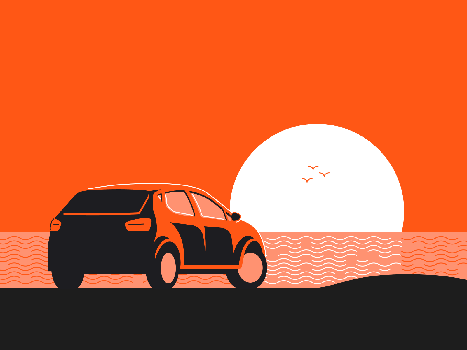
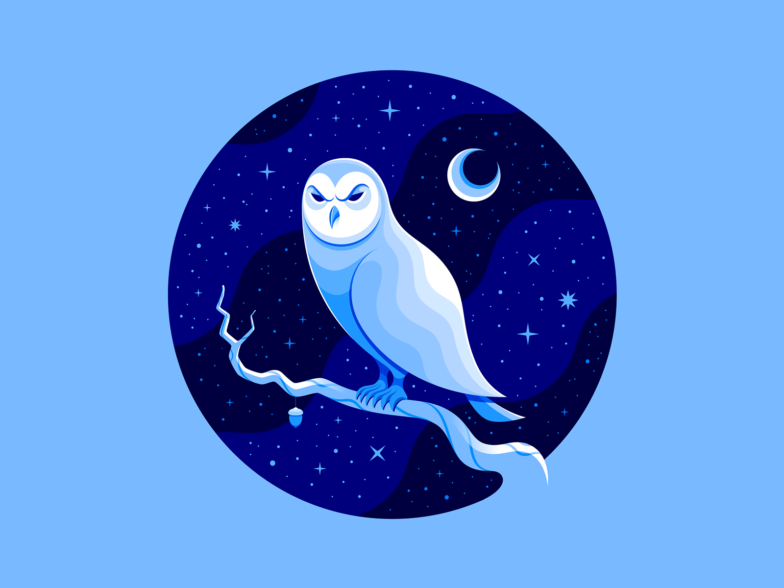
There aren’t many things more satisfying than looking at a beautiful monochromatic design.

[source]
There’s nothing quite like it. It’s easy on the eyes to look at and it’s so satisfying to see so many shades of the same color that work perfectly together.

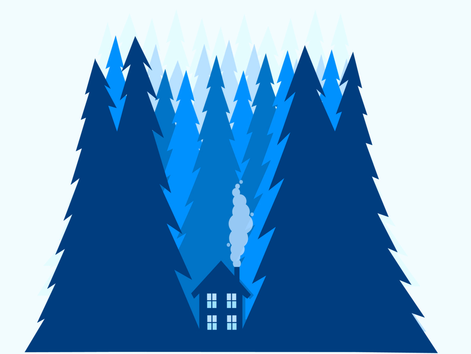
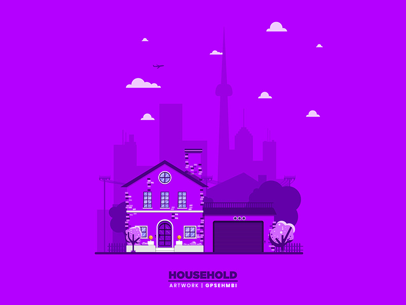
And the more unique color you choose the better. People expect to see black and white, but hit them with a beautiful blue or royal purple and watch your clients be in awe of your work.

[source]

[source]

[source]

[source]
Neon


[source]
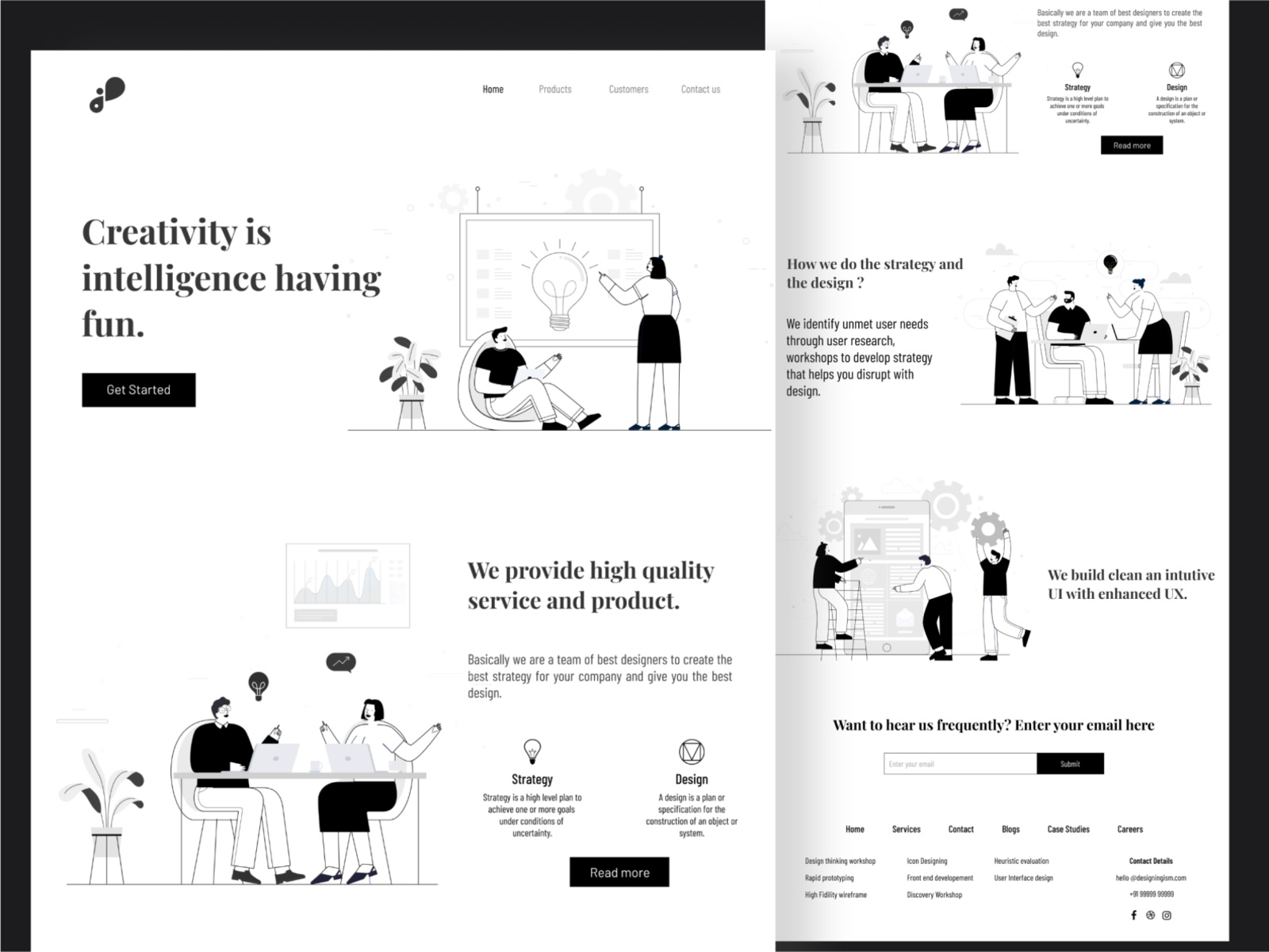
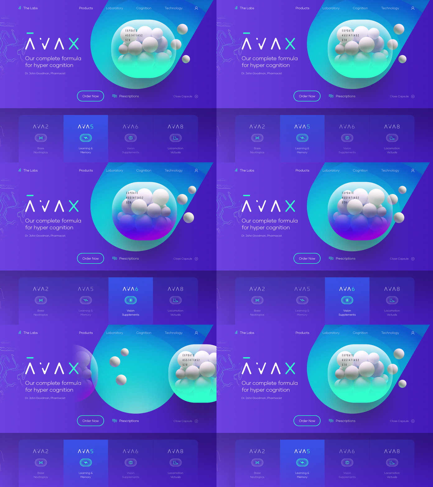
Nothing says bold and confident like neon. Some designs just call for bold and nothing else, and that’s why neon is on the rise this year.

[source]
It’s definitely a bold choice and takes lots of confidence to rock, but if you choose to go with neon, you won’t regret it.


[source]
You’ll stand out like nothing else, and people will appreciate the confidence you had to go with neon colors.

[source]
Also, neon colors aren’t easily forgotten. We highly recommend you try using different hues and shades of neon this year in your designs.
[source]
Neutrals
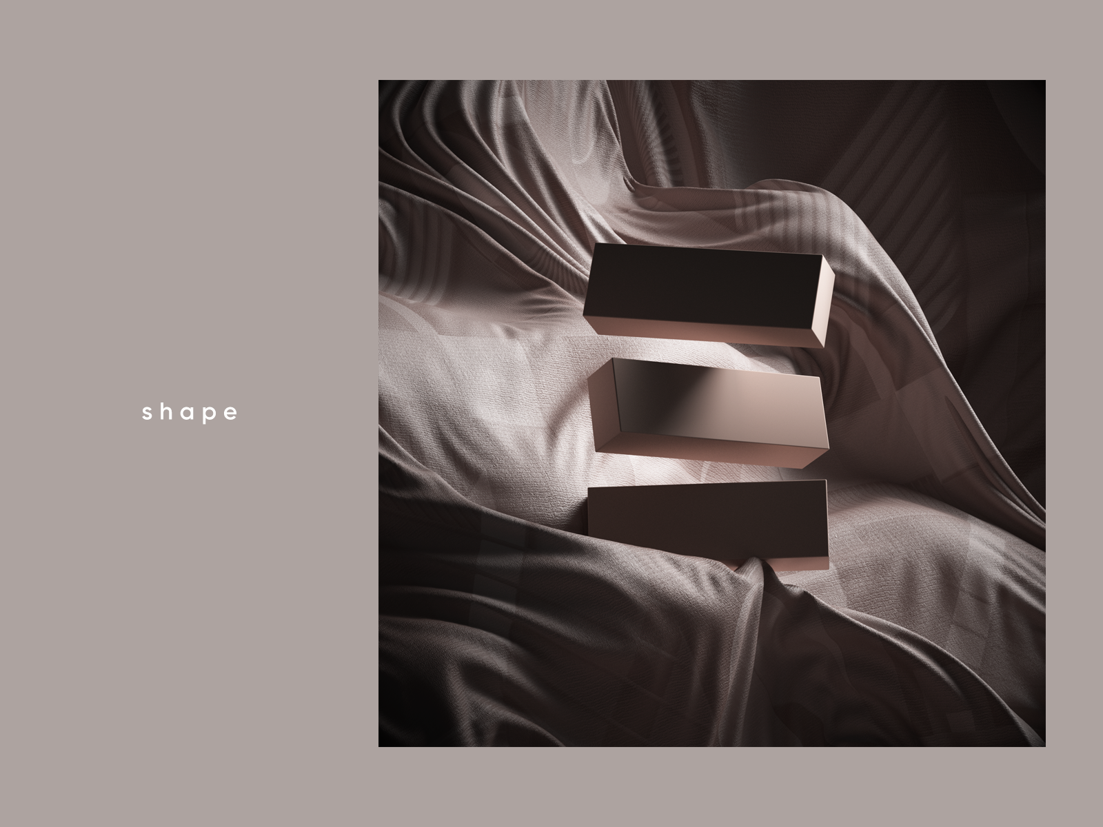
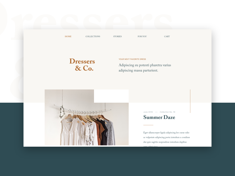
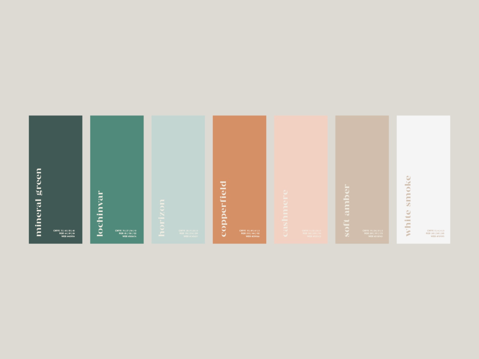
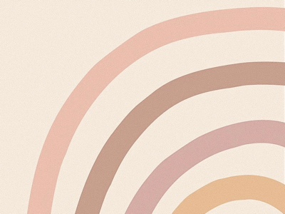
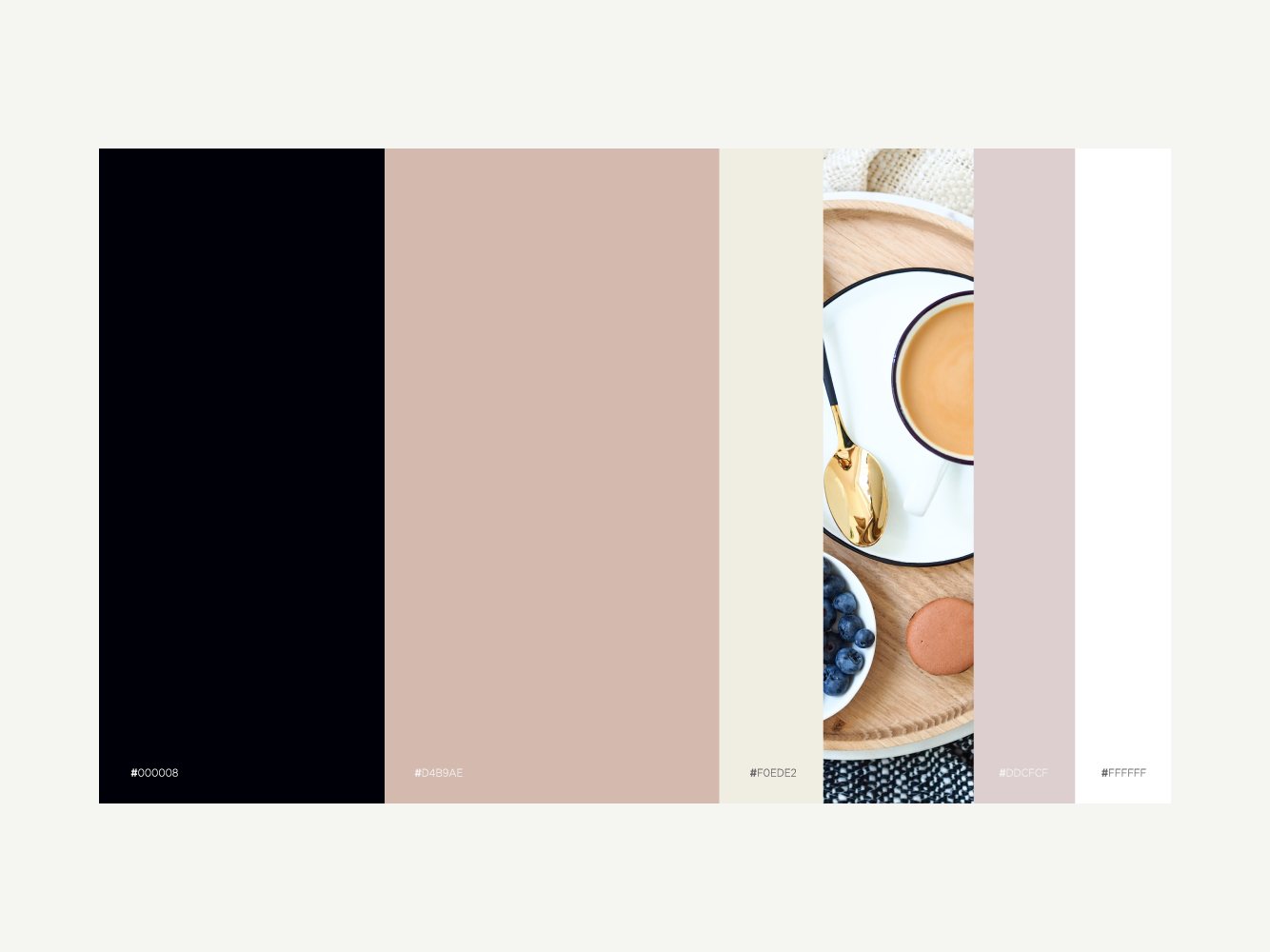
Neutrals will always be in style and will always be a great choice.
Although it is great to stand out with bright, demanding colors, it has to be the right situation.
And sometimes, the better choice is to go with something soft, to really enhance your product or whatever it is that you’re designing.

[source]

[source]

[source]

[source]

[source]
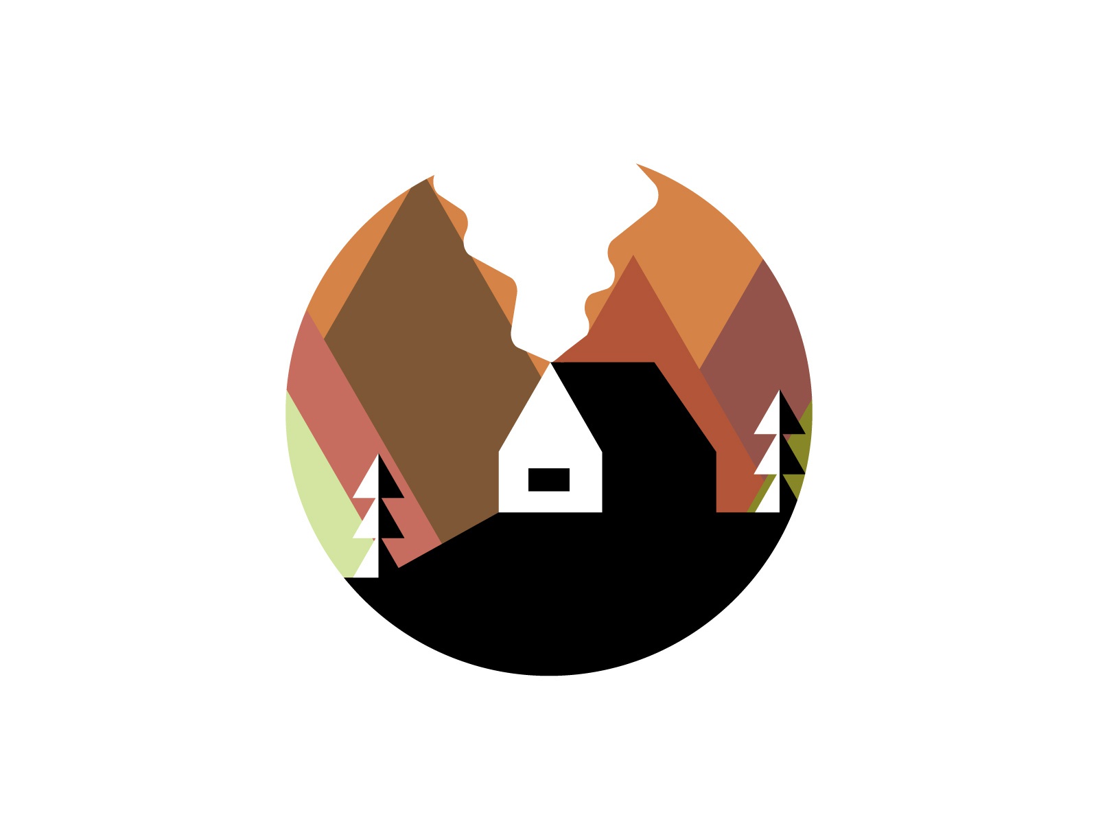
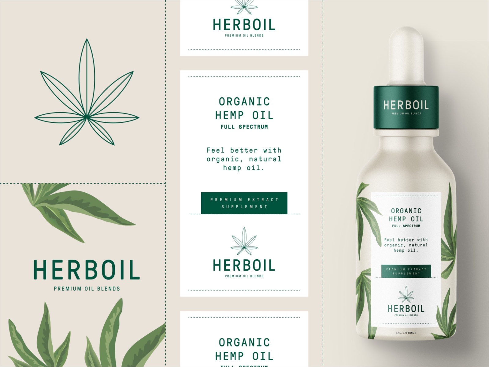
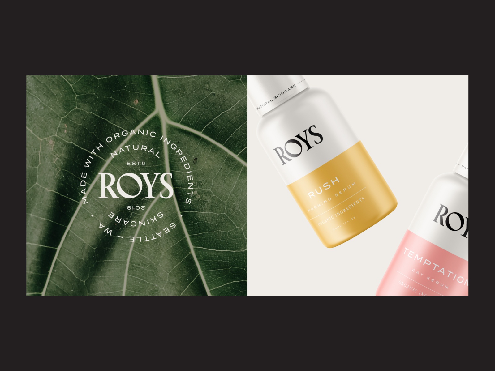
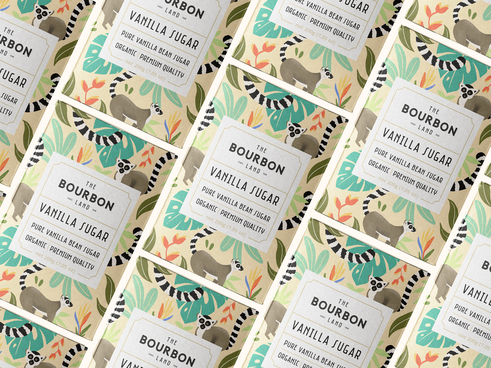
Earthy Tones
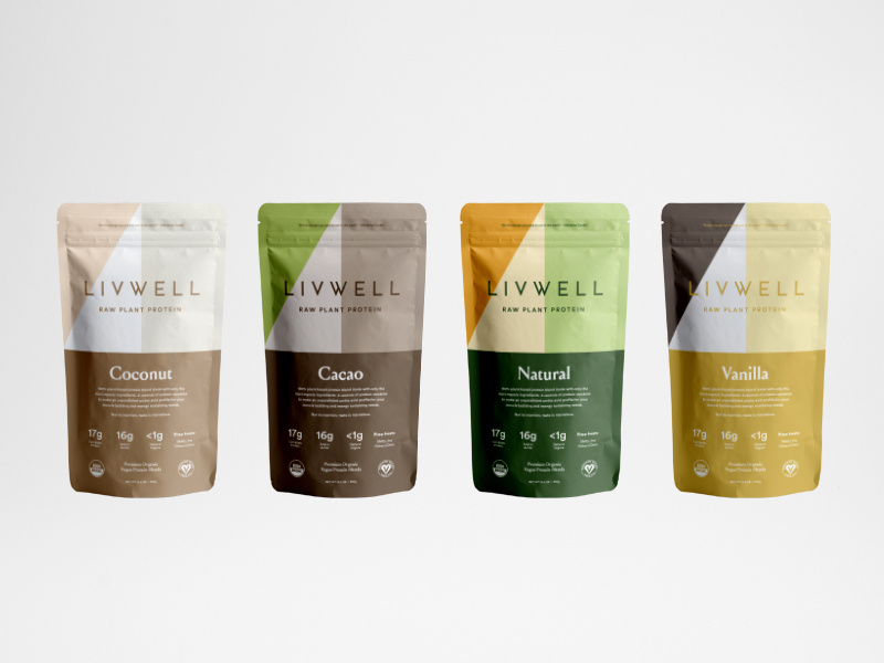
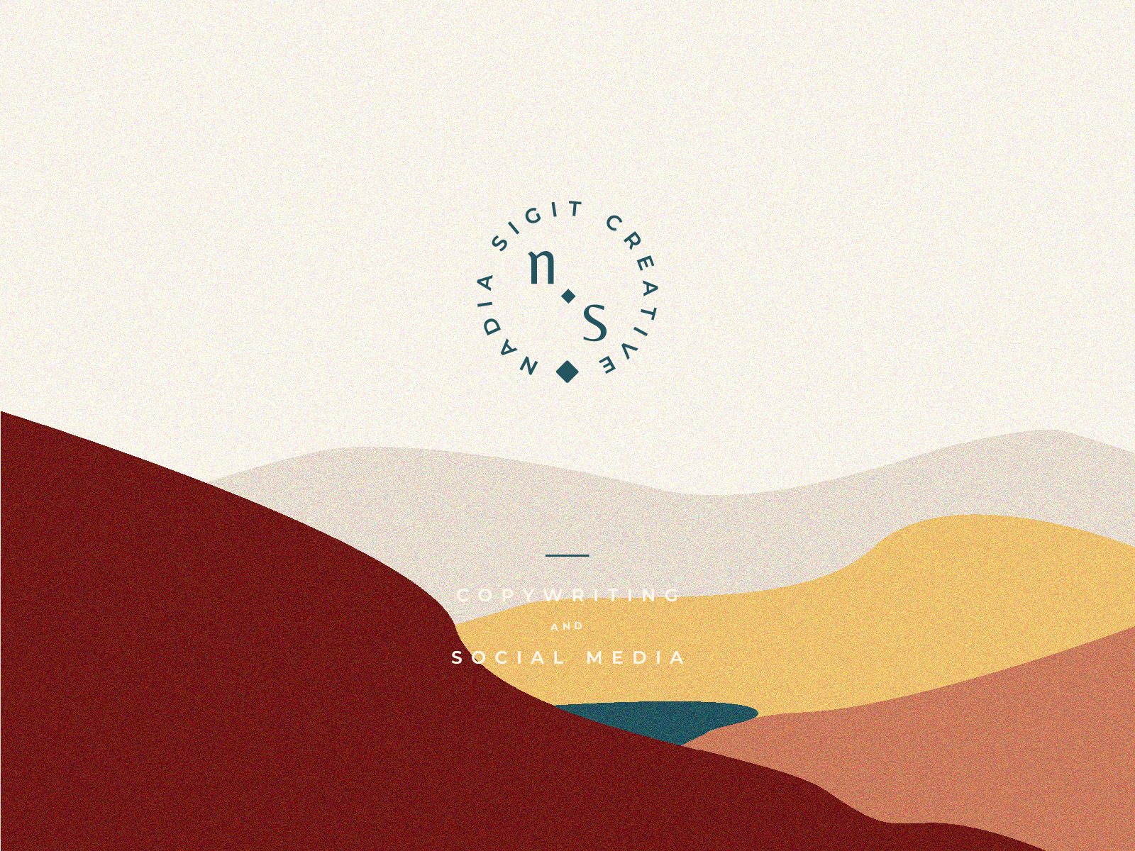
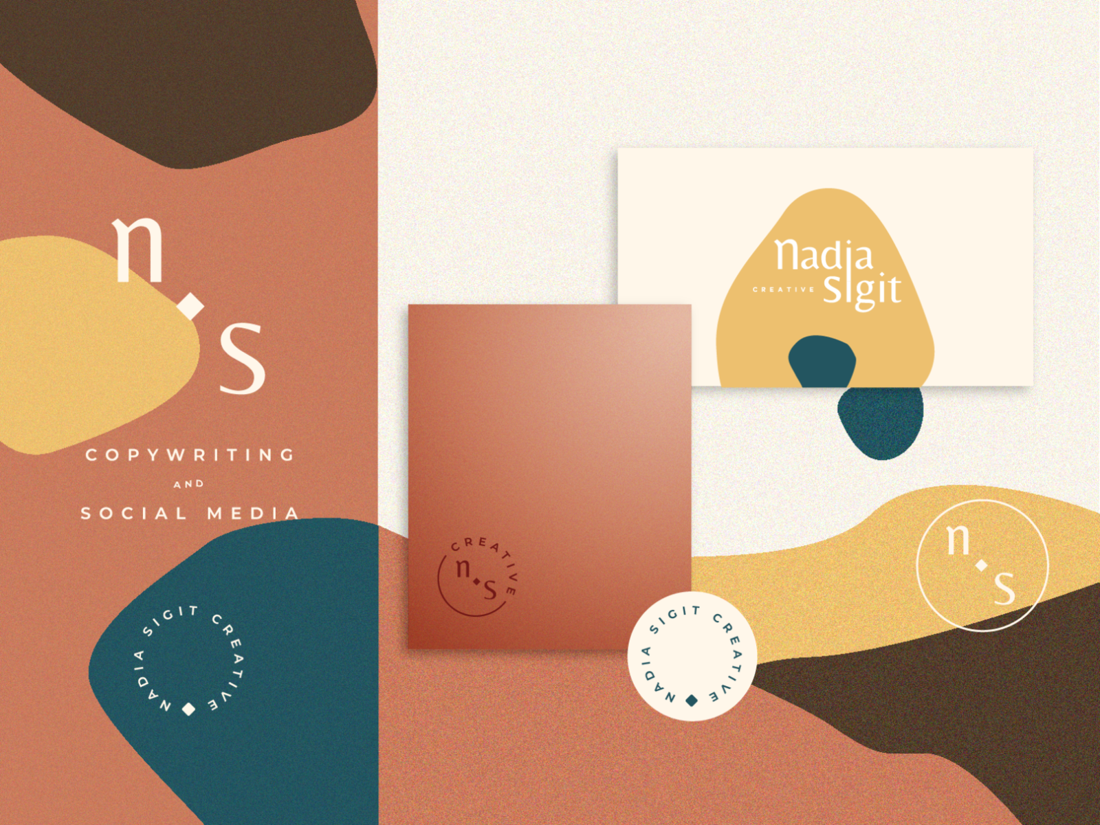
Nothing is more natural and subconsciously attractive than earthy tones.
Especially if you’re designing some sort of eco-friendly packaging or website, just by using earthy tones you inspire people to trust you.
Earthy tones are calming and relaxing to look like, giving you the feeling that you’re connecting with nature.

[source]

[source]

[source]

[source]

[source]

[source]

[source]
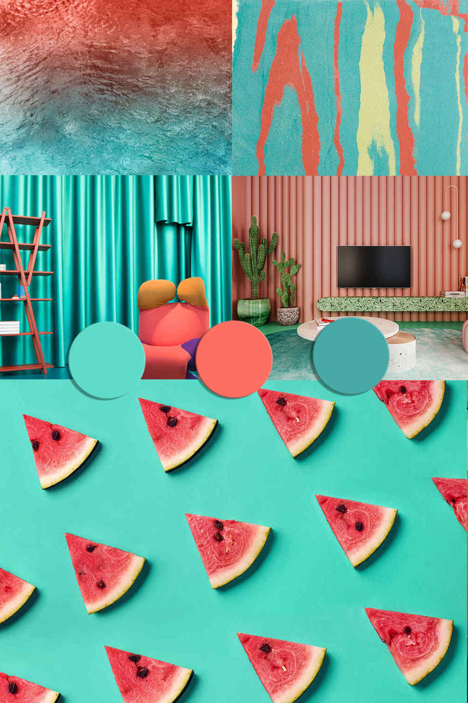
Coral and Turquoise
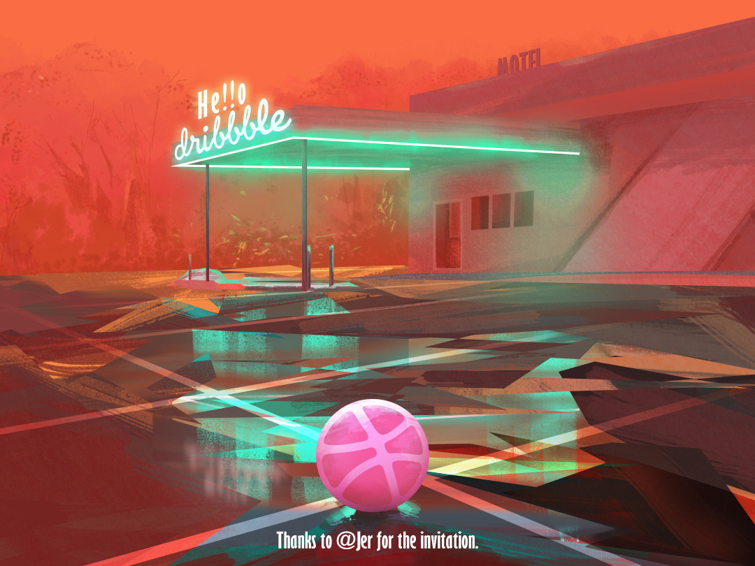
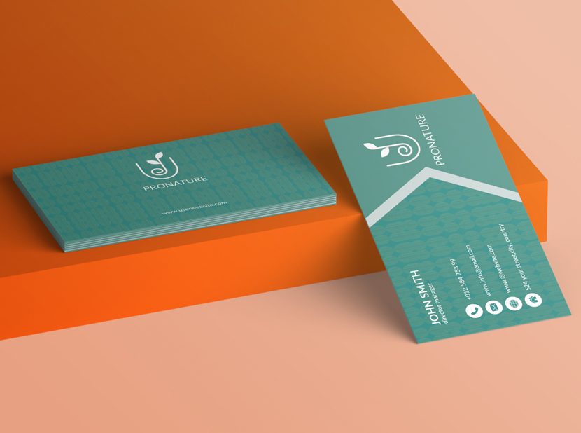
Coral and turquoise are certainly some striking colors that won’t be easily passed by.
The dynamic duo is irresistible to look at and is going to be a major hit this summer. I just know it.
The contrast between the two colors is absolutely perfect, but coral also works well with teal and other variants of blue.
Definitely experiment with the colors and see what masterpieces you’ll come up with!

[source]

[source]

[source]
We hope you enjoyed this inspirational piece on color trends for 2020.
What do you expect to see this upcoming year?
Let us know in the comments.
Until next time,
Stay creative, folks!


Leave a Reply