What is a font? And how are fonts used? How can you create quality typographic projects, using the best characters? This article aims to be the answer to these and many other questions that many young designers ask themselves every day.
Today, with this guide, I want to try to create a complete introductory resource for all the main topics of the font world. In short, it is a super guide for designers to use fonts!
OK, let’s go!
What is a font? And what is a typeface? And a glyph?
Before figuring out how to use fonts, it’s good to know what a font is, the difference between a typeface, a glyph, and so on. Because yes, typeface and fonts don’t mean exactly the same thing. The characters are, in graphics, typography, and publishing, like bricks in architecture, atoms in physics or numbers in mathematics. In short, they are the basis of graphics matter.

A set of characters studied coherently and according to the same formal principles, forms a typeface, whose file is called a font. But let’s clarify these aspects better.
Fonts, typefaces, and glyphs
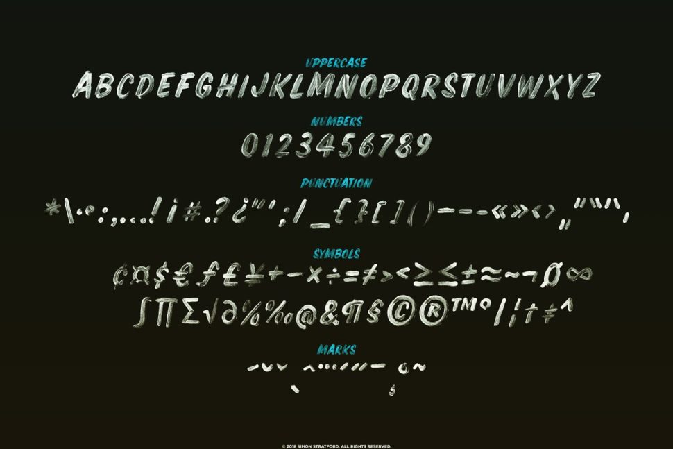
These characters are letters, punctuation marks or symbols. So, for example, the letter “A” is a character. This character can be composed of several glyphs, such as A, ä, ă or â, which will, therefore, be glyphs of the same character and of the same typeface. The set of all the characters and glyphs of the Latin alphabet designed according to the same visual coherence and meaning, takes the name, again, of a typeface.
And it is here that misunderstandings arise in many different languages. English is clearer: the character (understood as a letter) is a character, the glyph is a glyph and the coherent set of all this, the typeface, is a typeface.

The font, however, is the file
Font is another thing: font is the medium that allows you to apply a font. That is: while Garamond is a character (typeface), the garamond_semibold.otf file is a font (better: one of the fonts that make up the Garamond font family). To explain it we can make the comparison with music: if a typeface (character) is a song, the font is the .mp3 file that allows us to listen to it. It is, therefore, wrong to say “Listen to this chorus via this mp3!”, While it is much more correct to say “Listen to this song!”
We often use the word “font” instead of character, it is a common mistake of the digital age: to confuse the software (medium) with its purpose (end). It’s a bit like saying “but this is Photoshop” looking at a montage.
And it is a mistake that I myself made for years and in which I still make from time to time. So learn from my mistakes!
Why do you say “font”?
Many think that font is a term of English origin but in reality, its origin is French. It is, in fact, the English transposition of the term “source”, of medieval French. This word, which pronounced itself “font” (in French the end is truncated and not pronounced) originally meant “fused”. The Latin root of the word is the same as the Italian verb “folder”. The word font was then imported into England where it spread to all English-speaking countries and from there to the whole world over the last century.
What are the font variants and types of typefaces?
Let’s look at the terms that serve to identify the various files that make up a family of fonts and the types of main typefaces:
The variants of a font (weights, italics, etc.)
As mentioned, a font is a file and each file corresponds to a typeface in which all the glyphs that have been designed so that it works together, as a single body, and inserted. Generally, font files are grouped into font families, where there are variations of the original typeface.

Types of typographic characters
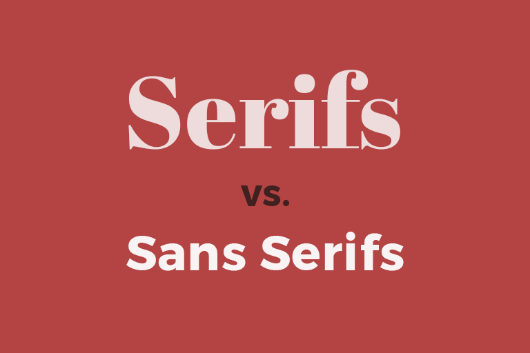
The typefaces are not all the same, indeed, they are very different! In graphic schools or universities, fonts are often said to be divided into two categories, the serif and the sans serif. These are two French terms that mean “with thanks” and “without thanks”. In reality there are several others, even within these two macro-categories.
Serif and Sans Serif

The substantial difference between these two categories of fonts is the use of the “graces”, or those small extensions at the ends of the rods, which derive from manual calligraphic writing.
How does a font work?
As I said before, a character, or a single letter in all its variants, is composed of various different glyphs. Glyphs, in turn, are composed of many different structural elements, which take different names:
How to use fonts
In a complete guide on typography in graphics, one cannot talk about how to use these fonts. How many times have you started searching for the font best suited to your project by scrolling the font drop-down for hours, searching through the hundreds of characters you downloaded or purchased?
To put it simply, the font should always compliment the context. Of course, there are many ways it can do that, so it’s not exactly a science. What it is, however, is a skill that can be adapted and fine-tuned with some practice.
How to use fonts: combine multiple fonts with each other
Choosing a font is a complicated process and requires careful analysis of your project. But knowing how to match fonts can be even more difficult. In reality, there are so many things to talk about in this wonderful and fascinating world. Because the type is really one of the most mysterious and profound aspects of graphic design.

There are lots of courses you can take in order to get this right. My advice would be to at least research and study as much as you can. Again, this is one of those things that can only be perfected through practice.
The conclusion
I hope you’ve learned something new today. Although this article aimed to cover a lot, there is still a lot to know.
Fonts have been around for quite a while, and won’t be going away ever. They are an essential part of graphic design, and design as a whole. My advice would be to get as comfortable with them as possible and to practice using a wide variety of them, combine them, and maybe even experimenting with your own.


Leave a Reply