UXD stands for user experience design. This kind of design refers to a product’s design that offers a meaningful and enriching experience to the user of that product. The term “User Experience Design” is often interchangeably used with “UI design” and “usability.” But, the latter terms are a subset of user experience design. A user experience design is much more than the interface design of the product or a design that provides usability. A user experience designer also pays attention to the integration of the product. He or she is concerned with processes like product branding, product design, and usability factors. Moreover, they should also consider the efficiency of the product function.
The process of designing a user experience covers all the procedures as mentioned above that a UX designer handles before the device reaches the user’s hands. In this blog, we are going to take a look at the tips required to have the best UX design.
1. Customer experience:
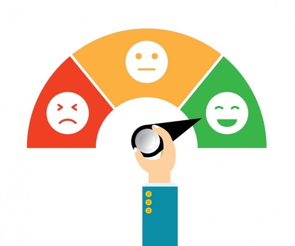
Look at the apps a user deletes from his devices. The fundamental reason why a user deletes an application is because of the technical snags in the application. A UX designer is required to understand the product development at every stage. Through every phase of the product life cycle, the UX designer should look at it from a customer’s perspective. A customer experience (CX) ranges from considering the application for use, moving through the usage, support to its removal.
As a UX designer, you should think like a customer while you are creating an application. Similarly, you should also think about the interactions a customer makes with your application. For instance, you should know that user registration is easy. These days, the system sends an OTP (one-time-password) to users who register through their phone number. It is a natural process for registration. But individual applications send links to their website for user verification, which may or may not work. Doing this may turn your customer away and abandon your application. They may even end up giving negative reviews to your application.
2. Keep it simple and responsive:
Another very significant factor of any UX design is the complexity level of it. Generally, ease of use is the primary aim of any UX design, yet designers either forget about it or lose track of the goal. Eventually, they end up having intricate designs that make them lose their users. When a page is filled up with textual content and sardined with images and videos, it turns a user off. Above that, if the typography is also not up to the mark, then you cannot expect your user to read your thoroughly researched content. Doing this may lead to your user bouncing off your webpage. If the bounce rate goes up, your website may lose its organic traffic and lead to loss of rank on the search results page.
You should have a design that responds to your user’s requirements thoroughly and is always user-friendly. The goal of your design should be to keep the user engaged and involved with your webpage. You should not let the user be distracted. Even if your page has a lot of white space, but has a definitive purpose, it helps keep your design user friendly.
The components and their purpose should be easily understandable and self-explanatory to the user. For instance, the interactive elements like “search” should have a symbol of a magnifier glass to signify search. You should place extra information about the website like a blog list or contact us on the page footer.
3. Understand your target audience’s requirements:

Without understanding your target audience’s mindset and requirements, it is practically impossible to design a user experience. To have a correct user experience design, you have to understand everything from their perspective. That way, you can follow the difficulties they encounter or the ease of use that puts the user at ease. Without acquiring this perspective, it is impossible to have the design correct in the first go. Moreover, a design may be a fiasco because of a lack of understanding of the audience’s needs and expectations.
To avoid this, you should enquire every minute detail about how the user expects a user experience design. For this, you can either have your users fill out the surveys and feedback forms. You can also observe how users use the product and what features they seem to like the best. The surveys can help you know about your users from the demography perspective. Your users could be tech-savvy, industrialists, or a student studying in a university.
The survey also tells you about what your user requires and how you can answer those requirements. It also helps you see how you can connect your user’s needs with your interface design. These answers are sufficient for you to understand the mindset of your target audience. Moreover, it can help you have the best UX design according to your users.
4. Have visually distinct elements:
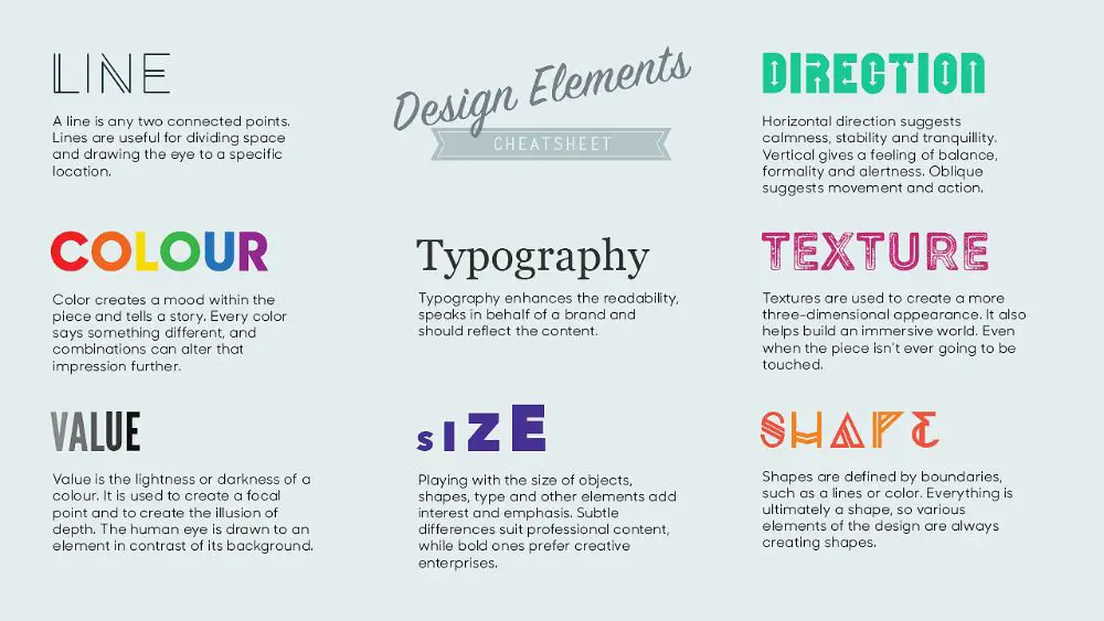
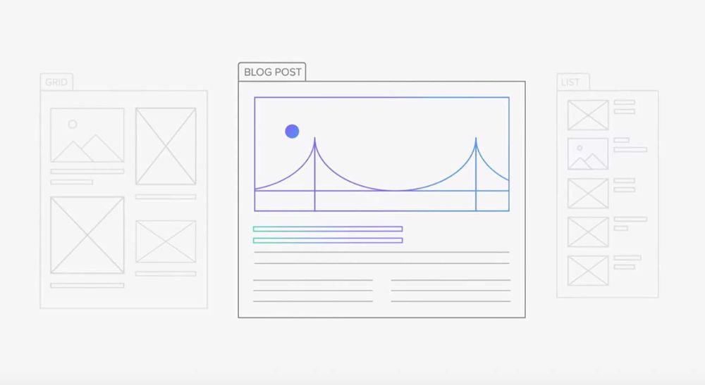
A page that is visually appealing as well as easy to use for a user is the best way to win at user experience design. If your user has to look for controls or the controls hide beneath the advertisements, then it is not a good example to set. Don’t make your user scroll up and down to find something. It is always a good start if you have the most critical things visible and easy to find. The most important thing, according to your design, should stand out and be in the center. For instance, if you deal with blogs, you should place your latest blog in a way that is easy for the reader to find.
Another factor that decides the integrity of a user experience design is the navigational elements. Certain websites offer navigation that is seemingly confusing for users. For instance, it is a trend to place the navigation on the page header and social media buttons on the right or left. Depending on the location of social media buttons, you can set your blog posts. Hence, if social button media buttons are on the left, you can place your blog posts on the right. Also, the latest blog posts should be on the top. Other content like “you may also like…” goes at the bottom of the page.
The location and caption of the action button are also very significant when you are designing the page. In addition to this, the caption on the button is also essential. For instance, you should not write “OK” on the button if it means “save” the information. Instead, you should write “save” on the button to avoid confusion. It is very annoying when you cannot seem to find the button to process your information. For instance, if the button hides beneath an advertisement, the user would never know about the existence of the button. He may simply get annoyed with the design and may abandon the page instantly.
The search field should be visible to your user irrelevant of what device your user selects to use. You can also signify it by putting a symbol of a magnifier lens to depict search. Traditionally, you should place the search field on the top-right corner of the page. Hence, try and maintain the same tradition.
Coming to the colors, you should have muted background colors. That is, they should not be very dark or very bright. It is a general and stated fact that blue color is for the hyperlinks. Try and maintain that design factor. Red signifies errors or alerts. Follow that to signify the same. Put a high-contrast color for call-to-action buttons. This may invoke the user to click on it and take action.
5. User flow consistency:
The user’s journey on your website also plays an essential role that decides the correctness of your user experience design. The “flow” defines the seamless movement of a user from one part of your webpage to another. While establishing this, the end product of the flow should be delivering the value to the user. A consistent design helps users find and do what they want to do on your website or application. This benefits your work because consistency is what brings about the usage.
To establish consistency, you need to think about how the user moves about on the website. For instance, a user lands up on the home page of a website dealing with cosmetics. He or she browses through the website. If the user is unregistered, he or she registers on the site. And later, according to their set preferences, the website shows the recommended products and services. Hence, the flow of the user here is browsing, registration, and exploring the products. The entire journey from browsing to the exploring should be seamless and intuitive.
Another factor to consider here is to address dead pages. Dead pages are the pages that don’t lead a user to anywhere. You should avoid these instances on your website to prevent your user from reaching a dead-end page. Every page must lead to another page or content.
Every website should establish an end goal. For instance, we talked about the site dealing with cosmetic products. The end goal here should be a user buying a product through his selected payment mode.
6. Error messages should be self-explanatory:
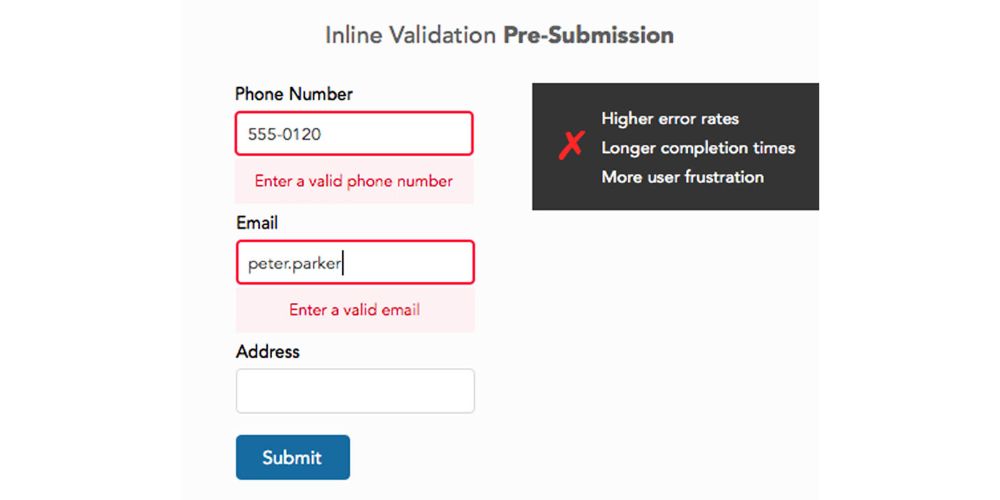
An expert user can encounter an error. But if the error message is unclear for the user to understand and solve, then it depicts an example of understandable annoyance. There have been occurrences where the system generates an error code, but the meaning of the error code is not available. It sets an example of bad practice. It keeps the user confused and frustrated not to be able to remove the error, whatsoever. Hence, you should always keep the error and alert messages easy to understand and comprehend.
Guiding a user through an erroneous situation can lead to good user experience and positive feedback. When you can positively affect user experience, you manage to keep the user engaged for a long time. Moreover, it is highly likely that the user may come back repeatedly for repurchasing products or services. Avoiding certain mistakes can make a user fond of your design, leading to an enriching and enhanced user experience. And this kind of user experience is what matters the most.
7. Align the fonts according to the user’s device:

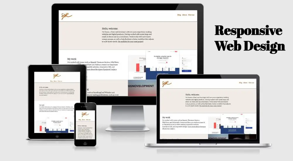
Gone are the days when the users opened laptops or fired up a desktop to look for something on the internet. These days mobile phones are one of the smartest devices available on the planet. The users use the internet through their mobile devices and tablets. Hence, your user experience design should have page designs that flow seamlessly across all the devices.
As a UX designer, you have to have the graphics and fonts readable on every device. If the user is browsing on a mobile device, make sure the fonts are legible, have the right contrast and the images render correctly even on poor internet connection. Another factor you should pay attention to is the responsiveness of the web page or web application. Ensure that the web page or app does not turn non-responsive if the user browses it on a mobile device. If a user has turned certain accessibility features on, make sure your website or web application supports those features.
Conclusion:
The secret to a good user experience design is in making your web application or website work for your user and your chosen platform. Also, it should add value to your user experience. This is something you should never forget. Quintessentially, a nicely designed user experience, should take your user to their required information smoothly. During this journey, the user should encounter least to zero distraction to avoid disruption in his quest to reach his goal on your website. It is easier said than done, even though every user experience designer understands this clearly. As a user experience designer, the above-given tips and tricks help you achieve the stated goal. Eventually, the user is the one who gets to decide whether a design adds value to his journey. Hence, if the user is not satisfied, the user experience design should be evaluated thoroughly to avoid future mishaps.

