The use of new and creative fonts for digital media is increasing multifold. But to make the fonts highly creative, designers tend to miss the mark on the legibility and readability part which may cause them to not be visible to everyone.
When you use fonts in the online digital world, they must be universally used so that they are displayed in the user’s browser properly. Therefore, it’s essential to use web safe fonts that are safe in terms of their design, usage and readability displayed in most browsers for all to see from anywhere around the world.
Good-looking fonts enable you to create your unique personality online and offline. Fonts have become an essential tool in branding as it creates an exceptional visual appeal to your content. Moreover, it carries the message you want your customers to receive. Hence, marketers always insist on creating a separate set of fonts for their company’s literature. Web designers have to be careful while picking up fonts for their clients.
Good handwriting catches a reader’s attention and makes the reader want to read your content. In contrast, wrong fonts can make your content unrelatable and irrelevant. Just like a disturbing stranger on the subway, you wouldn’t even care to look at them and carry on with your commute. Hence as a web designer, you would want to ace your ‘Font’ game by keeping up with the trend.
What Are Web Safe Fonts?
Web safe fonts are those that are acceptable and supported by most web browsers along with operating systems. In other words, these are fonts that would be visible to most readers because the web browser and operating system being used to view the fonts are displaying them properly, without glitches.
We have put together a list of 20 free, safe, and good-looking fonts to use in 2022. But before we begin with our list, we would like to explain how to correctly choose your font.
Five Types Of Font Styles
- Cursive
- Serif
- Sans Serif
- Display
- Script
Typographers choose from these styles as a base to begin developing new fonts. Let us briefly understand each one of them.
Cursive:
Cursive is a digitized version of cursive writing of human penmanship. Each word letter is joined from the end to this font style.
Cursive fonts look smooth, wavy, and beautiful because of their upward, downward, and slant motions. This type of font is majorly used in certificates, awards, invitations, or announcements for its decorative look.
Script:
Script fonts are fluid strokes similar to handwritten. So you might think that there’s a similarity between script style and cursive, but in script style, letters are not joined to form a word. This typeface is generally used for invitations, headings for announcements, academic certificates, display, or trade printing.
Display:
Fonts you see on billboards are Display font types. Hence, display fonts are designed specifically for larger sizes. Hence, they are large and eye-catching fonts. Designers can use these fonts in posters, logos, headlines, and movie titles.
Serif:
Serif fonts are those that you mostly see in newspapers or magazines. They have extra embellishments at the end of each letter. Serif fonts are easily readable in smaller copies as they look traditional, sophisticated, and formal. Hence, they are used in text bodies to carry and translate the right message. In addition, web designers use this font extensively.
Sans Serif:
Sans in French means’ without,’ hence Sans Serif means without embellishments in Serif fonts. Sans Serif fonts are easily readable and stand out in large and bold titles. Designers use these fonts in titles as they appear informal and friendly. Hence, it can quickly grab a viewer’s attention. Additionally, they are used in logos because of their minimalistic character.
Editors Note
It’s important to note that fonts for website headers tend to be more animated or lively than standard text fonts. Therefore these fonts may or may not be the best choice for your next website header design if you’re looking for captivating and lively fonts. At the same time, you want to make sure that your header fonts are displayed properly in most browsers.
Now let’s have a look at our top 20 list of good-looking web safe fonts:
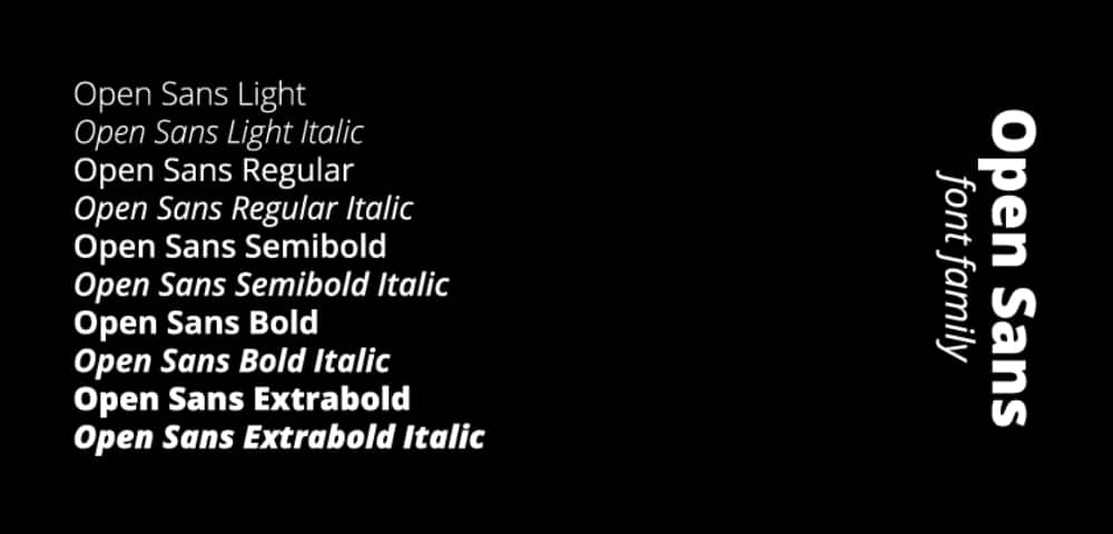
1. Open Sans
If you are looking for a font that makes your content more legible, you must try Open Sans. Its curvy and spacy design makes each letter of the alphabet appear user-friendly. Open Sans is the creation of Steve Matterson, a very talented and trendy typeface designer in the US. He designed it in sans serif, multiple weights, and three regular, bold, and italic styles. You can use this font to write print, web, and mobile content titles.
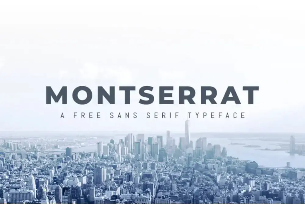
2. Montserrat
Inspired by old posters and signages in Buenos Aires, typeface designer Julieta Ulanosky decided to preserve this traditional design. Hence, she created a typeface and named it Montserrat. Montserrat font falls under sans category. It comes in 18 weights, from thin to extra bold and italic. You can use Montserrat in so many ways. Designers can use it for logos designs, posters, and branding as the letters in Montserrat look loud and clear. Additionally, this versatile font can be used for UI interface.
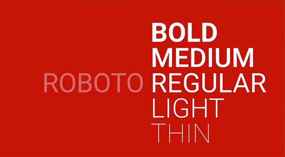
3. Roboto
Google fonts describe Roboto as a dual nature font. As it has a mechanical skeleton and the forms are essentially geometric. Roboto has a sans-serif typeface. Duality in its nature, Roboto looks friendly and familiar, and professional. It comes in four weights thin, light, regular, and bold. You may observe this font on Android and other Google services.
4. Playfair Display
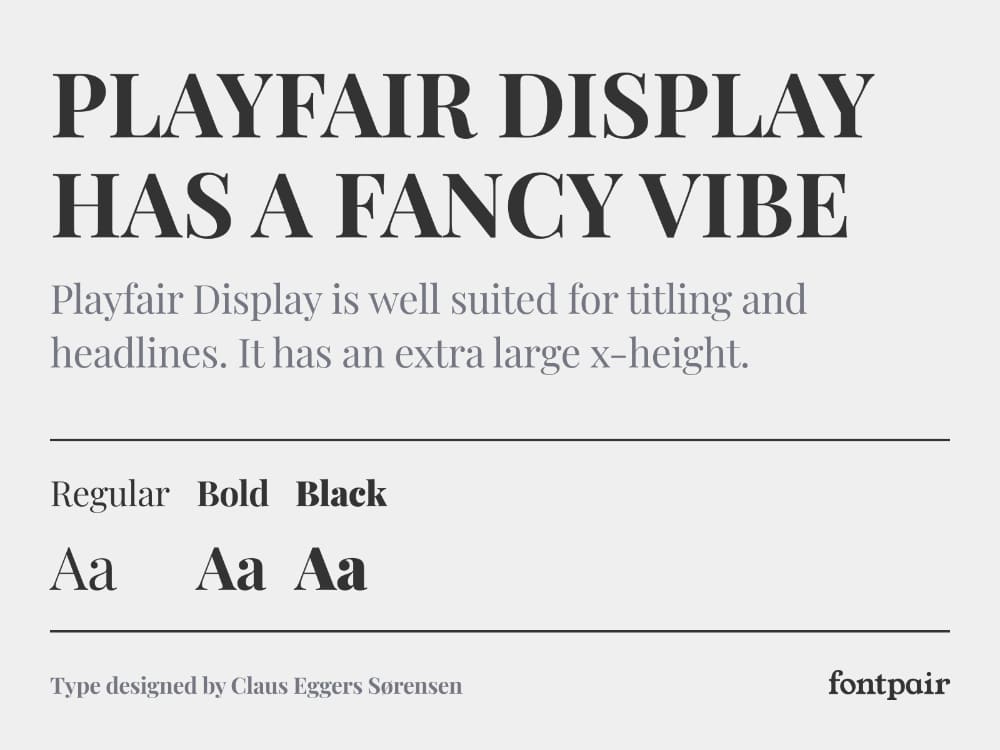
Remember writing letters in curves and pointy edges? Playfair Display is the font from the serif family. Claus Eggers Sorensen designed it. Small case letters in Playfair Display have large x-height and shallow descenders, giving them a transitional look. This font is best suited for titles and headlines of magazines and newspapers for print and online.
5. Lato
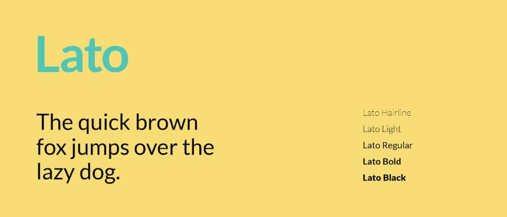
Lato is a sans serif font designed by typerface designers Lukasz Dziedzic. Lato means ‘summer’ in Polish. While designing this font, Lukasz wanted to create a transparent font in the text body but shows its original personality when it gets bigger. With a large x-height and broad shape, this font looks neat and readable even in smaller sizes. All nine weights are available in this font, from hairline to black, and each comes with an italic variant. Designers can use this font in various types of content. For example, it can be applied to text in videos, on website covers, and business cards for print.
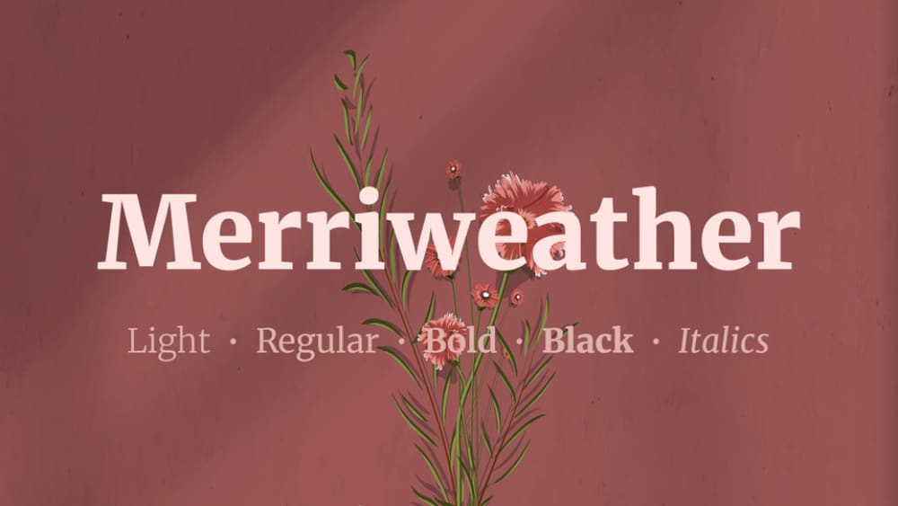
6. Merriweather
Merriweather font comes from Sorkin Type Co and is designed by Eben Sorkin. It is a sans-serif font with a large x-height and mild diagonal stress that looks wavy. Therefore, Merriweather font perfectly complements traditional and modern design styles. It is available in eight weights in Roman and Italic style. This font is good to read in small size better suited in body text. This font is most preferred for UI designs.
7. Helvetica
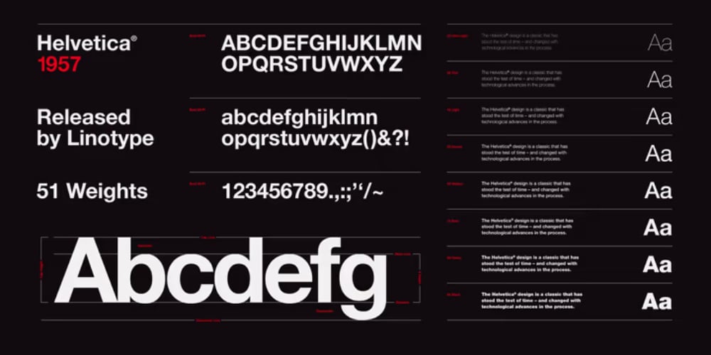
Designed by Akzidenz-Grotesk, Helvetica is a sans-serif font with about 100 variations available online. This font is quite popular among designers of most advertising agencies here in the US. This font was designed by a Swiss typeface designer named Max Miedinger in 1957, and its popularity only multiplied from then on. Helvetica font has a large x-height and small descenders, making it minimalist and refined. As a result, Helvetica is the most versatile font, which can be used any time of text content if used smartly.
8. Verdana
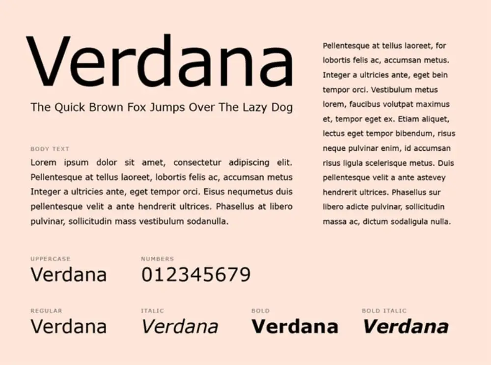
Microsoft commissioned Matthew Carter, a British typographic designer design Verdana, to design a font that is readable in small sizes on computer screens. Matthew designed it in a humanist sans-serif typeface with a large x-height and broad shape to make it legible in smaller sizes on screen. It is presently one of the most commonly used fonts for digital displays.
9. Adobe Garamond
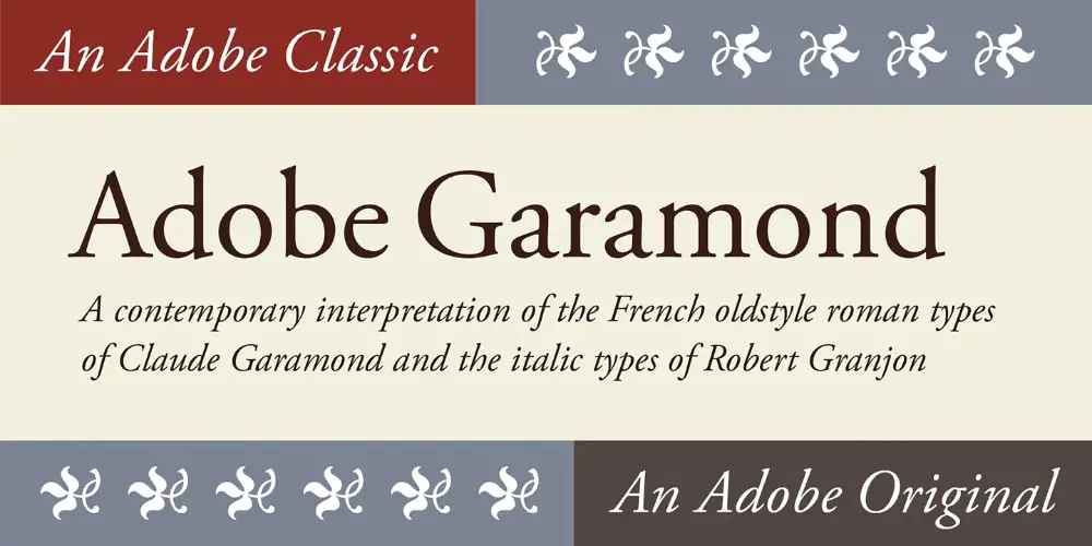
Garamond font is based on the work of french typeface designer Claude Garamond while Adobe Garamond is designed by Robert Slimbach. It falls in the category of serif style and shares similarities with Time New Roman. In addition, Garamond font gets pointier in the edges, making it look aesthetically classic. This is an Adobe classic font and can be used in a versatile manner.
10. Oswald
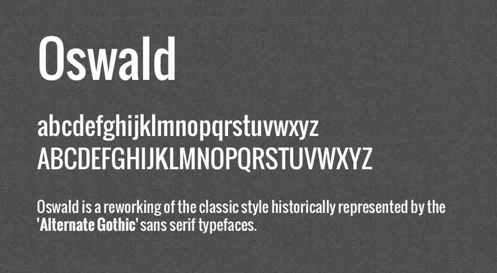
Vernon Adams originally designed this font. It is described as a reworking of the classic gothic typeface historically represented by ‘Alternate Gothic.’ It is classified in the ‘Display’ category. This font has slim and monolinear letters, creating quite a statement. Hence, it is widely used for tall and eye-catching letters for news headlines and online advertisements.
11. Quicksand
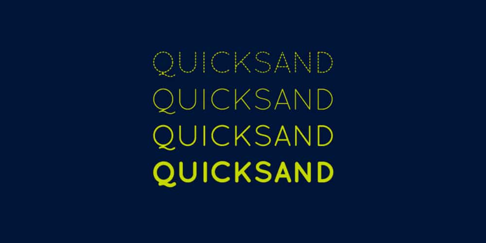
Quicksand is the type of font that can make your business card look way more professional than any other font. With lesser words and big size, this font can be used in documentary titles, website covers, logos, and many more ways. This font comes in seven styles, and each of them communicates simplicity and elegance.
12. Arvo
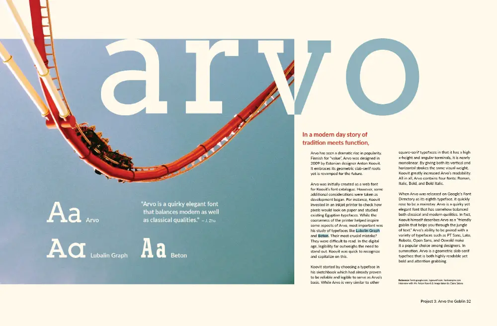
Arvo is a geometric slab-serif typeface designed by Anton Koovit. Letters in this font are flat and have equal visual weight on the edges, making them monolinear. It gives the essence of a typewriter print suitable for on-screen text. Arvo is available in 4 Roman, Italic, Roman Bold, and Bold Italic. This font can be used in designing website templates and text bodies of website content.
13. Josefin Sans
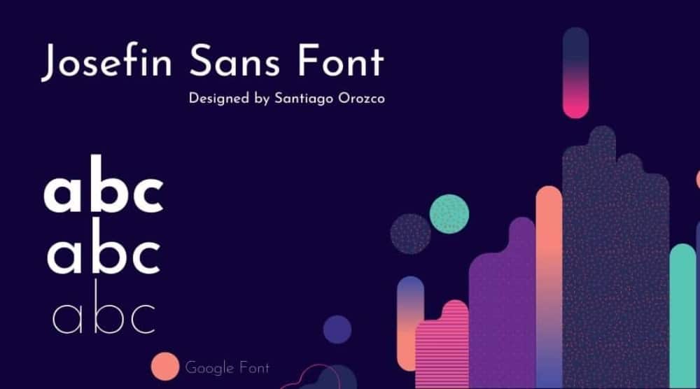
Santiago Orozco designed Josefin Sans to look geometric, elegant, and vintage. Josefin Sans’s distinct style comes from its x-height that falls way from baseline to cap height. It is available in multiple weights in Bold, Italic, and Regular. The good part is that this font is an amalgamation of many different styles. This not only makes this font unique but also increases its usability.
14. Bebas Neue
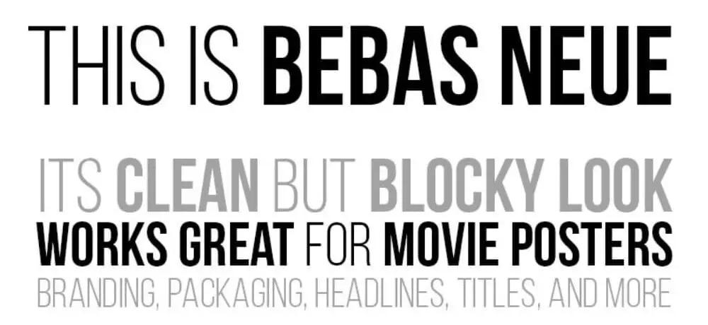
Bebas Neue is a sans-serif font designed by Ryoichi Tsunekawa. You may find a minor similarity between it and Oswald, but Bebas Neue is more about grace than boldness. Bebas Neue font is thin and clean, used for titles and displays. These qualities have made it the most popular and widely used font in the designing community.
15. Exo
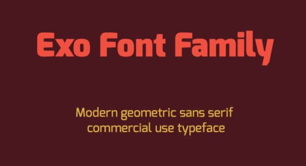
Exo can be categorized in geometric sans serif font. It has been recently designed to advance typography and let designers use it for future projects. It has nine weights in Regular and Italic for each. It looks neat and eye-catching helpful in creating websites covers, movie credits, and advertisements.
16. Inter
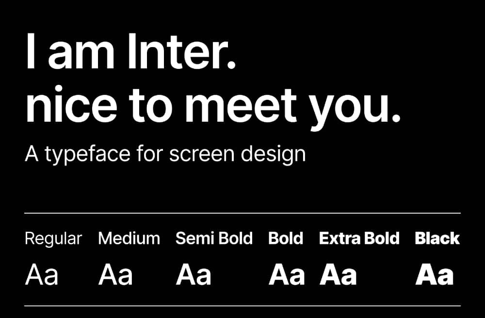
Rasmus Andersson is the designer behind Inter font. Inter is a variable font from sans serif. This typeface comes with a wide range of weights and styles. There are nine weights, each with italic counterparts, making 18 styles. Inter is a go-to font for most designers for its readability; letters in lower case and mixed cases have tall x-height and are slimmer than most sans serif fonts. Hence, Text body or titles, Inter’s decent features make it usable in every way possible.
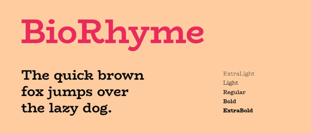
17. Bio Rhyme
Bio Rhyme font is perfection to class. Typographer Aoife Mooney designed this font in display typeface as an experiment. She wanted to check if letters were still readable with increased width. Hence, Bio Rhyme font has a wide width, diagonal stress, and slow curves. In addition, it has five weights to be used in large and medium sizes. Designers can use this font for titles as well as in movie credits. You can also use it on websites to enhance its aesthetics.
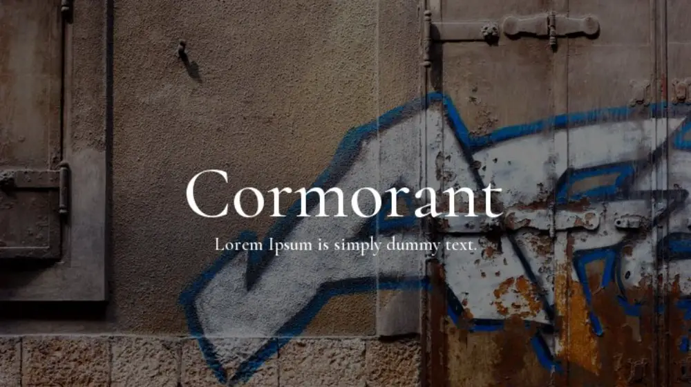
18. Cormorant
Inspired by the sixteenth-century types of Claude Garamond, typeface designer Christian Thalmann designed Cormorant in a display typeface. Although Garamond’s work was not his initial inspiration, he has already designed most of his glyphs. Therefore, he only took guidance from Garamond’s work for specific characters. Cormorant letters look sleek, spherical in shape, and classy in design. It is available in 5 weights, i.e., Light, Regular, Medium, SemiBold, and Bold, and about nine different visual styles.
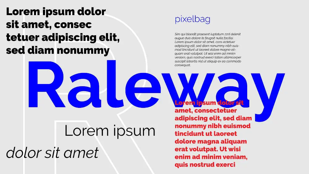
19. Raleway
Raleway Font is a font from the sans-serif typeface family. Letters in the Raleway look agile as if flexible, equal at turnings with high x-height. Matt McInerney initially designed this font and has been constantly evolved since then. Initially designed in one weight, Raleway now has 18 weights, including thin, light, regular, medium, bold and black. Designers can use this font to design logos, posters, shopping bags, and websites.
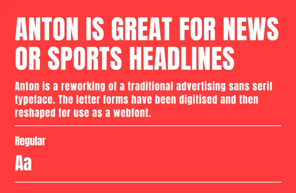
20. Anton
Vernon Adams designed a web font for a traditional advertising sans serif typeface. Anton font was designed with an extra-large x-height and slimmer fonts. This type of font creates a sense of urgency and seriousness. It catches eyeballs immediately. Hence, this type of font would work well on news and sports headlines.
Conclusion
The scope of digital news media and social media platforms will expand rapidly in the next ten years. This has increased the demand for fonts suitable for digital consumption but still retain creative value. Moreover, there is tremendous stress on fonts that carry larger legibility and less carbon load due to environmental concerns. Hence, web designers have to use fonts that are user-friendly and environment-friendly. Therefore, the web safe fonts listed above are curated, keeping both aspects in mind, and designers should feel free to use them.

Thank you for such helpful content. I’m just starting my design and using fonts from this list. Your insight is greatly appreciated.
This is a great article on safest and good looking fonts and what are different types of font style used to create an attractive web design as it hold an important reasons to create a good UI.
Thanks for visiting!