E-Commerce websites have the potential to be great income earners. Therefore building a site that customers love is the equivalent of creating a great retail space. Both take a lot of time and effort and rely a great deal on an understanding of how people behave.
Retailers may look at the aisle a customer travels and the spaces where he casts his attention. Understanding an e-commerce site means exploring how people browse the site, if they prefer muted colors or vibrant ones, and the purchases they make because of this.
While it is putting the website to test which will provide an accurate result on how the site works, understanding conversion studies will give you some great pointers.
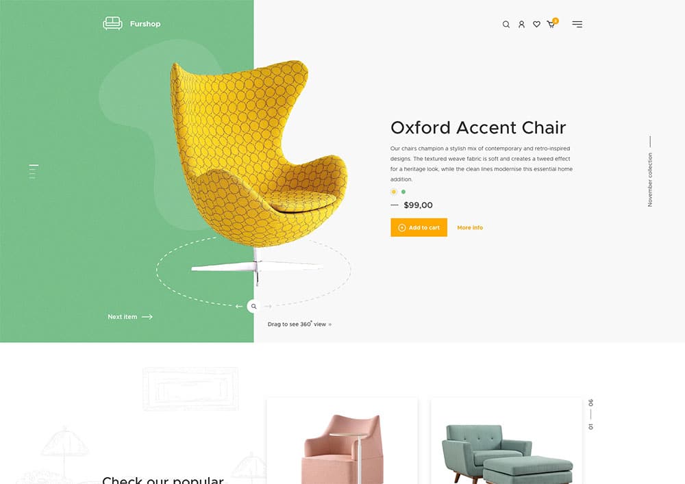
There are many e-commerce site design mistakes which could be easily avoided. I’m going to point them out so that you can exclude them from your own site designs. If you are making some of these mistakes, test your results after you have made some corrections. I am sure you will see a difference in your sales results.
Lack of clear reason to purchase
When you display a product on an e-commerce site, the goal is always to get your viewer to make a purchase. However, to do this, your customer needs to know why to buy from you instead of your competition. Do you offer better prices? Is your shipping free? Is your product unique to your site?
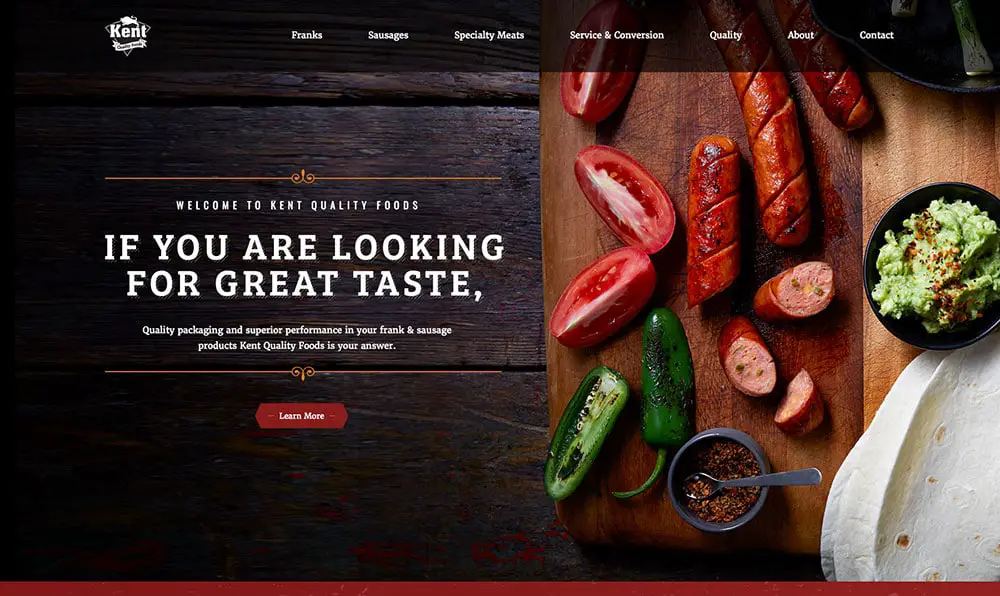
If your customer doesn’t know why they should buy from you, they won’t bother exploring your site. Without sharing your value, your customers could quite simply go to large online retailers such as Amazon, who provide a wide range of products at excellent prices.
As an online retailer, you will need your clients to know what you are selling and why it stands out. As a fashion retailer, for example, you could share that you offer local designs which uphold ethical standards and that your designs are unique.
Many sites don’t offer clients a reason to buy. Not only this, but badly organized sites may not even properly inform clients of what precisely is on offer.
When creating an e-commerce site, ensure that your value proposition (what you offer when compared to your competition) is clear and precise. You can also offer up photos or imagery if this will assist clients to identify with your products.
Offer up a brief heading or description of what you sell: ethical fashion at excellent prices.
Use your copy to create a description of what it is that you sell. A leather bag with space for a laptop, internal pockets which have spaces for your charger, wallet and keys. Genuine leather with brass hardware. Fully lined. A one-year guarantee. Emphasize the quality of your product.
You could also emphasize that you offer bonus services such as free shipping door to door.

Show an image of your product. This could include a rear view image of the bag which is being carried by a model, as well as a look at the bag from the front and the side. An interior photograph would allow customers to see the quality of the interior. The photographs you use should resonate with your viewers and create a feeling of desire within them for the product.
When people understand what you are offering and why they should buy from you (and not your competition) you will see an increase in sales immediately. Remember that clients may merely be browsing your site. It is your job to create a desire in them for the product you have to offer.
Lack of detailed product descriptions
When clients are online, they cannot touch or feel your products the way that they are able to in a retail store. The sensual experience of touching a jersey or inhaling the scent of a candle is missing in online purchases.
Likewise, your customer cannot look at the care or packaging labels. They do not know if a product has a guarantee, how it needs to be cared for, or how it has been constructed. Dress sizes cannot be accurately assessed without details.

You, therefore, need to give your clients as many details as possible in order to motivate them to make a sale. If these details are lacking, your clients may be reluctant to make a purchase. Without product details, you will only be able to compete with your competition on price.
Not having enough product details
Provide as much detail as possible. Share the measurements of your product, how much it weights, the materials it is constructed from, and the sizes and colours which are available. If you are selling a fashion item, give your clients a sizing chart so that they are able to work out which size will fit. Point out any care instructions your product requires.
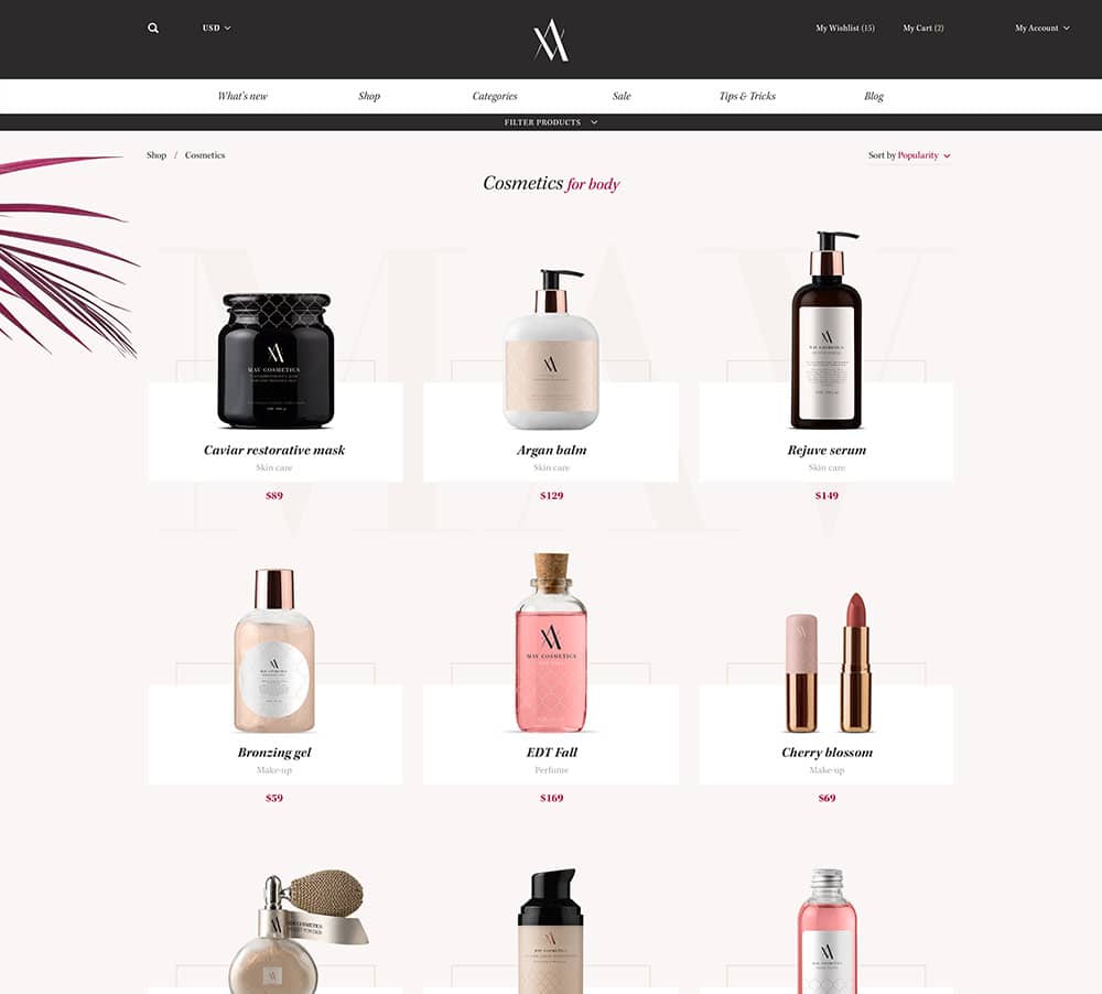
When selling products, use descriptive rather than technical terms. ‘A premium cotton shift dress made in a relaxed cut for easy wear.’ will appeal more than ‘cotton shift dress. Pleated style. White or Ink.” Describe your products with your client in mind.
Not having contact information
When your client has browsed your site and has found your products appealing, they will be reluctant to make a purchase if they cannot find your contact information. Hidden information may appear risky.
What if your product doesn’t meet your clients’ needs, and there is no way of returning it? What if they make a purchase and you are a fly by night company who will not supply the product?
By letting clients know how they can contact you (should they need to) and where you are based, you are showing them that it is safe to make an online purchase.
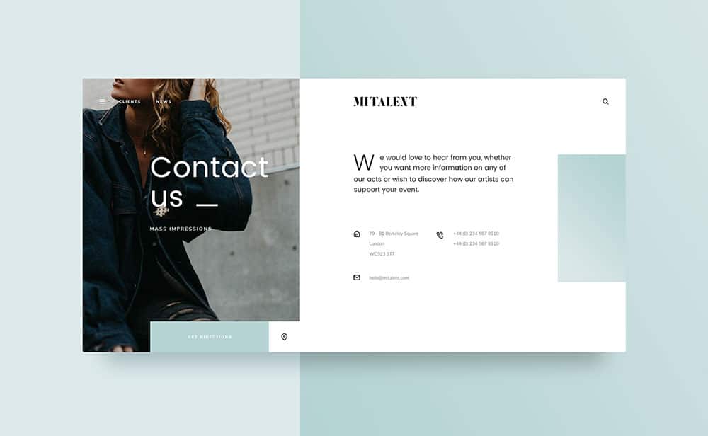
Place your contact information in an easily accessible space on your website! This could be in your header, in your sidebar or at the bottom of your page. As long as your client knows how to contact you via email, phone or residential address, there will be a high level of trust.
The higher the quality or price of the product you are selling, the more likely it is that your clients will require detailed contact information.
Avoid a confusing, long or detailed check out process
Many customers are happy to explore a site, but will often leave purchases in an online basket. Sometimes clients do this because the check out process is long and involved. Sometimes they do it because they don’t feel safe handing over large amounts of confidential information to a site. Sometimes they experience buyers remorse and wonder if they really need the product.
As a result, you will need to make it as easy as possible for your clients to complete their purchases at the checkout phase. There should be a few steps as possible between your client placing an item in his cart and actually paying for it.
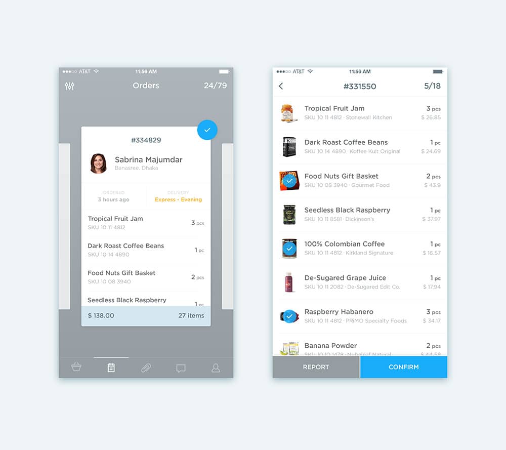
The ideal checkout process would allow a client to make a confirmed purchase using information which has already been submitted, or which could be submitted later on. Anything extra is an obstacle to making a purchase. Easy to use payment methods such as PayPal or Stripe, where a customer does not need to submit all his banking details, may also improve confidence in the site.
Avoid a cluttered site
Many website designers try to push as much information onto a page as possible. This is particularly true when it comes to areas of a site which do not require scrolling. When a viewer lands on a site, therefore, he often feels overwhelmed by what is presented to him.
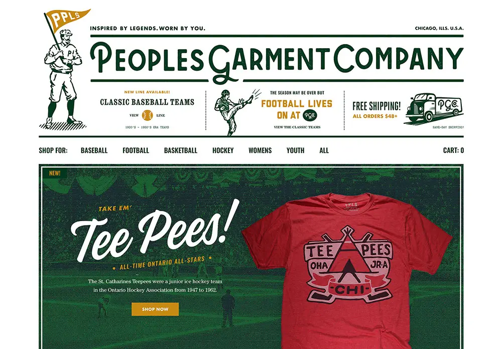
Many clients will naturally scroll down and find more information on a web page. However, when a site has too much information packed into a small space, the site will not feel simple or attractive to the client.
Make use of white space so that your site feels clean and fresh. This will enable your viewer to take in the information he needs and form a positive assessment of your site. You don’t want to demand too much of your customer while trying to encourage him to make a purchase.
Once you have displayed your products and convinced your customer that only your wares will meet his needs, you will need to guide him on how to make a purchase. This includes making use of a Call To Action button (such as add to cart). These buttons show customers how to make purchases on your site. If they are hard to find, your customer will be left in the dark and you will lose sales.
Instead of making your call to action button inaccessible, you need to ensure that it is the most visible button on your page. You can do this by keeping your button large, creating a vivid contrast between your page and your call to action, or using a bright colour. Keep your button in the upper half of your page (before your user needs to scroll) for the greatest impact.
If your call to action button is obscured by a large amount of copy used to explain the product, offer your customer a ‘read more’ button so that your button remains clearly visible. Use a unique colour for your call to action, so that it stands out from the surrounding copy,
Summary
Once you have created a great concept and designed your site around the products on offer, it helps to ensure your customers will buy from your site. The following tips are here to help you avoid some common mishaps which render an E-commerce site less effective. Keep these tips in mind when designing (or making alternations to) your site, and you’ll see an increase in sales.
Once you’ve constructed your site, remember to keep monitoring and evaluating your customer behavior. How do they respond to your site? Do they leave items in the shopping trolley? Do they browse without purchasing? The more you tweak your site to meet your customers’ needs, the higher your conversion rate will be.
