It’s candy apple and pumpkin carving time again. And in honor of my favorite holiday Halloween, I have rounded up 10 scary good orange websites for your inspiration. DID YOU KNOW? Besides being associated with Halloween orange is most commonly associated with comfort, warmth, creativity, fun, youth, enthusiasm, celebration and in website designs, this color is also associated with affordability.
It’s a fact: websites that use bright, bold and effective colors are the ones that stand out from the crowd and are remembered. We’ve done some research and looked for the most colorful and vibrant orange websites on the web, to inspire you in creating beautiful, eye-catching designs. Some have a bolder orange color palette, with almost no white space, while other use orange tones to highlight the most important elements in a page.
These vibrant orange websites are part of various niches, from portfolios, apps, businesses and more. You can get inspired and bookmark the ones you like most.
Check them out in the list below.
1) RIT: Minimal icons really make this homepage pop. Easy to understand just by glancing at it and the colors add to the professional feeling of the site. This example has a unique design layout. The menu bar blends in perfectly with the design concept, it uses dark textures and white typography. It also comprises the site’s logo, which is orange.
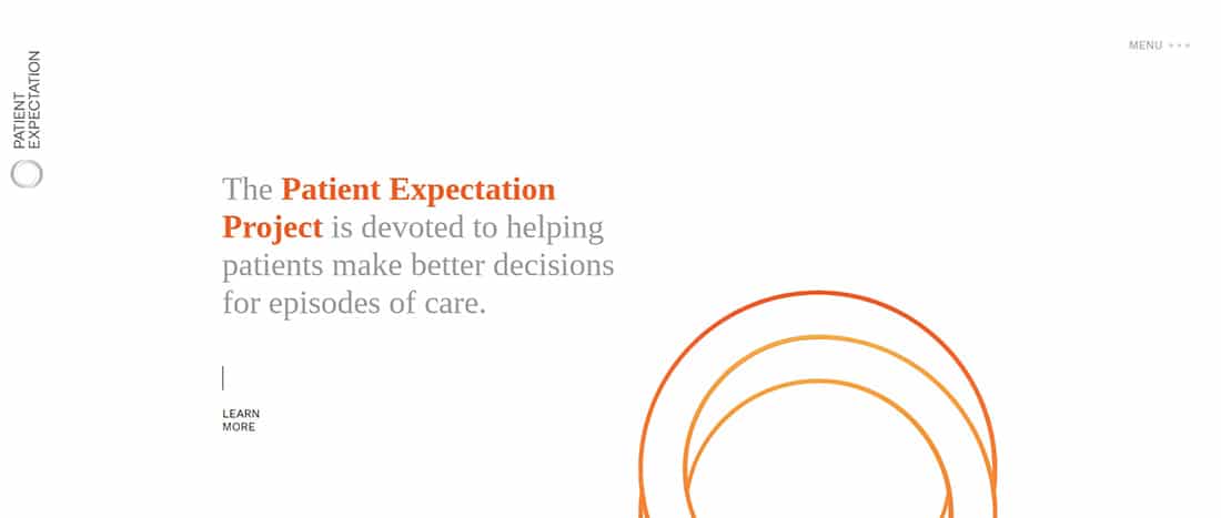
2) Patient Expectation: This is a great example of how to perfectly mix minimalist design with orange details. This website looks great and it focuses on helping patients make better decisions. This example can be a great source of inspiration so make sure to have a closer look. You can try out different colors on a similar design concept and see what comes out!
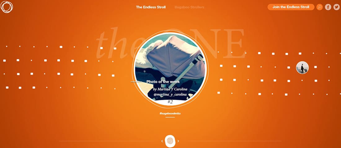
3) Bugaboo: This is an e-commerce website who sells pushchairs and accessories. This website’s design is based on orange gradients and details.
4) Reputation Radar: The use of these colors on this site gives it a retro feel. Mixed with the sketchy graphics and lines it creates a distinct and unique look. It also has a nice menu bar and an animated slideshow. This example is definitely worth following for future web design projects.
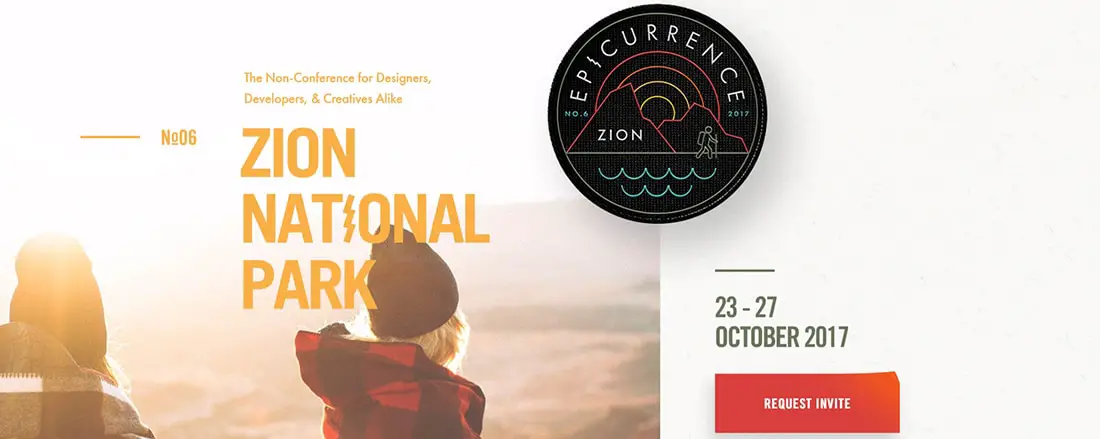
5) Epicurrence: Epicurrence presents an event which will take place in the beautiful Zion National Park. The event is in its 6th edition and proposes 4 days away from your desk. It comes as a break from your daily activities and it’s meant to get you re-inspired to create awesome artwork while also gaining life-long relationships. They also propose open discussions and adventures throughout the week. This unique experience is presented in this beautiful website. The website’s design concept is elegant and minimalist and it uses orange details and a similar color palette. You’ll love this website because of its elegant and simple design with vector illustrated elements.
6) Auberge Internationale de Quebec:
If you were thinking of spending your vacation in Québec, or if you were simply looking for some inspiration, this might just be the website you have been looking for. At Auberge Internationale de Québec, you’ll find the best prices. Their website has a friendly interface design. It is based on orange details and a similar color palette. Simple yet very appealing, this fullscreen website uses large, bold typography to spread its message.
La Lunetterie du Coin offers a large variety of good quality new and used frames. You can also bring your old frames and get a -70 € discount. This company has a really nice website which uses a cool flat design and huge typography. The website uses a simple orange background and a huge eye illustration and an overall simple layout but with very elegant details and a really cool slider.
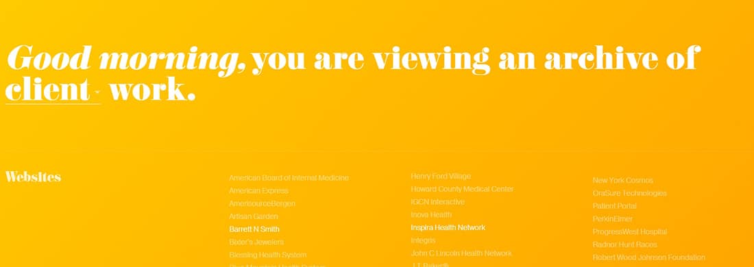
This website presents an archive of Jon’s work over the years. Jon is a user experience creative and digital artist who conducts usability studies and research. He also builds interactive experiences for his clients, digital art for mobile displays and much more. He believes that code and real-time data is a medium with which you can do a large variety of cool stuff, they can be manipulated, bent, carved and arranged into something amazing. His website surely proves that! It uses a simple light orange color and white typography. It might seem simple but if you’ll have a closer look at this website you’ll definitely be surprised by it and his work. This website is eye-catching, graphics and typography being combined in a very simple manner.

9) YMCA New Hampshire: This is a great example of how powerful this color combination can be. Although it has a simple design layout, the orange color brings out the black and white menu bar and typography and manages to create a very compelling home page. I also like how the orange is only used as an accent color and doesn’t overpower the text or the images.
10) Purple Orange: I love the added elements of grey on this site. They make the orange and black pop that much more. This example has a really nice orange logo placed on a vertical menu bar. It’s also nice that the menu bar isn’t perfectly aligned to the left because it lets you see more of that amazing background picture. This company’s motto is also great – It’s time to re-think PR – and it could work for any other industry because it’s always a good time to re-think the way we see things. Again, this another example of awesome navigation and a really neat user experience.
11). El monstruo If you’re up for a bonus example, check out Monstruo. Because it’s getting close to Halloween I couldn’t help but add a website with the black and orange color scheme but that incorporated monsters as well. This example focuses on raising awareness on children’s education. Enjoy, El Monstruo!
12). Colourpixel
Colourpixel is the online portfolio of Nag, a Web Designer/Graphic designer from Hyderabad, India specializing in web design, print design, identity design and more. This colorful website has a really nice design with some great header graphics and a unique, personalized menu.
![]()


There is something in this black&orange combination that makes powerful and professional impression.
If you want, checkout my website www.vedranstankovic.com It is also black&orange beauty 😉
Cool collection. Black and orange color scheme makes the websites look elegant and powerful. Thanks for sharing.