Web design trends move at a lightning-fast rate, and there’s always something new on the scene. It’s easy for designers to get carried away by the latest trends, regardless of how effective they might or might not actually be. As a whole, the web is a massive sample from which we can draw conclusions about what users like, rather than trying to guess or change the rules. Within that sample, web designers have a lot to gain by looking at the designs of especially successful web properties and reverse engineering their success.
The top ranking websites all have huge teams of highly qualified and well-paid designers behind them, with the goal of making visitors stay on the site, interact with it and come back often. It makes sense for any designer working on a smaller project to pay attention to what the goliaths are doing.
The goal is to create a sticky website visitor experience. You want users to stick around on your website as long as possible, which increases the chances they will view advertisements or make purchases. This maximizes the income per visit and is especially important when paid traffic sources are being used to create a return on investment.
Key Metrics
There are three key metrics that you can use to evaluate how sticky a site is:
- Bounce: Have you ever clicked on a website then immediately pressed the “back” button as you realize it’s not what you wanted? That’s called bouncing. Your bounce rate is the percentage of visits to your website that involve only one page view. You want this rate to be as low as possible, as this indicates that people are finding value from clicking around multiple pages on your site.
- Time on site: Once someone has decided to stick around, the next focus is how to keep them there as long as possible. A site like Netflix is a good example of a website that will have a very high time on site, as people will tend to use it for watching long form video content. Conversely, people may often go to Twitter whilst waiting for public transport, so the sessions there may be relatively short.
- Pages visited: This statistic gives context to the time on site. Are users actively browsing on the site or more passively staying to one page once they’ve found what they wanted? Generally, you’ll want a higher number of pages visited, as it indicates the user is interacting and interested in a wide variety of content on your site.
Even amongst the top websites, some truly stand out for incredible numbers. There’s a reason everyone knows about YouTube – the average visitor spends on average 21 minutes on the site and views 11 pages. DuckDuckGo has a remarkably low bounce rate of just 12.78%. Of course, the top sites do span across several categories, but looking at them as a whole, there are definitely some key tips any designer would do well to implement.
Front And Center
Sometimes designers try so hard to be different that they ignore a simple law which all top websites follow – they capture the attention of the visitor instantly with something bold at the top of the page.
This keeps people on the page for those vital few seconds that can make the difference between bouncing and not bouncing. About 57% of viewing time is spent above the fold, so it makes sense to always place your most compelling content in this area.
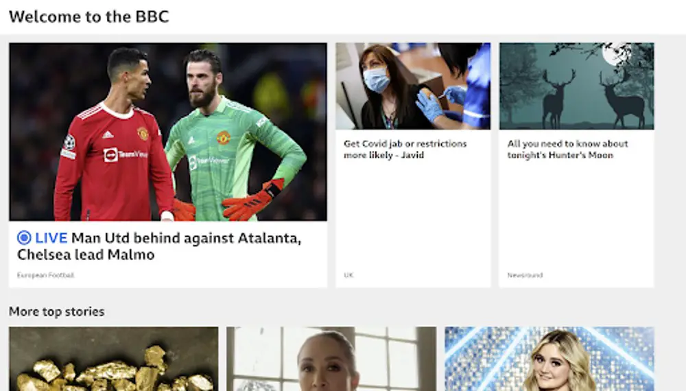
Top websites use a variety of design elements to accomplish this. News sites put the most viewed stories or breaking news at the top. You can see above that the BBC has chosen to put the main story as a soccer game featuring Manchester United. It’s clearly not the most important news story, but it is something that many visitors are interested in. If they click on the story, they are then more likely to click through to another page. The imagery is bold and of high quality.
Other sites like social media platforms rely on algorithms to suggest the most interesting post for the particular user. This is especially true for repeat visitors, where they have some idea of the demographics and habits of the visitor. The content feed is designed in a way that clearly highlights what’s most likely to be of interest and keep users engaged.
Show Recommendations
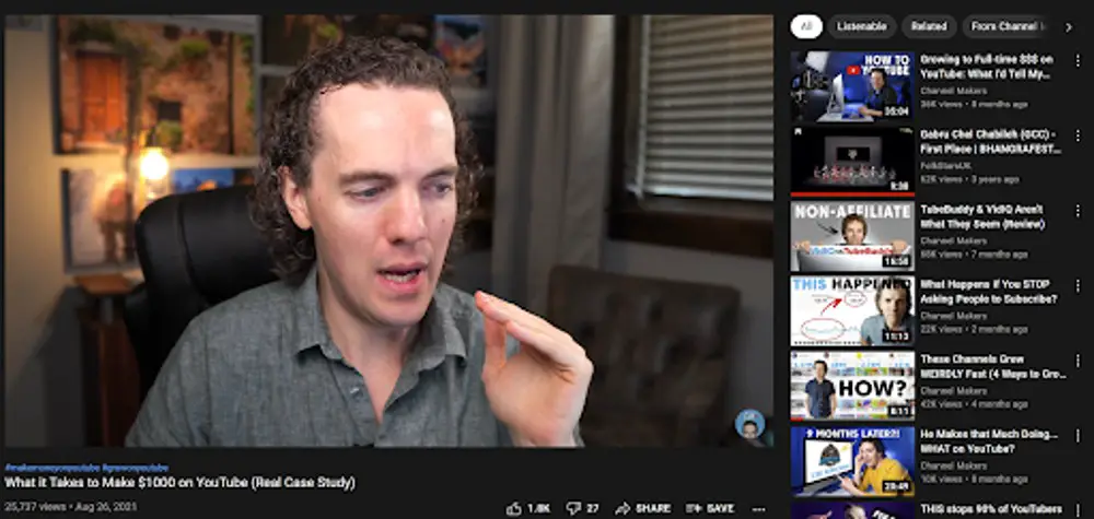
Another common feature that many top sites share is recommended content to the side of whatever content the visitor is currently consuming. YouTube is perhaps the best known master of this method, whereby every time you watch a video there are several similar videos in your eye line at all times.
This is why people often complain of disappearing down a YouTube black hole because they come for one video but then watch another 10! In fact, 70% of YouTube traffic is driven by recommendations. It’s exactly how they are able to maintain such a high number of page views per visitor.
This design tactic isn’t just for content-based sites, though. You can use the same strategy if you have a sales-based website, simply showing related products, for example. Amazon in particular does this well, and what’s clever is they do it just above the reviews.
So let’s say a user thinks they might buy something but after reading the reviews they decide against it. Instead of searching again in Google, they can instead browse the carousel of similar products which keeps them on Amazon and means it’s more likely the visitor’s money will be going to Amazon’s bank account.
Drive With Community
It’s no surprise that the sites with the highest average page views are social media-based. As humans, we have a basic need for community, and websites that can provide this can keep users on their websites for longer.
People love to scan topics of user-generated content in contexts where they don’t feel like they are being sold to or advertised to as much, as you can see in the success of Reddit, where people gather around topic niches and share content according to common interests.
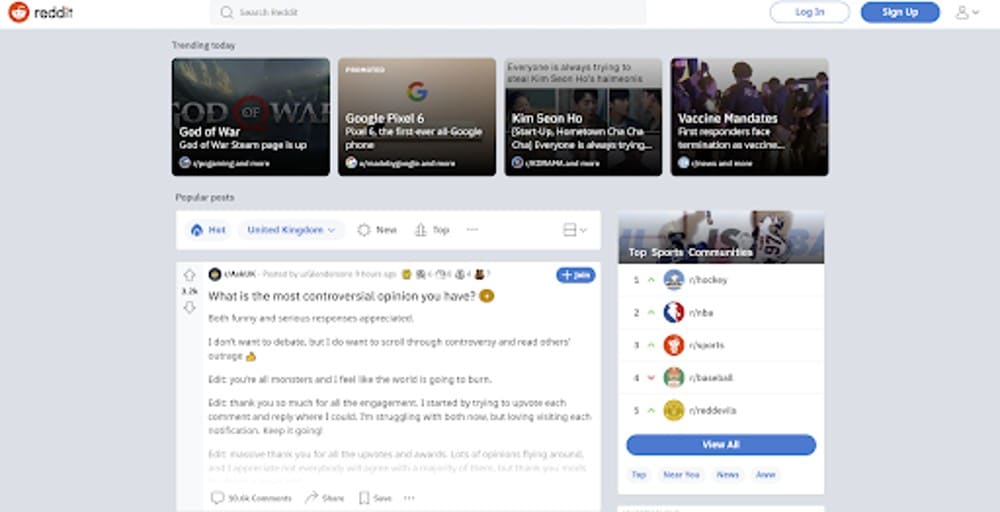
You don’t need to actually build a social network to take advantage of the power of community. Many sites will include review sections or highlight posts from their audience on their homepages. What’s great about sharing user-generated content is that the work for the business itself is limited.
You don’t need to worry about whether or not it can be maintained as it’s up to the marketing team to encourage user engagement. It gives an extra reason to stay on a site to see if anything has been recently updated.
Mobile First
Experienced designers can sometimes be stuck in the old paradigm of desktop-first when in reality, we are using our phones more than ever before. In 2021, 79% of all purchases will be on mobile. It makes sense for designers to prioritize this. That proportion, mind you, mirrors the Pareto principle, which tells us to focus on what drives 80% of the results.
If one had to make a hard choice, it’s better to allow the desktop design to have flaws than the mobile version.
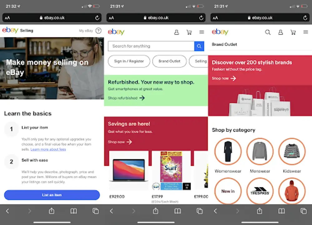
Even if a top website has its own mobile app, they still invest heavily in ensuring the mobile web experience is good too. You can see this clearly in the above screenshots from eBay, which has a beautifully simple UI that doesn’t feel cluttered but still allows visitors to do everything they need to do with ease.
This isn’t the desktop site squashed down to fit a smaller screen. It is specifically designed to maximize stickiness for a different type of experience. Make sure you’re giving the mobile design the attention it deserves and evangelize to any dissenting voices about the value by pointing to the numbers.
Don’t Reinvent The Wheel
Finally, browse the top ranking sites and realize how familiar they all feel. None of them are extraordinarily unique. Many fall back on solid interactivity design principles that have been around for decades. When your primary aim is usability then this isn’t surprising, and there’s a way most users prefer to act.
Take a look at Google and Baidu – it makes sense for them both to focus heavily on their own logo and the search bar, because that’s overwhelmingly why people come to their sites.
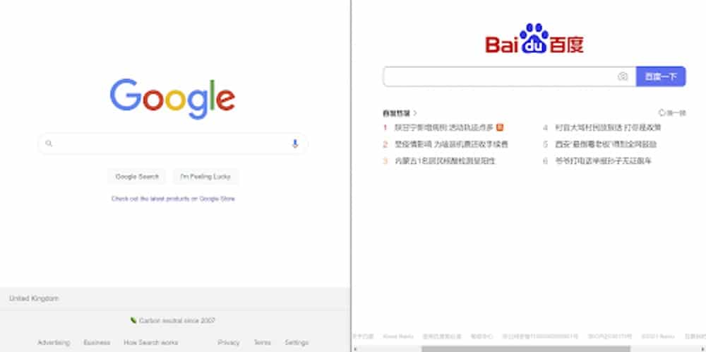
This isn’t laziness; it’s intelligence from the designers. Audience members get accustomed to common navigation patterns and will look in the same areas of different sites to find what they want. If they can’t find it where they expect it, they could get frustrated and go to another website instead. This is exactly what you don’t want. You want to do everything to keep them on the site and keep them happy to derive the benefits of the sticky user / visitor experience. By using similar designs, you’re exploiting the mere exposure effect, where we like things more when they seem familiar.
For example, you know the privacy policy will always be at the bottom of the page. You know the logo will be in the top bar, and clicking on it is likely to lead you to the homepage. You know if you click the hamburger button on a mobile site, you’re likely to open a longer menu. This all makes it easier for you to navigate, which makes your experience more pleasurable and keeps you where the site wants you.
Wrap Up
On your next design project, when storyboarding and coming up with potential ideas for how you want the website to look, make sure you compare with the top ranking websites, not just what bloggers recommend. It’s critical to make sure you’re paying attention to what is actually working rather than just the latest darling of the design community bubble.
These sites have very sticky visitor experiences which can lead you to higher engagement and more sales and advertising revenue. If it’s for your own business, it directly affects your bottom line, and if it’s for your client, then it’s a great way to keep them happy and prove yourself a good return on investment.
Source of top image: https://unsplash.com/photos/N8Pnhrcr73o
