Often, a website footer is not considered as important as the other content of the website. It is usually assumed that information that comes in the above fold section or before you start scrolling is more crucial. The truth is that the website footer contains vital information which a visitor might benefit from. Moreover, studies have shown that more easily navigable footer designs may increase the number of customers and increase revenue.
Whenever you design a website footer, the vital thing you must keep in mind is that the design must be mobile optimized. Reduce clutter, and always design columns for related links. The navigation should be implemented appropriately, and you should observe proper color contrast. Here are 10 things you should stay away from when creating the perfect footer design for a website:
1. Cluster of Designs:
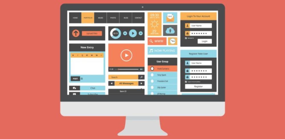
Yes, do not overload the websites with too many designs. Overloading is one of the most important things to avoid with designing a website, not only the footer but also any section. Adding too many designs would only overload the footer. Overloading footer would result in straining. As discussed, most of the viewers scroll down to the footer even before the elements gets loaded in the header and body sections of the website.
So, remember, no viewer would want to view a website with a footer which gives pain in their head. Yes, if you clutter the website with too many designs, it could only result in pain for the viewer. Hence in no time, the viewer would leave and would not want to revisit the website. Hence, keep the designs presentable and straightforward yet creative.
2. Choice of Colors:

Avoid using multiple colors in the website footer. Colors play an essential part, too while designing a website. As footer is one of the most visited sections of a website, please do not load it with harsh or too bright colors to grab more attention of the viewers. If you keep bright colors, it could strain the eyes of the viewers; hence they would not want to look on it again. This would lead to the loss of a viewer.
As a viewer spends more time visiting the footer, you should be very mindful while selecting the colors while designing the footer. You must choose soothing colors, which the clients get attracted too by leaving them a choice, not to leave this section as you have essential information for them about that website. Be careful while choosing the colors for designing the website footer.

Just because the footer is the section where the viewers spend their first initial time while checking out a website, it does not mean you should overload this section with too much information. If you keep this section overloaded with information the footer would change into a body in the bottom part of the website, and this is not the purpose of this section.
Firstly, do not forget you have limited space in the footer, and it is not meant to be cluttered with excessive information. Too much information would create a cluster in the footer, and the chances are high that the viewer would get confused. No one likes to get confused, and if it happens, they could lose their interest in further going through the website. And this would be the failure in designing the website.
Give yourself a good time to decide what is the essential information, that is more likely to be viewed by anyone.
Moreover, how the information can help the viewer to explore the website any further. The information should be mentioned briefly and objectively. There should be enough free space to make it easier for the viewer to check them and lead them into surfing the website.
Hence, it is essential to identify the proper information that must exist in the footer.
4. Incomplete or Incorrect Contact Information:

Keeping contact information in the footer is a good idea. But as you have minimal space in the footer to accommodate all the information, it is a limitation many times that you cannot update every detail in the footer though it is the contact detail. More information would lead to not utilizing your major area in the footer. Just to cover up space, you should never turn to add incomplete or incorrect contact information.
The website footer is one of the most crucial parts of a website. While designing the footer, you must make sure the information added to be correct and useful. When you add information in the footer if space found is less to fill the information, make the text shorter to finish it up and not leave the information incomplete.
5. Pop up boxes:
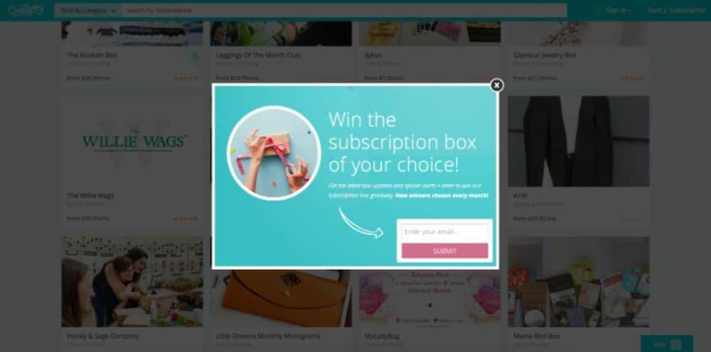
The pop-up boxes are part and parcel of the website footer. The one crucial thing you must consider is there should not be any pop-up boxes except for a chat box.
A chat box pop-up is a must for the visitors to solve the queries instantly and guide them. Any other pop up boxes can be annoying for the visitors as it can interrupt their attention to the other content of the websites.
6. Advertisements:

Advertisements in the footer of your website can be a real turnoff. As the website itself is a reflection about the brand, there is no such need to show the extra highlights of the brand.
Similarly, footer must not be considered as a space to showcase advertisements of the brand to get more attention. Advertisements in the footer of the page are not necessary as it is useless. Social media is best for the advertisement if at all the marketing is needed. The visitors come to the page for the information, and if they need to get into contact or put an action further, the website navigates them accordingly. The advertisements are indeed an inconsiderate part of being kept in the footer of the website.
7. Hiding important information:

Before any information is to be fixed on the page footer or anywhere else, the importance of the content must be rated. The contact information is a critical content which needs to display exclusively, and if kept in the page footer, it may not be visible.
The site design and the prominence of the footer would only make sure whether the content displayed would get the proper attention or not. So, before you move the contents around conduct a usability test. Hiding the necessary information due to inadequate space would be a wrong practice, so the content short. The contents must segregate to as per their importance at different levels on the page. Hiding information is the last thing you must do in the footer.
8. Over Optimising:

If you need a useful Search Engine Results Page (SERP), then optimization is necessary. But over-optimizing is not recommended as it is not a shortcut for good SERP.
Many brands tend to stuff the keywords in the contents and use the exact keywords as anchor text in the footer. Such practices are kept an eye on by Google, and such pages or brands can see their rankings drop consequently. The major part is to keep the quality and targeted content for the footer and not to stuff them with keywords unnecessarily.
9. Miscellaneous links:

The footer of the page usually consists ‘About’, ‘Contact’ and ‘Help’ which settles nicely at the end of the page. The footer used as secondary navigation can help navigate the visitors. The links to the essential services, product categories can be set in the footer.
The crucial thing you must take into consideration is not to pile up things in the footer and treat it as the bottom drawer of your desk. If you think the website doesn’t match with your footer and unnecessary pile up has done, you can consider whether it is needed or not.
There are chances that when the brands evolve, the content used to align might not now with the website. Whenever any link based on the page has nowhere to go, don’t paste it in the footer just take time to evaluate whether it should exist or not. Reconsidering the contents that need to exist in the website footer would help the footer to look good.
10. Afraid of space:
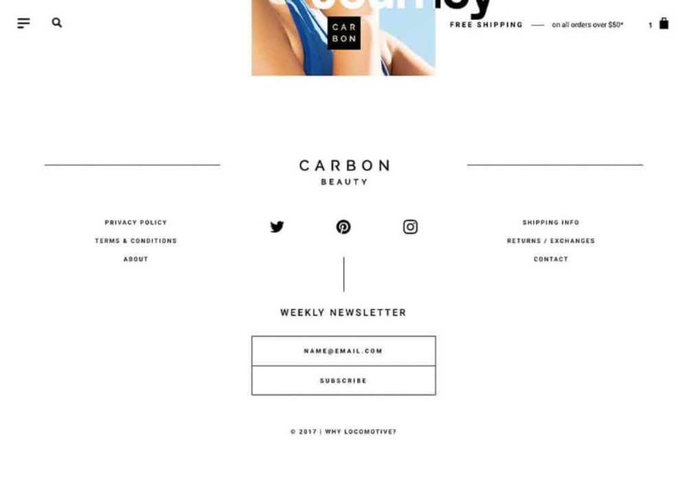
The footer on your website is a crucial element. The entire webpage had to be systematic, and the same must be the footer. The newsletter signup, links and social buttons must not clutter the space in the footer. You should not be afraid of space, as it makes the essential elements look prominent. With proper space, the footer can look as important as it is on a webpage.
It would be a wonder to many of you why so much thought for designing a perfect website footer is worth discussing. The reason behind being there is website technical and legal information, website navigation, SEO and security and credibility included in the footer of the page.
Also, while designing website footer, there are three primary considerations – content, aesthetics and structure. Also, one of the most critical aspects is copyright information. An easy way to protect your website from plagiarism is by keeping the copyright in your footer. With a little coding, you can also change the copyright year to the current year.
There may be many elements that need to consider while designing a website footer. Don’t ever be confused about the content to use in the footer. Moreover, never just pile them up with all information. A website footer is the primary focal point for website visitors. Hence it must not be cluttered like one of your old cupboards. Before placing the contents in the footer, get rid of unnecessary links by focusing on the relevant information.
First, sort the categories, and put information under those categories. If you find the information that doesn’t come under any heads, then it is probably not needed. The critical information must not be hidden in the footer. The attention of the users tends not to go there. The footer is the reflection of information that you may find nowhere else on the page. Always let go of the practice of over-optimizing the website footer for SEO as it’s not worth recommending. Google is tracking the stuffing of keywords in the footer, and in a short time, you’ll see the ranking of your page go down gradually.


nice post
Thanks for an informative piece, I’ve always struggled with footers and never end with something I’m satisfied with.