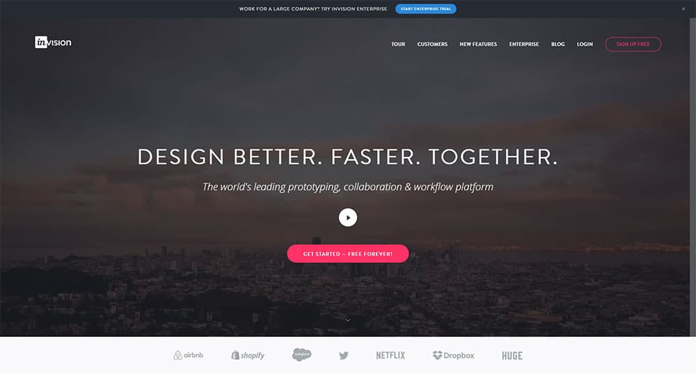
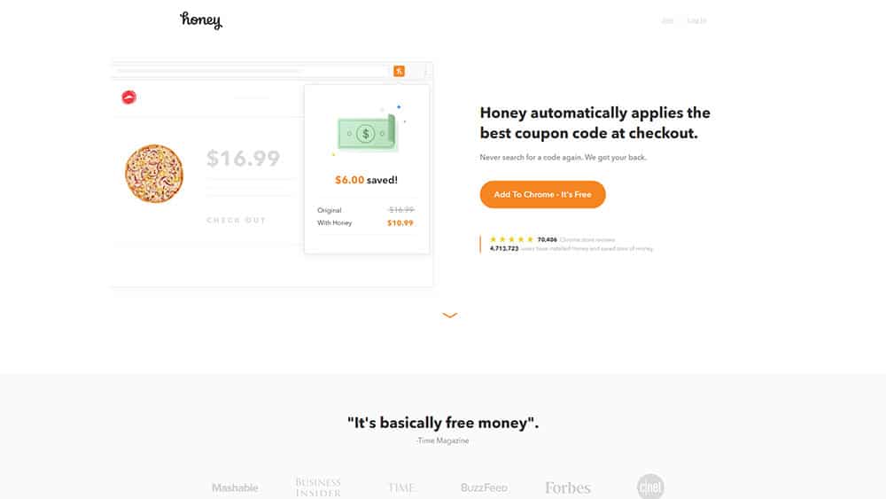
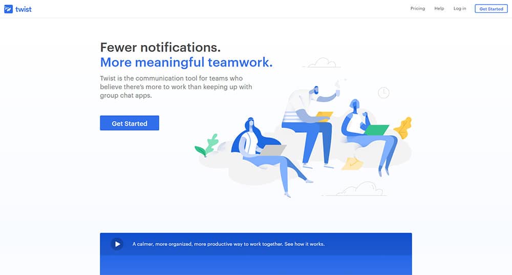
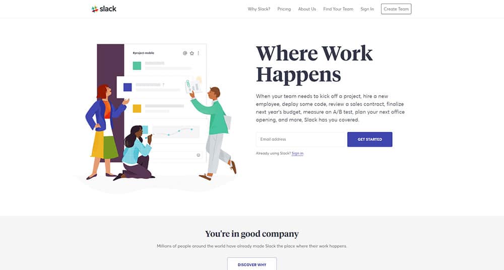
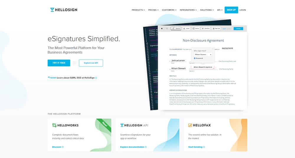
In the state of communication, there is a pretty visible change, a cultural shift.
Attention spans are getting shorter, and that 140-character tweet is now getting ahead of the long-form. The 10-second Snapchat is getting popular. Sure, all of these things have a downside, but their impact is hard not to be noticed.
In terms of web design, this is all about the landing page. Shorter attention spans mean that when today’s visitor gets to your website, you have just a couple of seconds before they already have an impression, and that impression may not always be good.
What’s actually a landing page?
A landing page is the page which encourages your visitor to do whatever your website wants them to do. It is a landing page design which only has one goal.
For example, you may want to display a product for sale, or to get him through some specific sales funnel.
Creating a compelling landing page
You’re getting traffic, but there is something due to which your other numbers seem to be pretty stationary.
Do you throw up your hands and get to a decision that your marketing is wrong? Don’t rush it. First, take a look at what users do when they go through your ads. If your landing page isn’t good, you might land a big user on it, but keeping him there will be tough.
Your goal isn’t to get visitors. It’s to get them to take action when they get to your website. To get a landing page that converts, you want to make things easy and compelling.
How does the landing page work?
You can use a landing page for a variety of purposes, but it only has one function, and that is to trigger a response. And that response should either be take action or leave.
If you’re a good salesman, you already know that “maybe” isn’t really an option. Leaving the table with “I’ll have to sleep on it” or “Maybe” isn’t a good choice. It’s either a “Yes” or “No”, and that is exactly what a good landing page should get you. A “Yes” or a “No”.
A few design strategies that will help you build a good landing page:
Judge the book by its cover
Yes, this is the complete opposite of “Don’t judge a book by its cover”. However, that is exactly what most of your online users will be doing.
Your landing page is more or less the equivalent of a book cover. It might be a striking visual and a single line of text, but these two elements should convey what your product is about, and build anticipation with the user.
The microsite and its power
A landing page should be everything to all visitors. However, a microsite can give a highly targeted audience a specific subset of information.
A multi-page user experience can deliver campaign-specific, or topic-specific content, rich content. A microsite is the perfect solution for a complex solution or product, and it’s very effective with “upper funnel” keywords and converting them.
Make sure your headlines connect with visitors
The headline is the first thing your users read when they get through to your promotion. This is why this is your best chance of making an impression. Below are a few things that might help:
- Keep the message consistent with your promotional e-mail, so prospects instantly know they’re at the right place.
- Tell them exactly what they get, and state your offer’s biggest benefit.
- Be clear, not cute. Clarity trumps persuasion.
- Create a sense of urgency, for example, a deadline. This always helps with the response.
Have your landing page include “power words”
Your customer’s voice in your landing page gives you power.
Combine this with “power words”, and your pages will be almost unstoppable. Using “power words” is about structuring your landing page in a way that will appeal to the emotions of your users, and not just about careful phrasing and choosing certain words.
Sharpen your hook
If you do end up with a lot of copy, your hook’s quality is what determines whether your users hang around to get the longer message, or not.
A lot of copy isn’t really recommended, but in certain situations, it is necessary, and the hook should get your visitors closer, so they convert.
Create a voice, and reveal an important aspect of the story. If you do the same with your landing page, it makes it much easier to differentiate your brand from the competition.
The hook doesn’t have to be a written one, and it is much more than a witty opener.
The goal is for your landing page and all its elements to establish a voice for your brand.
A good hook will convey your position to the visitors’ minds in a much more powerful way than any claim can. There is, after all, a reason why first impressions are so important.
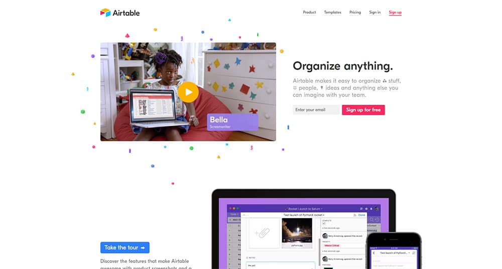
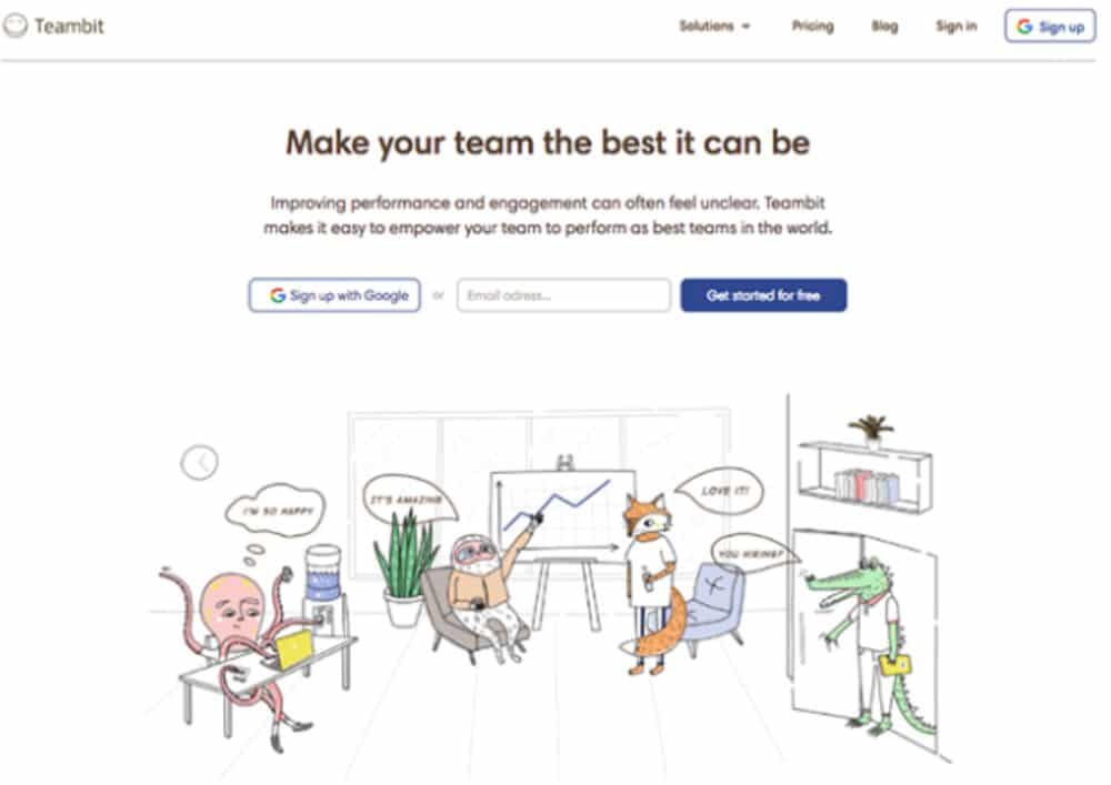
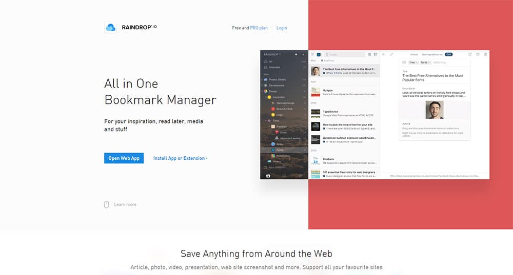
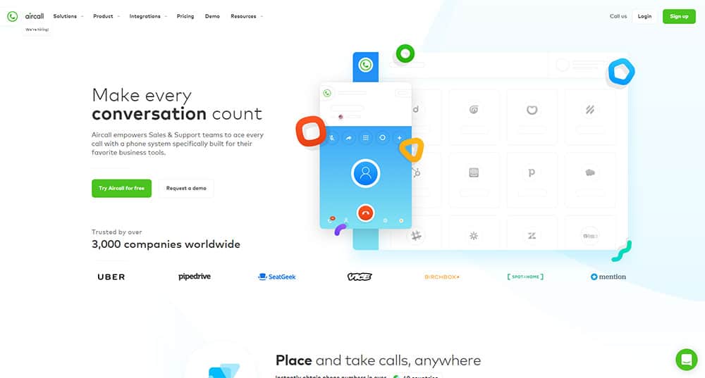
A really good source of inspiration is represented by startup websites. Successful startups tend to do it right. And they don’t stop until they get better and better results. This is why they often change their landing page along with all the elements in them.
Have a video on your landing page
If you want to get a complex idea through to your visitors, and not have them get overwhelmed with text, video is the way to go.
Video is a great way to reinforce your branding and messaging, and it is very powerful when used in the correct way.
Progressive Conversion
Progressive conversion will recognize and admit that users may need more than a single interaction with you before they convert.
This can be done either across multiple visits or in a single session.
Create a moment, and hold it
Unlike a novel, where you actually have time to build up everything, a short story relies on emphasizing a revealing moment. You have a short story with your landing page, use the same mindset.
Instead of trying to explain everything into details, use your visuals and text to focus on that one moment, one idea, that your service or product should be associated with. It might be a very important benefit, or a piece of user experience, it is up to you.
Keep “eye-tracking” in mind
The layout of your landing page is important. It should use subheadings, white space and your graphics to lead the user’s eye to what you have to offer. Below are a few tips on this:
- Varying font sizes get attention – the biggest fonts are usually read first
- Use two or three colors to highlight the important text, not more
- The design is best kept simple – use one column, not two or three
Constraints stimulate creativity
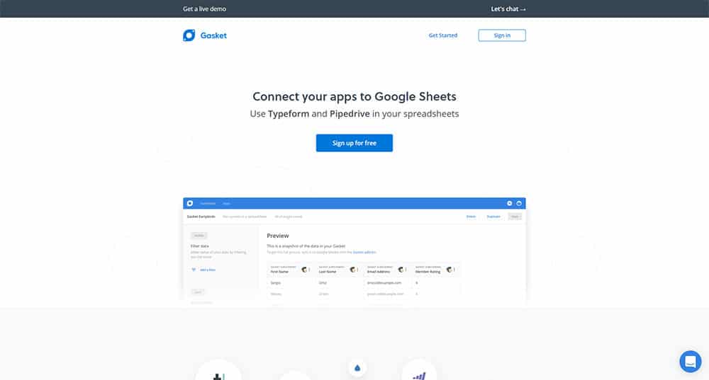
The fact that every visitor comes with a short attention span isn’t really that damaging.
Any designer will tell you that more constraints get more creativity in order to find a solution, and the same applies here as well.
When you have to present your brand with a combination of key visuals and a little copy, you will think hard about your unique selling proposition, and make sure your brand is presented in a focused fashion, with things that help you stand out.
The technical aspect is very easy nowadays, and you can go with “less is more”. Therefore, you have a lot more time and freedom to brainstorm what really matters, which is your brand and how you can represent it as quickly, and as simply, as possible.
Why you shouldn’t neglect a high quality landing page
Digital marketing isn’t something simple, and when you want to figure out how to build an e-mail list, understanding how to design a landing page should be one of your priorities.
There are a lot of strategies that online business people have available for assistance with marketing. However, whichever methods you opt for, a high quality landing page is always a given.
A landing page will get you that e-mail list, and it will also drive leads and sell your products online. Why? Because their one and only goal is getting the visitor to do a single action, and nothing more.
