The app icons or mobile app logos are the small pictures that represent an app on mobile platforms. It represents what the app is about, generally by using a standard logo that uses the app’s first initial, or an illustration that portrays something relevant to the app, or a pictorial representation too at times. As a designer, you have to ensure that the app is noticeable from the crowds of millions of apps available on different mobile platforms. Well-designed mobile app logos help portray the app to be of high quality, authentic and professional. It also helps make the app feel reliable and safe to potential customers. A low-quality logo generally gives off a feeling of a malware or a spam application, or also a fake application that evokes feelings of fear and distrust among the mobile users.
This is why it becomes important to know how to design a great mobile app logo for a strong and impressive first impression for the mobile app among potential customers. For this reason, we’ve catered a list of 13 essential steps for the ultimate guide to designing a Mobile App Logo you should consider before creating your next logo:
1. Understand the platform requirements:
Mobile app platforms are million in numbers, spread across multiple platforms. It is important to understand the different platforms available for developers to develop their mobile apps, as each platform uses a different set of guidelines a designer needs to follow for creating the app logo. Some of the popular platforms are Google Play from Android and the App Store from Apple. Both have a different set of guidelines which need to be kept in mind before designing icons for both of them. This ensures the icon is pleasing to the eye and utilizes the graphical interface of that operating system in the most optimized manner possible. One way to do this is familiarizing yourself with the icon grid samples for different platforms from Photoshop and learning in-depth about the operating software you are dealing with.
2. Cater to the Audience:
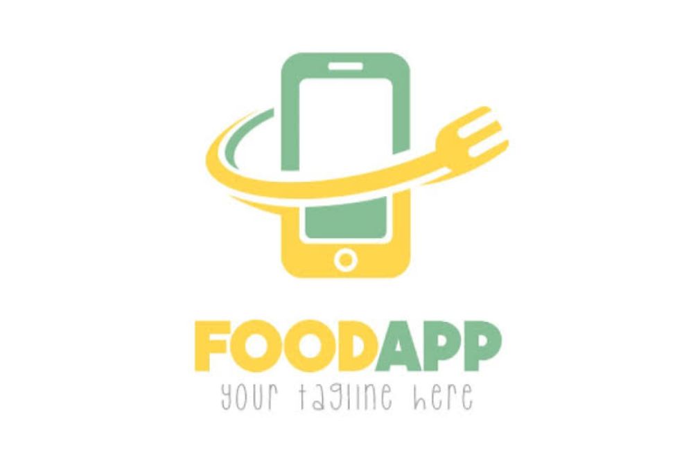
The logo of the app has to be in accordance with the utility of the app that it’s been created for. A food delivery icon for a restaurant’s app might not work out to be the best, as it would be creating a false image in the mind of the audience, providing them with false information. Hence, make sure whatever app you’re catering to; you know the services provided by it in great details to avoid such confusion. Also if you’re making a logo for an international company, you need to keep in mind that you use a logo that is universally acceptable and doesn’t offend a part of a country or religion or anyone’s sentiments. Hence different factors affect the level of cautiousness you need to keep in mind while designing a mobile app logo.
3. Stick to the original size:
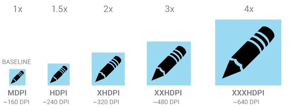
You might have the guideline down when you start creating your logo, but it might feel to be too small to work upon and design the logo. For this reason, you may consider designing the logo on a larger canvas and then resizing it to the original size for convenience and better results. However, this habit is discouraged because an icon that looks good in a relatively large size canvas may not look as good in the original size when resized as the size constraints might bring the elements closer than desired, and create a clutter which wasn’t seen in the big size icon. The entire challenge is making a logo in the small space available in a way that the text and the icon are clear and not ambiguous, which is why even if it’s a bit difficult the designer must always edit and design as per the guidelines size only to ensure that the final app logo looks exactly as what it does during the development stages.
4. Clear the clutter:

We understand that there might be many elements that might add value to your logo design in your head. However, you also need to understand that it’s a constrained space where if you add many elements, it would create clutter and create more ambiguity and confusion as to what your logo is talking about. Taking a minimalist approach here helps over maximalist most of the times as the logo becomes easily comprehensible and simple to look at.
5. Check if the logo looks good across backgrounds:

Generally, designers forget to put their design through this essential test. When designing a logo, they usually check how it looks on either a black or a white background or both at times. While it is understandable why they would think this suffices, it doesn’t. The reason is, the mobile users don’t generally stick to the two colours for wallpapers, mobile phones are highly customizable and personalized, and hence they can use wallpapers of any colour, any gradient or even pictorial wallpapers. This makes it very important for designers to check their logo design across many forms and colours of wallpaper to ensure its visibility across all colour wallpapers, and also looks aesthetically nice in all.
6. Use minimal text:

No matter what font you use, the text is going to be small in size and hence it is going to be hard to read. Moreover, even if you come up with a great text-only design as well, you’ll have a limitation of localization of the app when you try to outreach it to other markets such as Korea, China and more. Instead of using much text in the logo, you could use the first initial or an acronym of optimized length if the name of your application allows you to do so, which won’t only look less cluttered but also could act as a great logo option. Having said this, try using fonts that are easy to read and not very fancy because that only creates further complications and difficulties.
7. Don’t use actual photos:
You might want to use actual photos for your logo design; however, there is a big taboo about this practice. It just doesn’t seem right in terms of mobile app design and generally throws people off, because it doesn’t look very suitable for mobile app design. If you’re keen on giving a picture like an effect, then there are many photorealistic icons that you can refer for inspiration and create one for your logo, however, using an actual picture is an absolute no.

Generally, any icons that depict what the app is all about, or what is it meant to be used for easily to its potential customers, is considered good. Your icons should be such that the potential customer shouldn’t feel the need to read the description that comes with the app to understand what it’s for. If you notice, a music player generally uses notes, instruments or visualizers to showcase their logo, which makes it crystal clear it’s a music listening application whereas cameras also generally use lenses of cameras to showcase the utility of the app that is to click pictures.
9. Keep an eye on the Competitors:

Always see what competitors in the market, making apps in the same segment as you are doing for their logo. How is it being perceived by the audience and how is it helping the app get downloads. Many times studying the competitors can help you have a test study without any risk as to what design elements work and don’t. You might come across some design element you might have thought of adding to your logo, but when you see it being used in some other app, you’d realize it doesn’t look as you visualized it to be. If there is an app that gained absolute popularity in a segment that your app falls in, use its key characteristics but add your twist to it, to draw benefit from the most popular association people have to the logo of that field and provide something more.
10. Avoid using too many colours:

Once you start adding colours to your logo, it gets tough to stop. Often too many colours throw off too many different vibes to the audience, and it looks distracting and weird. Hence it is ideal for sticking to two or three colours at the most for your app logo design. Such colour contrast of duotone or three tones help create a design language for the audience and makes it easier on their eyes to perceive your logo. It looks aesthetically nice, especially when you use complementary colours from the colour wheel, and the design doesn’t look overwhelming but rather simple and clearer to comprehend.
11. Recognizability test:
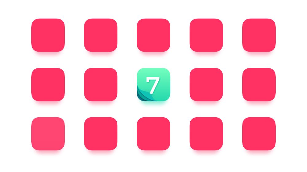
You can take care of all the important aspects and guidelines while creating your mobile app logo, by using minimum text, clear and sleek design and much more but all of it goes to waste if your icon isn’t instantly recognizable from the crowd on the first look. This is why it becomes important and also comes in handy to put your app logo through a recognizability test in your targeted market. For this first layout, different app icons of the targeted category apps in a selected grid, say 5 by 5 as many phones follow that grid. Then randomly place your icon on that grid, and show your icon to a few people. After a day asks them to find your icon in the crowd of the grid you’ve placed it in and see how quickly and often they can find it to understand the impact your logo has to be remembered after a long period.
12. Reflect the app or brand in the logo:

Your logo is essentially the gate to the application that must have been designed as per the brand aesthetics and design value. Try incorporating the same design value in the application logo as well to form a sense of seamless experience when users click on the logo, and the app opens with similar design language. This helps create a smoother user experience and reinforces the brand’s design values to a particular brand. By doing this, you are making a consistent experience for the user. The app icons should match the solutions it provides. You can achieve this by using the same colour palate the app does and using the logo that stays similar in the app logo and the in-app company logo.
13. Create different variations:

It is impossible to get the design that fits the app logo the best on the first attempt. Even if you do, you can’t tell if it’s the best you could come up with since you didn’t invest time creating other alternatives. Make several variations even if minimal and keep testing them in the market by asking your friends or other designers if they have a preference for one logo over the other, or few over the other. Keep shortlisting the good variations through various steps and come up with the final 5 or 10 logos as per your requirement. Sit with the app developer or the brand and present these selected logos to them and get insight as to what they like the best and is closest to their brand identity and work on the design accordingly. After workings on the feedback, provide them with the final design for the logo, which, when approved, would be the best version of the logo you could have created for that app.
These were 13 essential steps for the ultimate guide to designing a Mobile App Logo you should consider for your next mobile app design project.
