The urge for keeping in pace with the new generation retina displays would have definitely motivated you to tweak your websites in the right way. In order to prevent your website imagery from becoming pixelated, you’d have tried multiple techniques. Retinafication is perhaps the most viable option, you won’t regret choosing.

What’s featured in this guide?
Well, here I’ll be talking about the most prominent methods of retinafying your existing website for creating that perfect impression on your visitors.
Starting off with the methods utilized for making a website retina-ready
Method No.1- Create a retina-optimized image and serve it to different non-Retina devices
Here, you can opt for a contemporary browser which uses bicubic resampling and can work as the best match for downsampling images. The two ways for enabling browser to downsample images include:
- You can use image tags. For these tags, you need to set the width and height attributes to half of the actual image’s resolution. For example, if the original image has dimensions as: 400×200, then the image tags should have dimensions as:200×100.
The image tag would have the following format:
<img src=”http://www.example.com/Retina-image-400×200-2x.png” width=”200″ height=”100″>
If the original image is using a CSS Background, then you can use CSS3 background-size property for downsampling the image for the retina-incompatible devices.
The class for the same is:
<div class=”photo”></div>
Detailed code snippet is:
.photo {
background-image: url(Retina-image-400×200-2x.png);
background-size: 200px 100px;
background-repeat: no-repeat;
display: block;
width: 200px;
height: 100px;
}
Method No.2- Use CSS Sprites
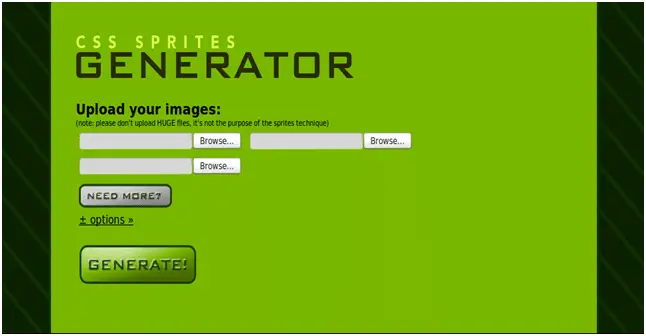
CSS Sprites make the job of serving responsive retina-ready images quite feasible. As per the conventional method of catering your site imagery for high-resolution displays, you need to have two separate images viz: one with a normal resolution(@1x) and the other one with a high-resolution (@2x). That means, you need to double the number of files, selectors and references within your CSS. On the contrary, with a CSS Sprite, all you need to do is simply override the link that takes you to the @1x sprite image file for all selectors which include high-resolution credits. One of the greatest benefits of using CSS Sprites is that the network requests and style-sheet file size is being reduced for creation of brilliant retina properties.

Method No.3- Using Icon Fonts
The fully scalable, editable and maintainable stature of icon fonts makes them the best tools for serving retina-ready website imagery. Instead of using image files for your icons, you can opt for creating a font file using vector icons. Being much smaller in size as compared to an image, the icon font will load instantly and there will be a single HTTP request for every size set of icons. You can use @font-face for embedding icon fonts in your CSS. These fonts will then scale to any size and can further be styled and animated using CSS coding. Additionally, icon fonts can also allow you to apply special text effects to your website imagery. Some popular ones include: rollover states, drop shadows and colors. Supported on all modern and legacy browsers, icon fonts are completely fuss-free. You can either use a dedicated font-creation app like Glyphs or a web-based service like Shifticons for creating an icon font. Moreover, if you aren’t inclined on creating an icon font from scratch, you can opt for ready-made fonts available online. Popular websites offering fonts include: Fontello, Pictos Server, Font Awesome and Entypo.
Method No.4- Using SVGs(Scalable Vector Graphics)
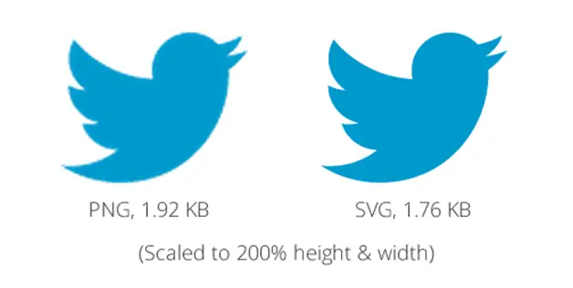
The infinite scaling abilities of SVGs make them appropriate tools for serving sharp images which look great on all high-resolution devices. Since vectors use lines and shapes instead of pixels, you need not worry about the sharpness of your website images. Ideal for logos, patterns, navigation, icons and repeating backgrounds, SVGs can be used as an <object>, <img>, <embed> and <iframe> tag.

As an extension to the SVG approach, you can opt for creating an SVG Sprite which would contain all the graphics and aid you in reducing the total number of HTTP requests. Make sure to stay abreast with the browser support while utilizing SVGs.
Conclusion
Mobile being the future, it makes complete sense to follow steps for making your website visually appealing and ready for high-resolution screens. I’m sure the options covered above would enable you to craft a website that works equally well on different screens with varying resolutions.
Author Bio :
Sophia Phillips has been working as a professional in WordPress plugin development company and loves sharing information about leveraging multiple benefits of WordPress in the best possible manner. Currently, she has an impressive count of WordPress-related articles under her name.

