Design trends are something we all crave for and follow blindly, without considering the pros and cons behind them. It is not wrong to go with the flow, but it is also necessary to check the intensity of the flow before stepping forward to keep yourself safe from drowning. After some good amount of research, we have come up with a list where you are advised about what not to follow. Sometimes, knowing about what you are not supposed to do, may take you on a higher note compared to knowing what you should do. It should be noted that for some of your projects and websites, the below design trends could work just fine. However, we have created the list below as general guidance of some of the things that have a high chance of not working out as well as you may have anticipated.
1. Don’t be over-influenced:
Designing for a brand is not easy. It may seem easy to the audience at first glance, but it requires a lot of research, study and data collection before producing it and showcasing to the audience in the market. The tough part is the judgement, as every design associated with your brand, reflects as the real image of your brand. Your target audience would pursue your brand in a way that you would want them to, and this is only possible if you know the taste and mindset of your target audience perfectly. This understanding comes from experience and experimentation. Hence it is essential to be original and find your personal taste in design.
It is easy to lose touch of your designing style as there are so many influencer and established designers available to teach you design from their work. While it’s a good idea to draw influences from their work, make sure you don’t entirely make their style, your style.
This is the reason it is advisable to do the groundwork and essential homework regarding your specific target audience before opting for a design for your brand. This helps you understand them better and come up with an exclusive design just for them; this showcases your originality and makes them feel special at the same time. Also, this will connect them towards your brand for the long run and help you get a permanent customer.
2. Avoid following the trends:

We know us well, right? We often get attracted, and head over heels for something temporary and not permanent, making us regret at the end, every time we do it. However, but again, we are humans, and we tend to make the same mistake again and again. Here, we are sure, at some point in time, you would have had the urge of following any trend. It isn’t harmful to follow the trend, but the main reason for avoiding it, is that it just vanishes in the blink of an eye. You invest a lot of time and resources in coming up with a design and launch it, and within a few days, it’s gone scrap.
This is the reason it is recommended to go with something permanent event though it is not that appealing to the eyes at this moment. It would take some time to grab the customer’s attention but once done; it would work wonders for you. The add on here is that it would work as a competitive advantage for you over other brands prevailing n the market as your peer. However, if you would like to taste the ongoing trend, we would advise you to invest low on it and not experiment it with the main product of your brand. However, following a designing trend might harm your brand in the long run.
3. Avoid sourcing from the easiest source:
Why do we spend so much on lifestyle products? Is the reason it makes you look good from the exterior right? And we very well know how marketing and branding work- the things which look good, get sold away faster. The same way, it is essential to be extremely serious about the selection of your design. A minute flaw in your design may ruin the image of your brand in front of your target audience completely. This may affect your sales as well as incur a substantial amount of monetary loss. This is the reason it is advisable to triple check with multiple resources before putting out any sort of design related to your brand in the market.
4. Say no to neon:
Unless your brand sells super-funky products, we would not advise you to go with neon. Neon designing trend is overly used. They are definitely in trend but is temporary. In case, you serve natural product or services like most of them in the market; it is better to go with normal color palate instead of the super gaudy neon’s.
5. Say no to red, blue and green:

We know you love these colors and all your designs mostly hover around these particular colors. The reason being, they are primary colors and are easy to use whenever in doubt. But we would advise you to try something new and not portray your design on only these colors because human psychology works a little differently in this case. The minds of people are so used to viewing these colors, that they automatically presume it as casual and unimportant. The use of other colors would attract the user’s attention and would likely concentrate on the information mentioned in it. Also, these colors are overused and out of date to use anymore.
6. Avoid using patterns unnecessarily:
We know you love patterns, and so does we. However, there should always be a good reason for using it. The reason we deny the use of pattern designing trend in your upcoming designs is that it is too distracting to the eyes as well as it has a hypnotising effect to the eyes, taking the user’s attention span to just the design and not the printed information on the design. The message would not be conveyed the way you would like it to convey, making you feel a little dissatisfied with the audience’s response.
7. Say no to floral:

Love for flowers is eternal; we do not deny that. It surely adds freshness to your design look. Here, all we are trying to say is that it does not go with all sort of brands. In case, your brand is serving to men’s section or some hardcore electrical products, picking up florals just because they are in trend, does not make sense. This would take away the charm of your brand as well as affect your brand image in a very gloomy way.
8. Don’t use pastels:

Again, making use of pastels would bring upon the same level as your peers, and you would be no different. Choosing a pastel designing trend for designs have been adopted by most of the brands as it makes the product look luxurious and sophisticated. The trick here is to adapt to pastels in some minute part of the designing and not taking it as a base color. That would make your brand just look normal like any other brands, and your audience would react to your posters or design in the same way they do for others in the market. To stand out, you would have to drop the idea of pastels for your next design.
9. Don’t underutilize typography:
Words are important as they can convey a message, and not an only mere message, but the way you want it to convey. Words have power, and so the typography section of the design is very important. Proper use of typography would help your target audience understand your design in a better way. The trick is to keep in mind the readability and feasibility of the text over the base design. This helps provide a smooth experience to the users while accessing your design.
Not paying attention to typography can lead to content which the audience would have to squint their eyes to make sense of. It would add effort on the part of the audience to make sense of your work, which would throw their attention away. The prime objective of any design should be in ease of understanding. Not using typography effectively would compromise on this.
10. Avoid zig-zag fonts:

It looks cool and creative at times, but when we dive deep into the understanding, the human brain is used to pursue straight designs in a better way compared to zig-zag designs. The reason being, we understand lines in a better way than curves as they are easy to decode and does not require many efforts in visualizing it. You can use it as a heading text on the top and not the entire body content. This brings in reliability issues and would be a hindrance to the performance of your design campaign.
11. Avoid focusing on trends and not your target audience:

If you know someone perfectly inside out, you would not need to go out asking about them to strangers and taking away ideas to make them happy. It is your brand and your audience. And trust us, no one can know your audience more and better than you. If you have ever taken time in understanding them a little beyond what they look like in front of you, you would not need to step out for taking inspiration from other trends-setters in the market. Instead of the following trend, you would be focusing just on innovating a customized design that can cater the best to your target audience and would keep them glued to your brand.
12. Avoid clustered spacing:
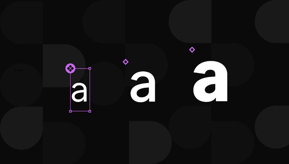
Your design and typography should go hand in hand and no way fair. The design and typography should not overlap each other in a way that it hides the meaning of both, and the design turns to disaster. Here, when we talk about spacing, we are talking about both, the space between each letter of the text as well as the space between every element of graphics. These both things are essential as these both combinedly make a design. Even if one goes a little off track, it can make the entire design unusable.
13. Avoid choosing colors based on popularity:
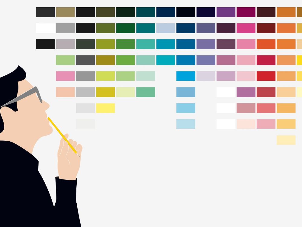
Colors are life. We don’t like to go all monochrome at times. When we are designing our marketing and branding campaigns, it gets tricky to use the colors that best represent our brand and its motto. This is the reason it is advisable to brainstorm on color schemes of your brand design separately and not merge with other elements of the design. If you master in the selection of the color schemes, your 90% of the work is done. You are guaranteed to be successful based on that. The tip here is to consider your logo design and colors while selecting the new color schemes.
14. Avoid using long texts:
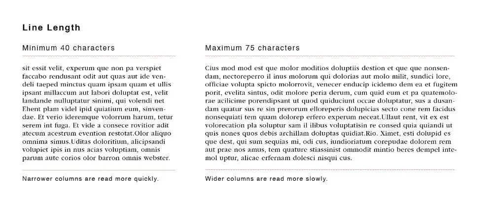
Everything long lasts longer. This logic sets perfectly here as the more words you use in your design; the more time is consumed in reading it. You would not like your audience to waste their time in just reading the text plainly and not understanding it. It is advisable to use short sentences in the design campaign to make it more useful and time-saving. This attracts more user span, and the churn rate of leads based on it would be larger.
15. Avoid using excessive minimalism:
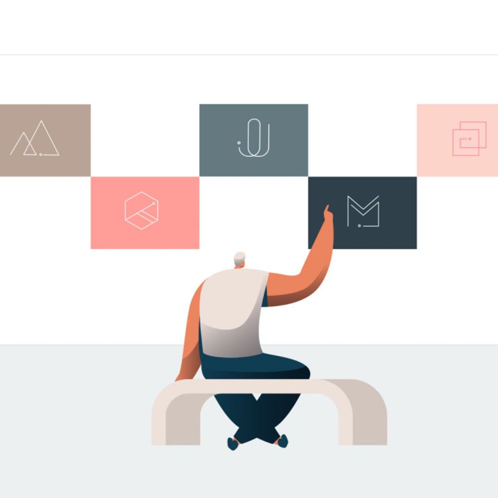
You cannot skip the important things in the name of minimalism. Using less is more is only valid when your less is sufficient enough and perfectly convey about your brand. If just for the sake of minimalism and adopting the ongoing trend, if you are cutting short the important information needed for your audience to reach the purchase stage, you would lose many potential clients. Minimalism is a designing trend that is functional, but it is wouldn’t necessarily always go with your brand and correctly attend your target audience.
16. Avoid sticking to white:

Generally, all simple designs have a white background and black text. It looks minimal and impactful. However, you should switch it up at times and try dark designs. We have seen the increase popularity of dark-theme in smartphones, websites and every place else. The reason being that light fonts are visible in a better way compared to dark fonts on a lighter base. Adopting the use of black may make you stand out from your peers and would attract your audience in a better way. As per the psychology, people have more preference towards black compared to white and other lighter shades. If not for every campaign, but some, you can try and see how it goes for your brand. If it goes well, you are proven lucky.
Now, so as you know what you should not do, you should start working on the strategy which you should adopt after eliminating all these features. We know, you would come up with something amazing for your brand.

