I recently met with two new clients to discuss the development of their websites. I typically like to see if there are any specific colors they’d like to use, along with any preferences they may have towards layout and content. I was quite surprised to hear both of them tell me they liked, “earthy tones”. I couldn’t say I’d ever heard an earthy tone color combination, but it wasn’t too difficult to get an idea of what they were thinking. Greens, browns, burnt orange, were the immediate colors that came to mind.
The nice thing was that the color options were already narrowed down quite a bit for me, rather than being given no limits towards a color palette.
The colors I was picturing in my head were right there, and then a few other options that I’d never even considered. I can see this site being a great resource when trying to figure out color schemes for a site. Speaking of earthy tone sites, let’s take a look at a few good examples that I came across.
Kevin Lucious
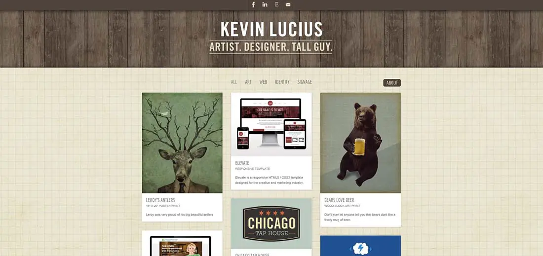
Kevin Lucious has a pretty cool looking site. Obviously, a heavy use of browns and the background appears to be a wood panel. An almost cardboard looking texture decorates the main content background, with a leather, sandpaper, or just old paper looking texture in the header.
Filcka.cz
I really enjoy the simplicity of this site Filcka.cz. It has a few different shades of brown, along with some green, and a gritty sort of texture that helps give the page some character. I also like the thought put into the layout and navigation structure. The couch, clock, and door set the scene and allow the links to be cleverly displayed as art hanging on the wall.
Landscape Gardener
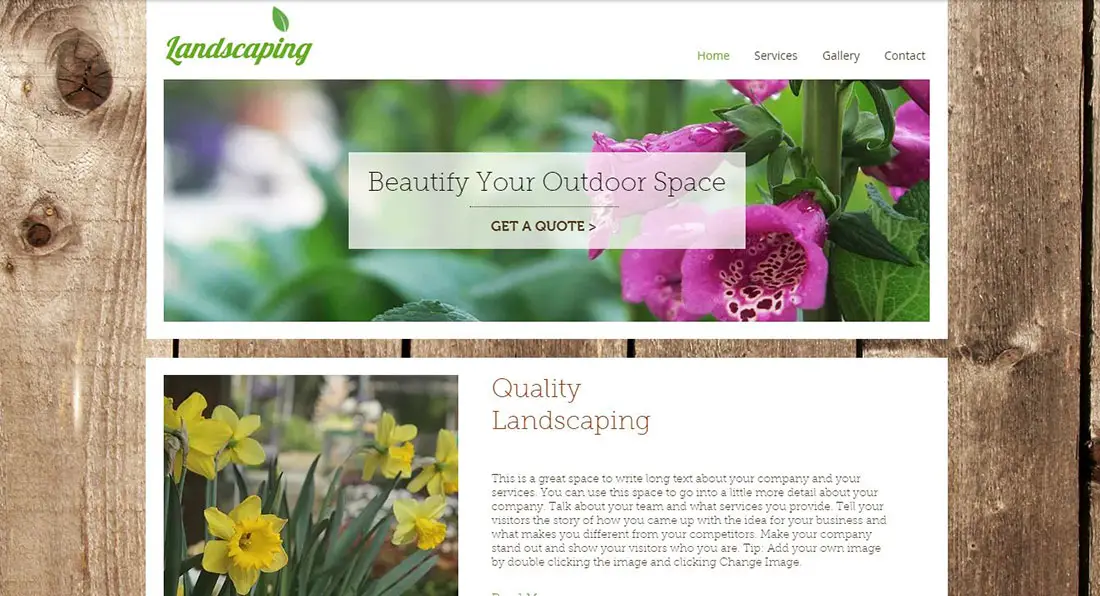
Are you a gardener and need a presentation website? This template offers you everything you need!
Musicians Corner
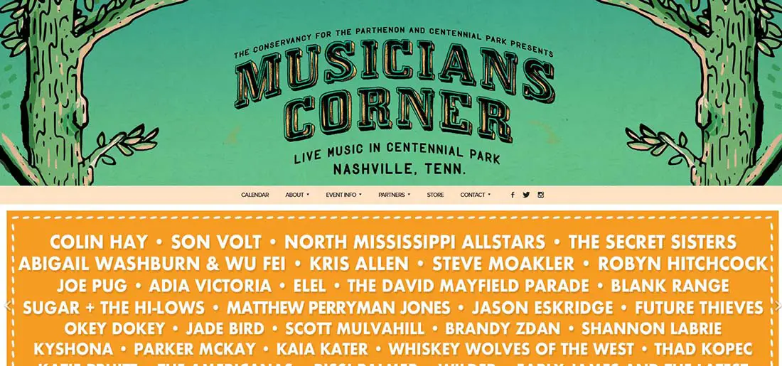
Musicians Corner is another cool website. The lighter tones of brown, tan-ish off-white and gray are accented by hits of green and traces of yellow. Again we see a large amount of that grainy texture that helps add an earthy feel to the site.
Arangi
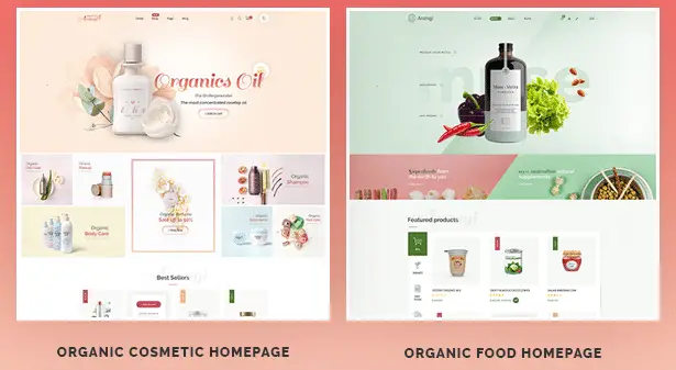
Arangi is an E-commerce WordPress theme designed for online shops selling thrifty, organic, spa & beauty related products.
Chris Spooner
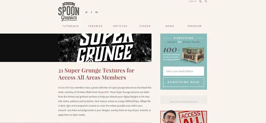
The designer tapped into the earthy tones when he developed his site. His site is full of browns, while his slideshow banner injects some more color to help give the site a little more character.
Washtenaw Community College
Washtenaw Community College homepage is a fantastic example of a site using nature tones of brown and green, they even have some burnt orange in there. Thanks to the outdoor, winter theme, background design image in their main content area, they also sneak in some shades of blue and really influence the nature theme.
Beauty SPA
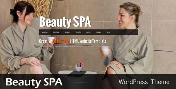
Beautiful, fullscreen template, perfect for a spa salon. It has a very simple but modern layout, the high-quality photos being the most important in this design. They even threw in a little bit of orange for good measure as well.
Plant Nursery
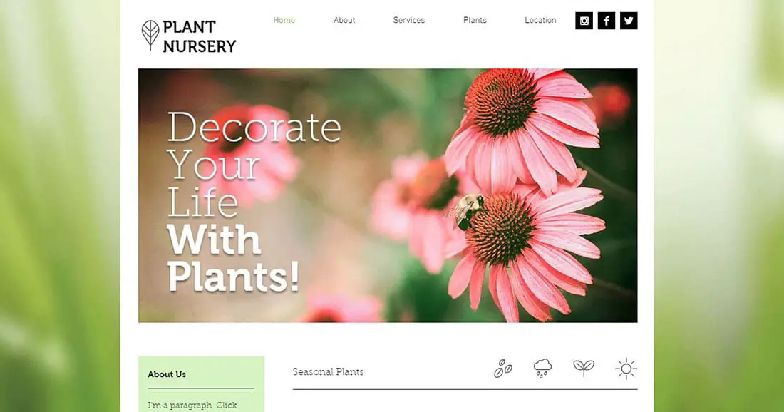
Do you have a gardening business? This lovely template might be the one for you! Simple design and natural colors, this website will emphasize your beautiful products. This site uses a more polished and modern look with lots of blurred images.
Organic Web
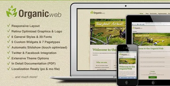
This template has a responsive layout, an optional slideshow on the homepage to display up to 6 pictures, retina display optimized system graphics and more! The background has the standard gritty texture.
Plant With Purpose
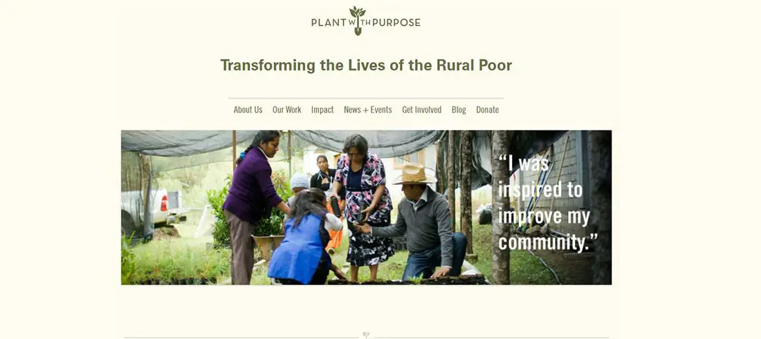
It’s no surprise that a site titled Plant With Purpose is going to have an earthy noted, nature-esque theme to it. And just as James Lai’s site was mostly blue, this one is mostly green. The slideshow helps prevent the site from being overly green, as do the small splashes of burnt orange and tan to help smaller subsections of the homepage stick out.
I wasn’t too surprised on the color combinations of what other designers had chosen to use when they were trying to convey an earthy tone. Though I was surprised to see some of the applications in which the colors appeared. I was expecting mostly sites like Plant With Purpose and was quite surprised that the majority of them don’t really have much to do with nature. Then again, the two clients I met with who commented on liking earthy tones are not in the outdoors or nature business either.
About the author: with over ten years in the freelance web design and writing fields, Scott Stanton has had his finger on the beating pulse of the industry’s hottest design trends and bends for the past decade. Scott regularly writes for Wix.com the free website builder. Follow him on Twitter @TheScottStanton.
