The flat design trend is growing pretty fast and more and more websites are using it. The flat design trend is characterized by no shadows effects, clean layouts, solid colors and sharp typography. There are certain types of color palettes that are consistently used in flat designs, as well as certain types of icons and graphic elements.
We showcased today, 20 of the best-designed websites with flat desgin. Do you like the flat design trend? If so, which flat websites from this list, are your favorite? Let us know in the comment section below.
Squidee
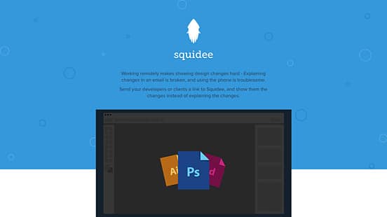
Working remotely makes showing design changes hard. With Squidee you can show your developers the changes instead of explaining them. This website uses flat design successfully! The choice of using basic, bold colors makes a great difference for this website design and the colorful dots sure add a lot of personality to the final look!
Built By Buffalo
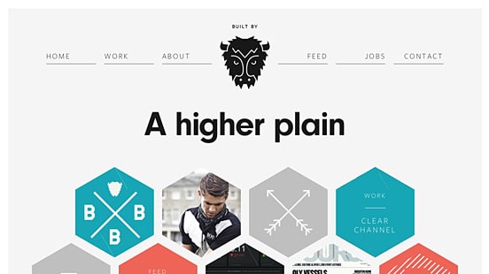
Buffalo is a small web design & development agency based in Brighton, UK. Their website follows the flat design basics and it is simple and interactive. The retro colors work perfectly with the simple but effective design and the little animations that you can find on the homepage make everything even more catchy!
Combadi
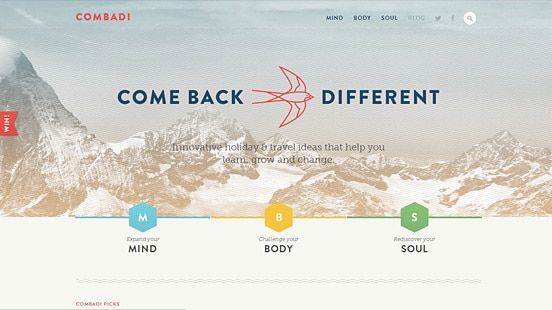
Combadi offers innovative holiday & travel experience ideas that help you learn, grow and change. Their website combines flat design elements with beautiful photography. By using a textured background and simple but bold colors the website helps the visitors navigate through all the important parts.
Concrete Matter
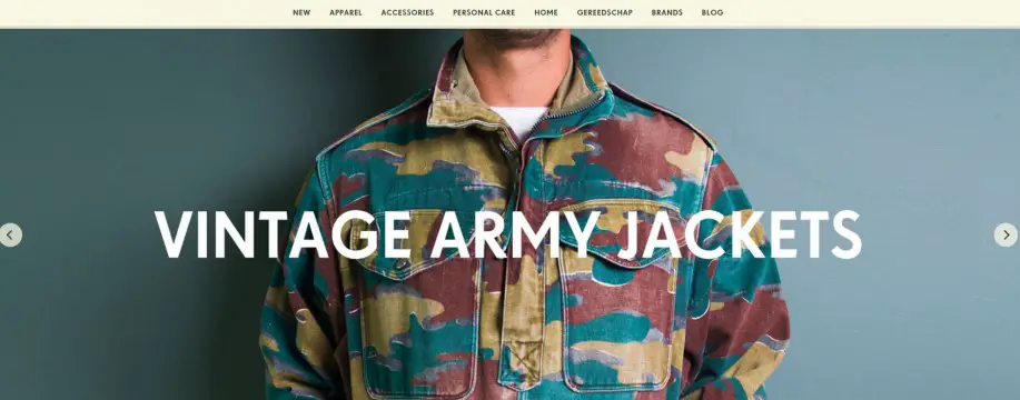
Concrete Matter is an online boutique selling beautiful and unique products which make great gifts for men. They have a simple and minimalist website with a limited pastel color palette that makes their products stand out from the crowd. Even the products are shown on a clean white background which makes everything customer-oriented.
Data Driven London

Data Driven London is a meetup for entrepreneurs and professionals interested in real-time metrics, lean analytics, and data-driven decision making. They have a simple layout with a large background, blurred photography. The typography is very well chosen. This website is very straight to the point and doesn’t show useless images or text so that everyone can get the right message.
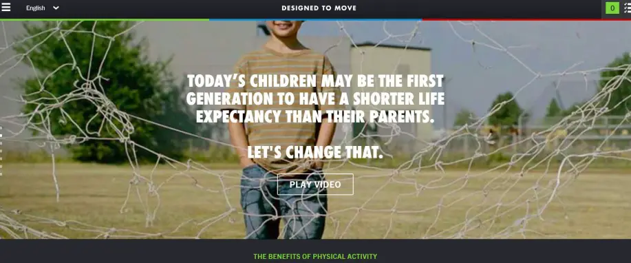
Designed to Move
DESIGNED TO MOVE is a call-to-action supported by a community of public, private and civil sector organizations dedicated to ending the growing epidemic of physical inactivity. They have a very beautiful, one-page scrolling website using simple design and a limited color palette. They use a slider that features beautiful photography to show their cause and tell their message. The buttons are simple and straight-forward.
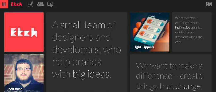
Etch
Etch is a small team of designers and developers, who help brands with big ideas. Their website is simple, interactive and follows the flat design guidelines. The dark background makes the images pop out. The idea of choosing only one main strong color for this website is a great choice for it unforgettable.
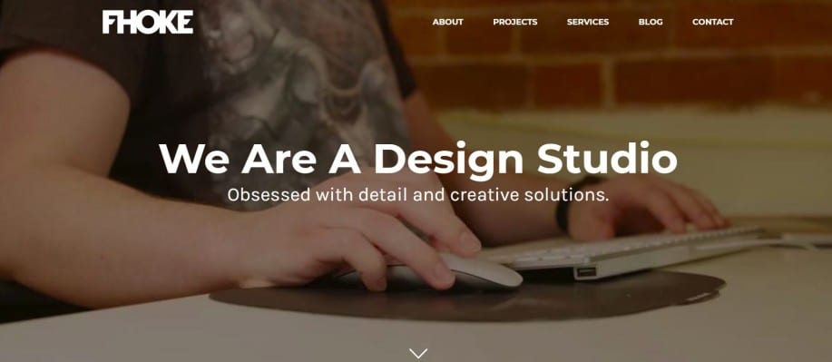
Fhoke
Fhoke is an award-winning website design agency offering responsive web design, website development, branding and logo. Their website is known for big typography and gorgeous photography. This website follows the rules of minimalistic, flat websites that are simple and efficient.
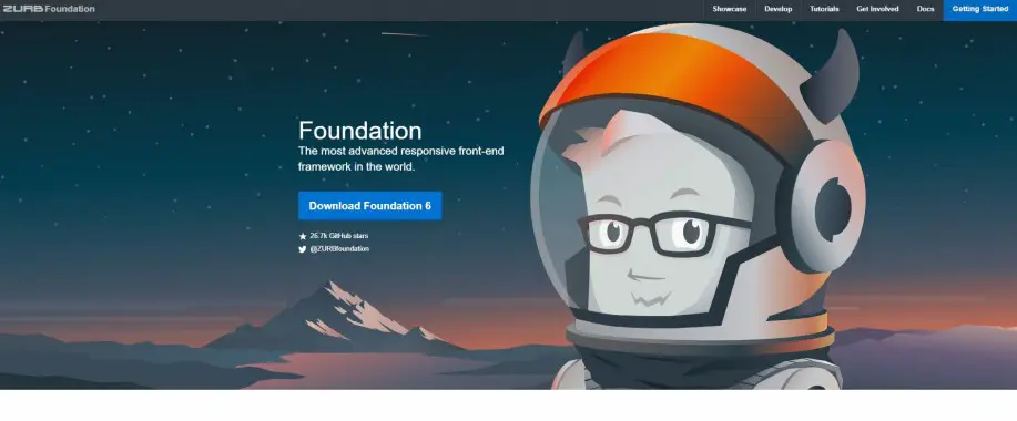
Foundation Framework
Foundation by ZURB is the most advanced responsive front-end framework in the world. They have a flat design presentation website that features cute flat illustrations of a yeti. The website is based on a simple white background that makes the text and images very clear and understandable.
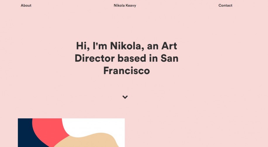
Nikola Keavy
Nikola Keavy is an art director based in San Francisco. Her personal website provides a very simple but delightful scrolling experience with nice pastel colors and bold typography. This kind of website makes it very easy for clients to see and understand the artist’s style and way of working.
Futureal Bundle
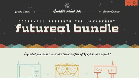
This website offered flat designs elements with great designs! It uses nice retro colors and simple drawings. The font choices are also very good and they fit well with the overall look of the website!
Hundreds

Hundreds is an iPad & iPhone puzzle game about the space between you and the serene. They have a really gorgeous and catchy website that uses flat icons and illustrations but also movement. The website has a very simple design and a limited striking color palette.
Interactive Advent Calendar
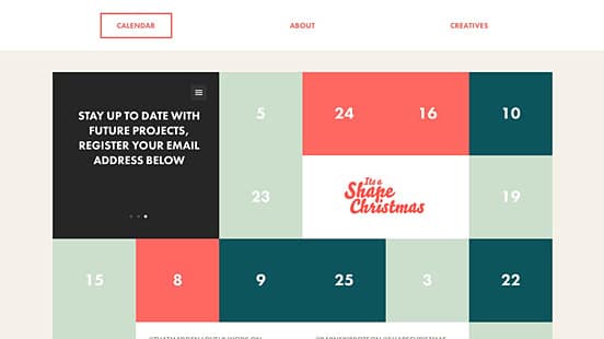
‘It’s a Shape Christmas’ is an Interactive Advent Calendar produced by Shape Design Studio. It has a gorgeous colorful design that uses simple shapes and interaction. The website begins with a simple, flat presentation that will make you fall in love with their concept.
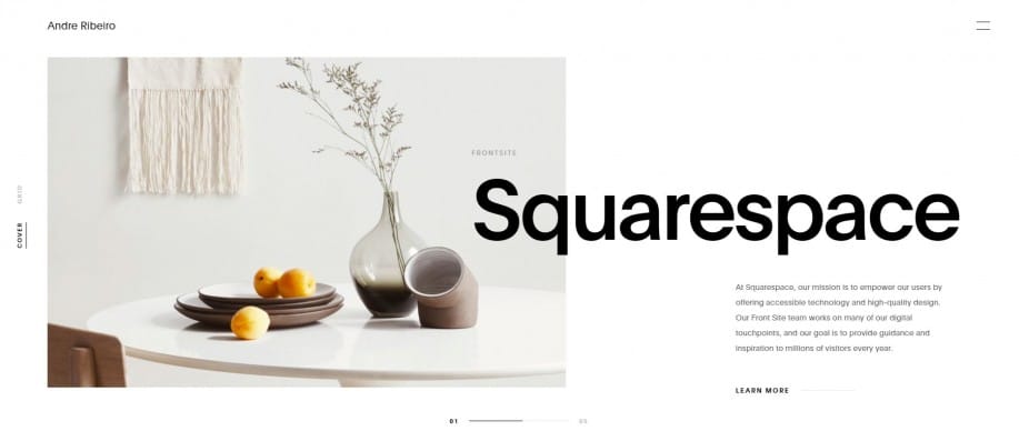
Andre Ribeiro
Andre Ribeiro is a Brazilian born Designer and Art Director living in Brooklyn that’s also the Design Team Lead at Squarespace. His website is very simple and striking because of the huge typography and neutral colors. It also has the option to view his work in cover or grid mode.
Lorenzo Verzini

Lorenzo Verzini is an Italian designer & art director living in London, working in the field for more than 9 years. His website is striking because it uses simple colors to create great contrast. Lorenzo’s website also has flat illustrations and great typography choices that tell us who the artist really is!
Lowdi
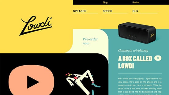
Lowdi is a portable wireless speaker, and this is its presentation website. It’s made out of strong, fluid shapes and pleasant colors. This website is very easy to navigate and the product photography is simply gorgeous.
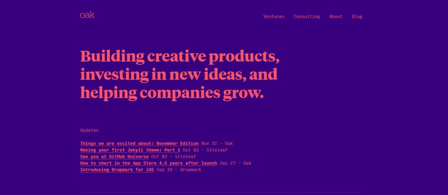
Oak.is
Oak Studios creates websites and applications, publishes weblogs, and builds brands online. They have a really striking website that’s based just on two strong colors. Their website focuses mostly on typography and colors to send a clear message.
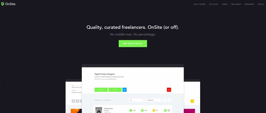
OnSite
OnSite is a strictly invite-only platform for which all freelancers must provide work examples to be considered for admission. Their website is very simple and easy to understand for both clients and freelancers. They only use black or white color block backgrounds that make everything very easy to follow.
Simone Marcarino
Simone Marcarino is a multi-disciplinary designer & front-end developer from Italy. His website is more than gorgeous and it has a really simple design. The homepage features an automated algorithm with music that allows you to play with any photograph. Other than that, his website only features a simple About text – but these are more than enough to understand who Simone is!
Spelltower
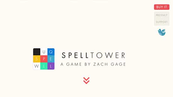
Spelltower is a presentation website for a game of words made by Zack Gage. It has a flat website that goes very well with the design of the game itself. The website is based on simple colored backgrounds, flat illustrations and animations and it’s perfect as a game website.

When it comes to modern trends in web design, it all boils down to simplicity. I think flat is great, but it’s becoming too common, unfortunately..