Small details make a big difference. One of such minute details is the website menu. The labels and structure of your website menu can have a significant impact on results. One of the prime requirements of a user on a website is ease of navigation. Unfortunately, not all websites menus are designed to provide such rich user experience. Creating a solid navigation system is one of the most critical aspects of designing a site. Navigation structure can help determine the rank of your website and can even affect how much traffic you will get from search. The easier the site is to use, the more visitors will convert into customers and leads. Menu navigation should help users find content quickly. Here are eight website menu design rules which shall help in understanding the basics of navigation, some popular styles and how to get your menu design right.
Provide Description:
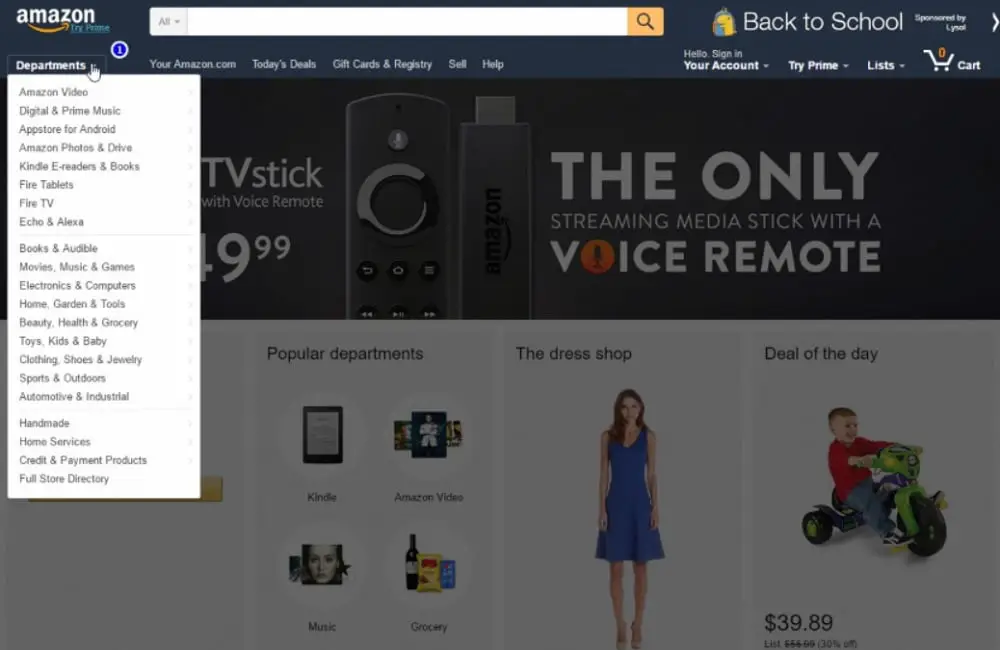
Writing “what we do” does not precisely tell about your services. Neither does “solutions,” “services” or “products.” So, having descriptive navigation that uses keywords is better for two reasons. First, descriptive labels in your navigation bar are suitable for search engines because the navigation is the main place to show relevance to search engines. Also, your navigation appears on each page, so the descriptive labels tell Google that you truly stick to that topic. Second, descriptive labels in your navigation bar are good for a visitor as the navigation panel is visually prominent, and so it communicates instantly. When the navigation panel lists your main services and products, it shows visitor, at a glance, what your company does and so they will know where to find specific service on your website. So descriptive navigation increases conversion and makes your website SEO-friendly. Hence use your main navigation as a place to tell search engines and your visitors about what you do. You should use phrases that people use while they search for something. You can use the Google Keyword Tool to determine search phrases. Also, in case you have a page with a list of all the services, your website will never rank high. That is because you are not focusing on one topic. Each page on your website has a chance of ranking if they are focused on a topic or a keyword.
Don’t Use Dropdown Menus:
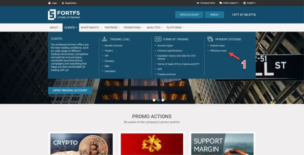
These may be one of the most popular designs for menus. However, it does have its own disadvantages. On the main reason to avoid the dropdown menu is that they are challenging to identify for search engines. Depending on how dropdown menus are programmed, they may lead to some problem in the ranking of your website. According to a study, a dropdown menu causes usability issues for visitors. This is because visitors have to move their eyes faster than moving their mouse to keep up with the pace of the scrolling list. Along with this, the chances of clicking a wrong option are much higher in dropdown menus. Hence, they can annoy your visitors and drive them away from your website. Most importantly, this type of menus encourages visitors to skip significant pages on your website. If you are currently using dropdown menus, you can observe these issues in your analytics. However, research has discovered that only one type of dropdown menu performs well in usability tests: mega dropdown. This type of dropdown offers lots of options, making the moment of friction worth it. So, in a large site with a different set of products and services and lots of pages, a mega menu may work well for your site, even though they drastically increase the number of links from your homepage.
Use Limited Number of Menu Items:
Some websites have lots of links on their homepage. This is not a good idea as search engines don’t easily recognize such sites. Your homepage has the highest chances of getting identified by the search engine as more sites link to a homepage than to any of the interior pages. So the homepage has the supreme authority in your website, and if you load it with more number of links, the authority will be diluted and transferred to other pages. This will reduce the chances of your website to rank on search engines. You can use “Link Juice calculator” to count the number of links on any page. So, create a concise navigation bar with less number of links. Also, according to a famous psychology paper, a person can only hold seven items at a time in their memory. So if there are more items in your navigation, it will be difficult for visitors to remember and process the information on your website. Also, too many items can encourage visitors to scan past all the important items. If there are more than seven important items, you can consider breaking them into 5 or 7 seven groups to make the website look clean and organized. Every time you remove a menu item from your homepage, the others tend to become more visually prominent. So this will help you divert the attention of your visitors to important items.
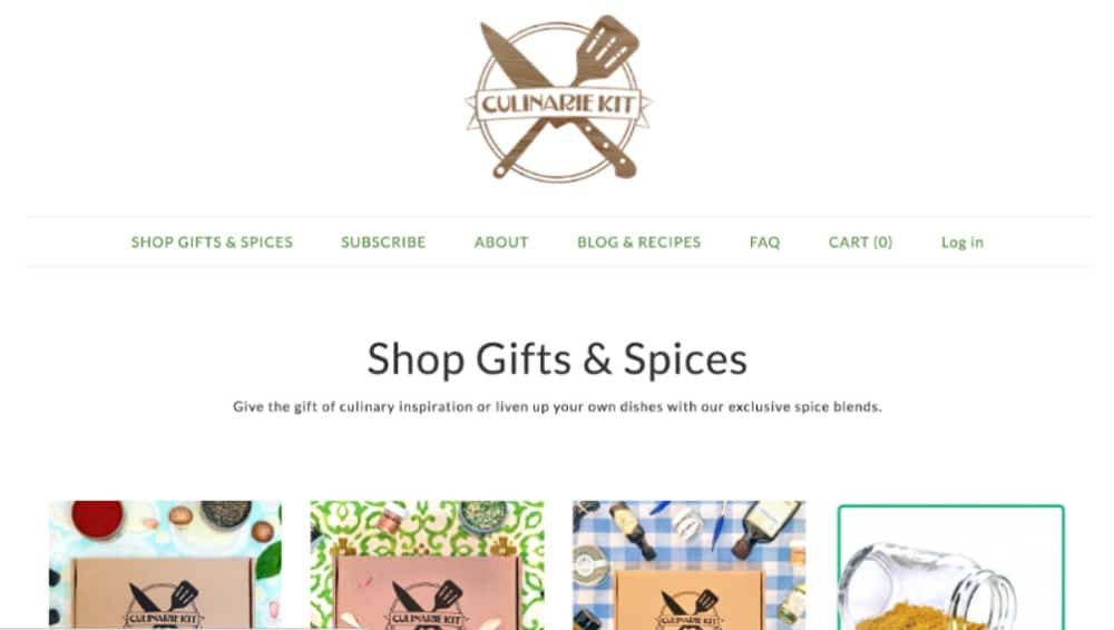
Along with the number of items, you should also consider the order of those items. In website navigation, the items on the top and the bottom are the most effective, because this is where retention and attention are highest. It is called the serial position effect, and it merges to cognitive biases. First is the primary effect in which the items at the top of the list are easier to remember. And second is the recency effect in which the items at the bottom of the list are easier to remember. Due to this reason, anything you put on the top or the bottom of your navigation becomes more prominent. So, you should put important items in these places for your clients and visitors. One more way to highlight an important item is to use white space tactfully. This aligns the core principle of content marketing and web design, i.e. “First give visitors what they want, and then they might give you what you want.” So you should consider rearranging the items in your list so that you can get maximum conversions from your navigation menu. If you can’t decide on what is important, you can use analytics tools to determine which ones get more attention and are more useful.

Regularly evaluating your website navigation can help you improve the performance and the visual appeal of your website. There will be two reports that will show you the navigations items your customers prefer the most. First one is “in-page” view or “navigation summary”, and others are the User Flow/Behavior Flow report. In-page analytics allows you to assess the percentage of visitors that goes through a specific page on your website. These reports will allow you to select the navigation items that your visitors prefer and hence make the optimization process easier. For optimizing your website’s navigation, you should remove the items that are rarely getting clicked. However, if they are one of the most important items on your website, you should consider renaming or relabeling them while using keywords. You should also move up the items that are a popular choice of your visitors so that they can find them easily. However, keep in mind that your homepage might not be the only entry point for many users. A search-optimized website has numerous entry points, and so many visitors might not even see your homepage. Hence you should consider designing other web pages the way you design your homepage. You should invest enough time in creating a webpage (other than the homepage) that send out your company’s message appropriately.
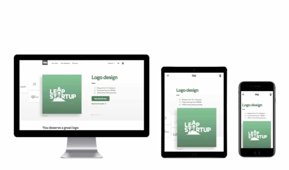
Responsiveness is now a must-have for any website given the rise in mobile browsing. A compact navigation menu style also known as the Hamburger menu is used to make the menu responsive in websites. Many times when you are viewing a website on mobile you would come across three horizontal lines with a slight separation between them. A menu opens up when you press this icon. This is one of the best ways to put up a menu on mobile without occupying much space. The designing and structure of this menu varies according to the website. While making your website responsive, structure the menus in such a way that it is easier for the user to navigate on your website. This problem only occurs in small screens like mobile or tablet. You could use arrows similar to buttons which help the user navigate through the menu. You can even use colors and typography to distinguish between the levels of navigation. Making your website responsive is highly important as it will help in making your site compatible with different devices but also increase the traffic on your website as most users today come from mobile devices.
Use user-friendly language:
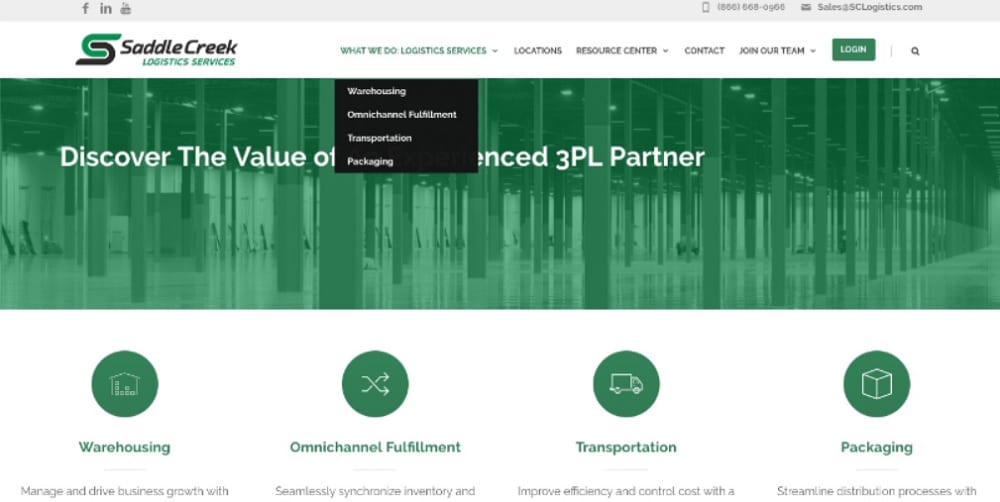
While designing the website menu, it is important to consider language and labeling. With so much competition on the web, everyone wants to stand out by getting creative with copywriting and other design elements. However, sometimes, this could cost you the clarity of your website. Your website may be designed according to your industry, but it is important to consider the user and how they understand or interpret what you write. For example, if you label a shop as “Marketplace”, the users are not familiar with this term and hence would leave an opening for interpretation. Any link, phrase or element on your website that takes more than a second to understand will only bring down the traffic. Users should be keen to discover what you have to offer in terms of user experience. So if you want to perform better on your primary navigation, you can use A/B testing. More often, it is best to keep your navigation menu simple and easy to understand. However, if you still want to customize your website, you try it with pop-ups and notifications. This will make sure that the main elements on your website are user-friendly and so users will come back to your website to explore more.
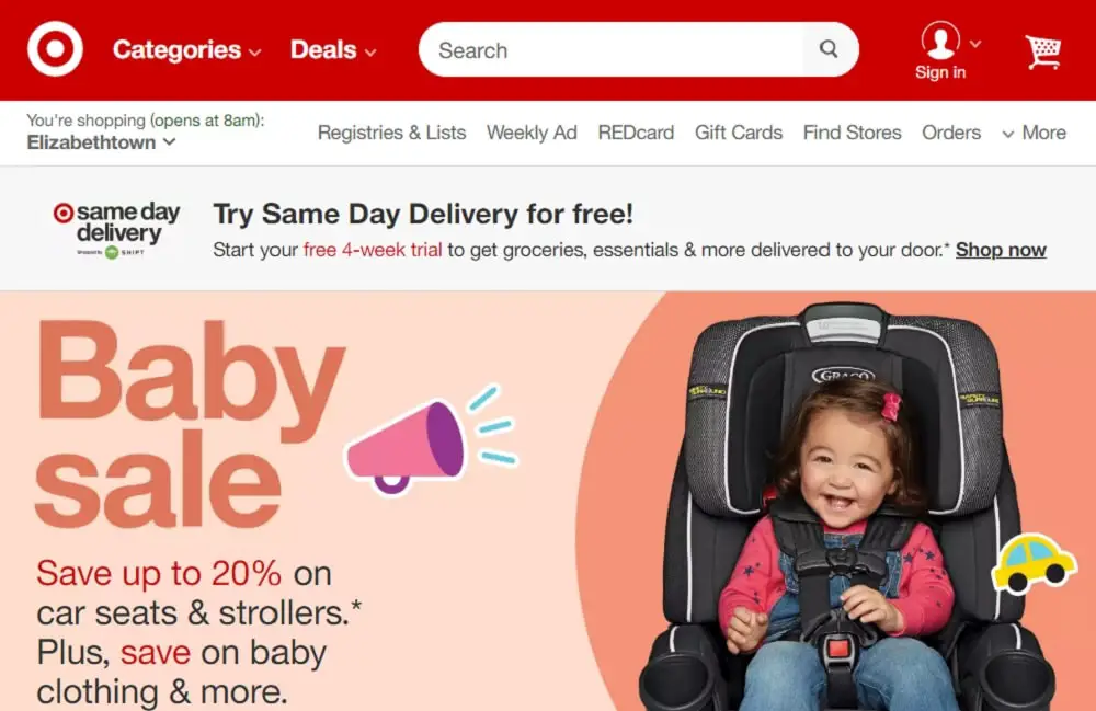
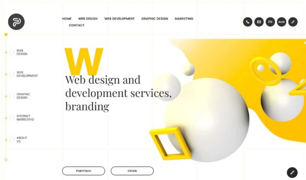
You should design your primary navigation in such a way that it stands out and stays consistent throughout the site. Usually, the main menu will stay on the top of the page aligned left or right or in the centre of the page. You can make it stand out by using a color that contrasts the background and it is highlighted well. If you use bold and vibrant images as your welcome image, you can opt for a plain white color for the navigation, helping it catch the eyes of the users. Some sites also use the left side of the page a navigation bar so that the site looks unique. The most striking part of the left-hand menu design is the overall size allocation and the ability to use custom fonts. You can use bold strokes and typography to catch users’ attention. For example, Cadbury is linked with purple color so you can observe that they have made good use of dark purple color in their navigation bar in contrast with shades of light purple in the background to make it stand out. Using different combinations can make or break the visual appeal of your website, so be careful while trying to be creative with website menu design.
A website menu is an integral part of website designing, and so it is essential to create a user-friendly, visually appealing design. You should try to provide your users with enough information needed to navigate through your website in the menu. This will help them find different topics and discover new elements on your website.

