The age of using images for buttons on websites has ended, thanks to expanded browser support for CSS3 properties like rounded corners, gradients and text shadows. Browsers, like Firefox and Safari, actually started supporting some of these properties long before CSS3 became a buzzword, but now with IE slowly getting into the game, there are no more excuses. Pure CSS buttons are easy to design, implement and manage — welcoming words to any front-end web developer!
If you’re looking for some ready-coded CSS buttons freebies to save you some precious time, then you’ll surely like this freebies collection!
We searched the web for some of the best and free CSS buttons and icons. These buttons and icons have clean and modern designs and some of them come with the free PSD file included. Because they are ready-coded, they’ll save you a lot of time in your design process.
Also, check out the mini-tutorial at the end of this roundup which shows you the basics of creating a CSS button yourself!
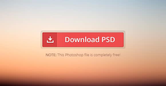
This is a perfectly crafted download button. Beautiful, subtle gradients, a glassy border, and an icon. It’s simple to change the colour or text and use this in your own design. Do not miss the chance to have this amazing button in your collection.
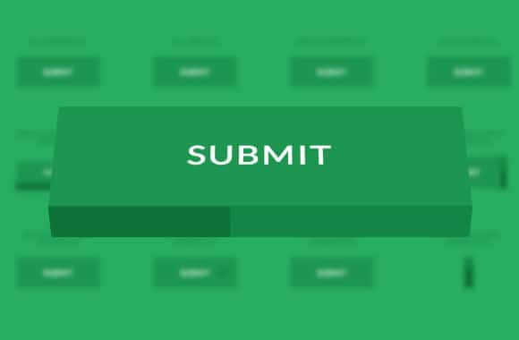
This is a set of flat and 3D progress button styles where the button itself serves as a progress indicator. 3D styles are used for showing the progress indication on one side of the button while rotating the button in perspective. This example can come in really handy if you are looking for a cool button to spice up your design. Check it out!
Pure CSS flat switches
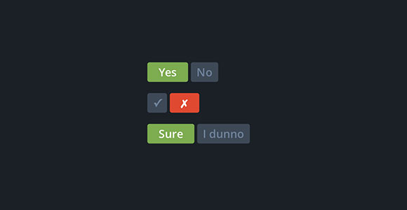
These are some pure CSS flat-style switches with nice structure and animations. CSS snippet is provided for free. These buttons can be used in many creative ways. Check them out, download and watch how your web design improves.
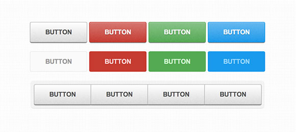
These are some nice CSS3 patterned buttons created using subtle patterns. There’s also a tutorial which will walk you through each step of making these cool buttons. They are cool, could come in handy for future projects and would definitely be a great asset in your freebies arsenal collection. Do not miss the chance to have them in your collection!
Tweety – Creative Tweet Button CSS
This freebie is a very creative tweet button. There’s no PSD file, because it is a simple design and can be made by everyone. CSS is provided for free. It will definitely add a friendly dose to your website’s design. Check it out!
Button switches with checkboxes and CSS3
These are some amazing, realistic-looking, CSS-only UI elements. Find more buttons in the link aove and see which ones are your favorite. Do not miss the chance to have these buttons in your collection. They can be used in many creative ways!
This is a free CSS snippet for this cool Share It button. It can easily be added to your website and would make your website look great! It is definitely an example worth having in your collection.
These are some pure CSS flat radio buttons with a really nice animation. The code snippet is free!
This button set consists of some simple, creative and subtle styles and effects to inspire you. They have a minimalist design which uses some really cool flat icons. Click and hover to see the cool effects.
This UI kit wasn’t created using any particular coding technique, instead, it just serves just as an inspiration to give your interfaces some more dynamism. Go through all of these examples and see which one is your favourite.
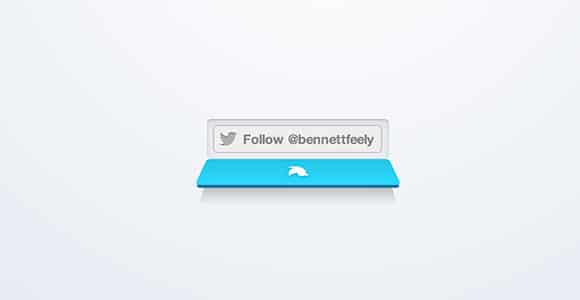
Ths is a great CSS animated Twitter button that opens like a drawer when hovering. Such a cool idea!
Boot snipp – CSS code snippets for Bootstrap
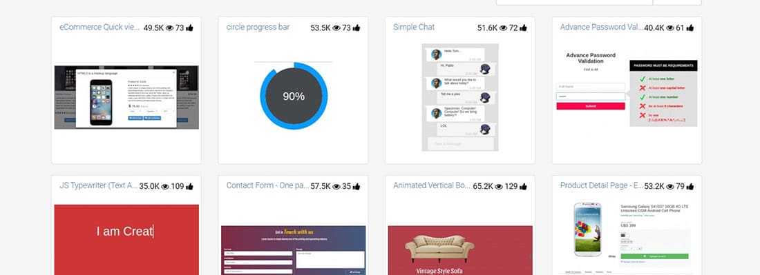
Bootsnipp is an element gallery for web designers and web developers and anybody using Bootstrap will find this website essential in their craft.
Animated SVG icons
Using SVGs on websites is becoming more and more easy with great libraries like Snap.svg. Here’s a great collection of animated SVG icons for you to use in your design projects.
CSS iOS7 icons
These are some simple iOS7 icons with CSS snippets given for free! They’re cool and they can be used in so many ways to improve the way your designs look.
DC Social Media Icons PSD + CSS
This free social icon set contains 20 icons for popular services like Twitter, Facebook, Google+, YouTube, Flickr, Dribbble and other. Check this icons set and see if this is the one you have been looking for all this time!
Stackicons – A colorful icon font
Stackicons are icon fonts for the web with multiple button shapes and a unique “multi-colour” option. These icons can be a great asset to your freebies collection.
Social rhombus icons – CSS + PSD
These are some great social media buttons with CSS snippets and PSD files free to download and use in your own projects.
Simple icon hover effects CSS
This is a set of simple round icon hover effects with CSS transitions and animations for your inspiration.
Sketched Social Icons Webfont
This is a selection of varied social media icons in an unique “sketched” style. These are pretty interesting and are provided as a CSS-ready font for you to drop right into your site.
Pure CSS icon set
This is a clean set of icons made with CSS. These are very useful for you if you’re a web designer.
CSS3 Buttons For Every Web Browser – Mini- Tutorial
I’ll show you, step by step, how to create CSS buttons. Of course, there are plenty of websites out there where you can generate a CSS3 button in seconds. My favorite is CSS3 Generator. Although, you don’t really learn from a generator, so we’ll build a CSS button from scratch and better understand how it works.
Input & Anchor Tag
In most cases, you’ll use either the input or anchor tag to display a button that will either trigger an action on the current page or send the visitor off to another page. Let’s go ahead and write the markup for our two elements.
<input type="submit" value="Accept" class="btn" />

<a href="#" class="btn">Decline</a>
Notice that we’re using the CSS class btn. This will be our base CSS class for our buttons. In an effort to keep object oriented CSS in mind, we’ll first create a simple class of btn, which all of our buttons will inherit and then extend that with additional classes for color and size differences.
CSS Round 1
First, let’s set some elemental properties on the btn class. This is mostly to override default browser styling of the elements and lay the groundwork for a button-like design.
     .btn {
          /* Round 1 */
          border:1px solid #666;
          cursor:pointer;
          display:block;
          margin:10px auto 0;
          padding:5px;
          text-align:center;
          text-decoration:none;
          width:140px;
     }
CSS Round 2
Now, for the fun part, let’s style these input and anchor tags and turn them into buttons, using the border radius, gradient, and text shadow properties, along with a few others for good measure.
     .btn {
          /* Round 1 */
          border:1px solid #666;
          cursor:pointer;
          display:block;
          margin:10px auto 0;
          padding:5px;
          text-align:center;
          text-decoration:none;
          width:140px;
          /* Round 2 */
          -moz-border-radius:15px;
          -webkit-border-radius:15px;
          background:#20c167;
          background-image:-moz-linear-gradient(top, #20c167, #157f44);
          background-image:-o-linear-gradient(top, #20c167, #157f44);
          background-image:-webkit-gradient(linear, center top, center bottom,
               from(#20c167), to(#157f44));
          background-image:linear-gradient(top, #20c167, #157f44);
          border-radius:15px;
          color:#FFF;
          font-size:.75em;
          font-weight:bold;
          text-shadow:-1px -1px 0 #444;
     }
As you can see below, our CSS3 buttons are taking shape. The gradient, rounded corners and text shadow combine to create one sexy button, if I must say so.
CSS Round 3
Let’s extend the btn class with one called decline, which we’ll use to, you guessed it, style the decline button. If we use our base button class to cover the browser overrides and general button styles, then we can use semantically named classes to change the button’s size, color and anything else we need to.
     .decline {
          background:#ad232e;
	  background-image:-moz-linear-gradient(top, #ff3443, #ad232e);
	  background-image:-o-linear-gradient(top, #ff3443, #ad232e);
	  background-image:-webkit-gradient(linear, center top, center bottom,
               from(#ff3443), to(#ad232e));
          background-image:linear-gradient(top, #ff3443, #ad232e);
          width:90px;
     }
Now we’re cookin’! Our decline button is a little smaller and has a nice red gradient. By using this approach, creating all sorts of buttons for your website should be no big deal. Just use a base class like btn and then extend it with custom classes to create different buttons.
What about IE?
Before you stop reading and start creating CSS3 buttons, we should probably talk about IE. Funny how that browser always wiggles its way into CSS discussions. Now, Microsoft does have its own proprietary gradient filter, but I’m not the biggest fan of using it. Instead, to make our buttons more cross-browser compatible, we’ll use a 1 pixel background image.
     .btn {
          background:#20c167 url(btnAccept-default.gif) repeat-x left bottom;
     }
     .decline {
          background:#ff3443 url(btnDecline-default.gif) repeat-x left bottom;
     }
With our gradient background image in place, we have an okay looking button in IE7/IE8 and a pretty nice one in IE9. Unfortunately, there still isn’t text shadow support in IE9, but at least we have rounded corners.
Finishing Touches
Lastly, for a nice button press effect, we’ll reverse the gradient colors on the active state of the element.
     .btn:active {
          background:#157f44;
	  background-image:-moz-linear-gradient(top, #157f44, #20c167);
	  background-image:-o-linear-gradient(top, #157f44, #20c167);
          background-image:-webkit-gradient(linear, center top, center bottom,
               from(#157f44), to(#20c167));
	  background-image:linear-gradient(top, #157f44, #20c167);
     }
So there you have it — a great looking button styled with the latest CSS3 properties that works in all the major browsers.
